
Create a "boxed-in" header in Squarespace (Brine 7.0)

Oh, the header.
It seems like there’s not enough creativity in the world to come up with a unique way to set up your nav bar… especially in Squarespace, and particularly if you’re using the Brine template.
Which seems silly, since all of the templates from the Brine family offer the most amount of options in terms of setting it up!
However, you don’t have to reinvent the wheel or think about doing anything too complex in order to pull off a creative header style for your Squarespace site.
You know those really great-looking ones you’ve seen on Showit websites?
The ones that have the menu links boxed-in and looking all nice and organized?
Well, whether you know what I’m talking about or not, today we’ll be looking at how you can easily style your Squarespace header to make it more unique and custom, with just the right amount of code!
Let’s do this!
Creating a Showit-style header in Squarespace
First of all we need to prep the header.
I’m starting off with one of the Brine family templates and have set up my logo in the top center, a search bar on the top right side, social icons on the top left side, and my primary nav on the bottom center.

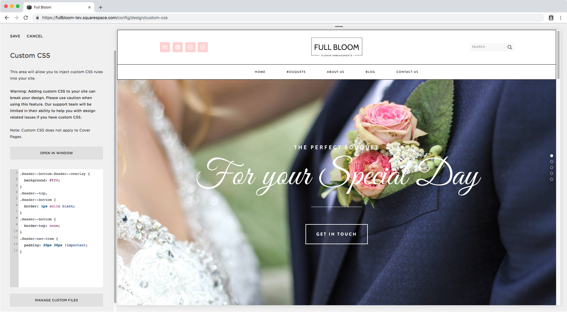
As you may already know, or are just now noticing, when we set our nav bar in the bottom header of our site, we don’t have the option to add a background color through the Style Editor, so that’s what we’re going to do now through our Custom CSS window.
Let’s take a look at what all that bottom section is called.

Brining that Inspect Element window closer we can see that our bottom header section has a couple of classes.
I’ll be using .Header--bottom and .Header--overlay.

So, let’s give that bottom header a background of white to match with the color of our top one:
.Header--bottom.Header--overlay {
  background: #fff;
}

Good, but there seems to be a lot of space between my two headers, so I’ll head over to the Style Editor and remove the padding for the bottom nav.
This is what it looks like now:

Alright, better.
Now we can begin adding the borders to box-in our header!
I want both headers to be distinguishable, with a line dividing them, so instead of setting a border for the container holding both navs, I’ll set it for EACH nav section.
We already know that the bottom header has a class of .Header--bottom:

So let’s check what the class is for the top one…

Perfect, its .Header--top.
Since we’re going to be applying the same style to both headers, I’ll group them in the same selector:
.Header--top,
.Header--bottom {

}
And now, let’s give them a nice thin black border:
.Header--top,
.Header--bottom {
  border: 1px solid black;
}

Not bad, but since I want all borders to have the same thickness, I have to do something about those two borders meeting in the middle.
You can leave it like that, but what I’m going to do is remove the top border just for the bottom header nav.
.Header--bottom {
  border-top: none;
}

Much better!
Let’s move onto the menu links.


These are a elements with two classes. We’ll go with .Header-nav-item.
.Header-nav-item {

}
And the first thing we’re going to change here is the padding around these links, I’ll make it 20px for top and bottom and 30px for the sides.
.Header-nav-item {
  padding: 20px 30px !important;
}
Nice! Now let’s add the dividers.
I’ll do this by adding a right border to each menu item.
.Header-nav-item {
  padding: 20px 30px !important;
  border-right: 1px solid black;
}

Ok, I don’t know if you notice but the links seem to be misaligned, let’s see what’s going on.

Those orange lines tell us that there’s a margin there that may be the culprit of that misalignment.
And if we zoom in a little closer we can see that it’s a margin of .6em…

The good news is that the margin comes from the settings inside the Style Editor, so we can quickly hop on over there and set it to 0…

…and now we’re set!
Now, let’s take care of that first border.
To do it, and since we have no way to differentiate between one link and the other besides its position, we’re going to be relying on the pseudo-class :first-child to target it.
This will help us tell our browser we want to style the first element of that series of elements.
So, to point to that child, we need to find the parent that’s holding it to use it as reference – otherwise, you can’t tell your browser who’s child you’re talking about.
Let’s take a look at what that parent container is called:
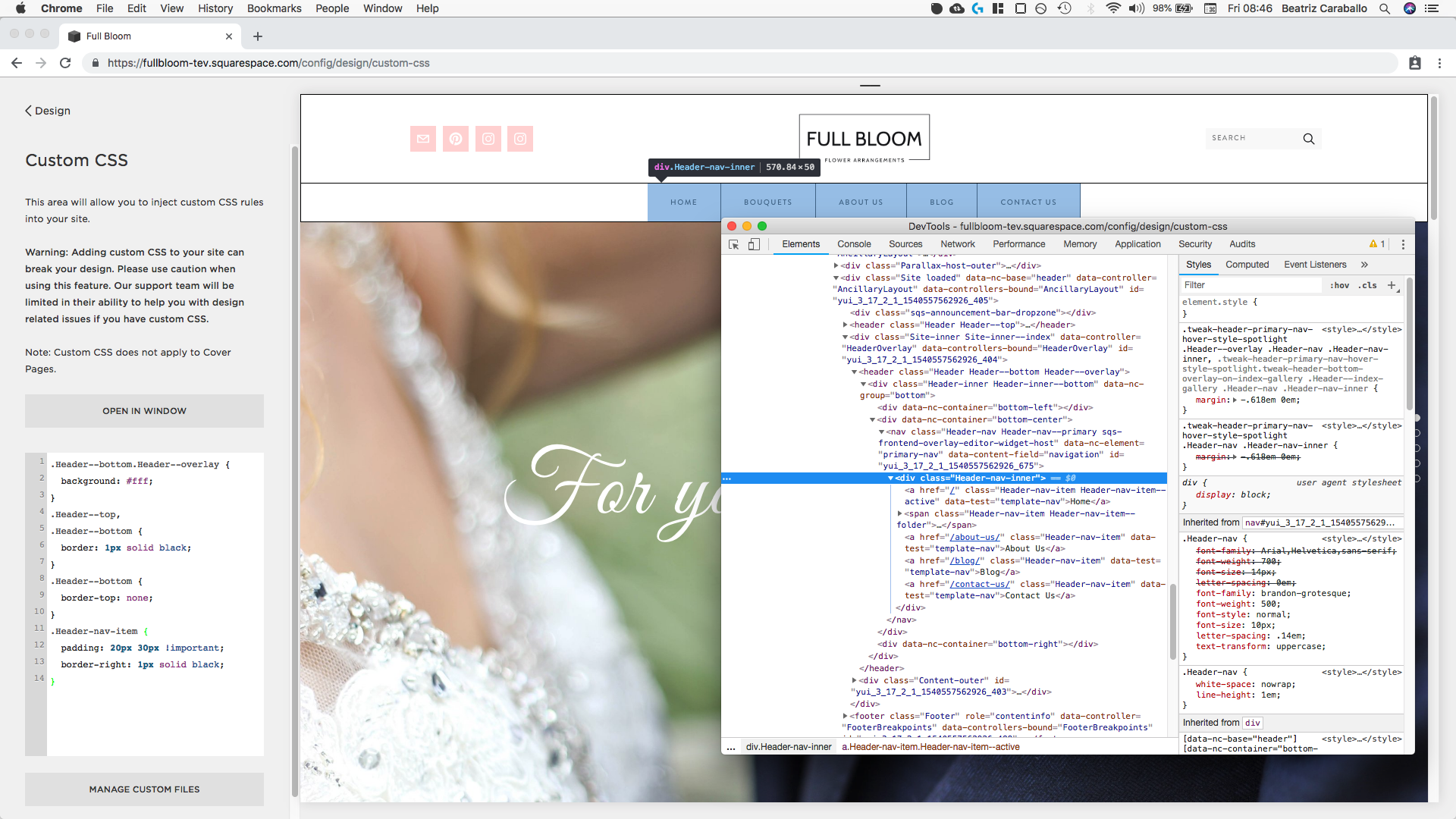
Zooming in…

…we can see that the parent container is called .Header-nav-inner, so let’s head over to our Custom CSS window to create our selector.
Remember, we want to point to the first one of all the .Header-nav-item elements located inside the .Header-nav-inner container, meaning:
.Header-nav-inner .Header-nav-item:first-child {

}
And then set the left-side border to match the rest:
.Header-nav-inner .Header-nav-item:first-child {
  border-left: 1px solid black;
}

Perfect!
Styling the dropdown folder
Lastly, let’s check on ooooone small detail: the dropdown menu.

We have to realign them with our menu links so let’s look for their class name to make the necessary adjustments.

Ok, this dropdown is called .Header-nav-folder and if we take a look at that bottom diagram on the right, we can see it has a NEGATIVE margin to the left side which is pulling it in that direction – explaining why it’s not completely aligned with our nav link.
So why don’t we get rid of that margin?
.Header-nav-folder {
  margin-left: 0;
}

Nice!
You can stop here if you like but I want to make two additional alterations to the dropdown that I think will make it look even better.
First, I want to make sure the bottom border of my link doesn’t get covered by the dropdown, so I’m going to give the latte a top margin that matches the thickness of that border, 1px.
.Header-nav-folder {
  margin-left: 0;
  margin-top: 1px;
}

Alright, and lastly, I want to make the dropdown as wide as the menu link, so I’ll expand its width.
.Header-nav-folder {
  margin-left: 0;
  margin-top: 1px;
  width: 100%;
}

Awesome! Here’s the final result with and without the dropdown showing:


And there you have it my friend!
That’s how you can get a bit more creative with your Squarespace header and simulate a Showit-style nav bar!
Until next time,
B.
Full code
/*Adding a background color to bottom header*/
.Header--bottom.Header--overlay {
  background: #fff;
}

/*Adding the lines to the header*/
.Header--top,
.Header--bottom {
  border: 1px solid black;
}
.Header--bottom {
  border-top: none;
}
.Header-nav-item {
  padding: 20px 30px !important;
  border-right: 1px solid black;
}
.Header-nav-inner .Header-nav-item:first-child {
  border-left: 1px solid black;
}

/*Styling the dropdown folder*/
.Header-nav-folder {
  margin-left: 0;
  margin-top: 1px;
  width: 100%;
}