
Adding an extra title and overlapping the button of an overlap image block (7.0 & 7.1 CE)
If you’re into overlapping stuff in your client sites, I know you’re going to really enjoy today’s fun tutorial.
It’s all about taking the overlap image block design one step further, with very little code, to create a look I’m 90% sure you’ve seen before while perusing Pinterest: an image with an overlapping title, a secondary title, text and an overlapping button.
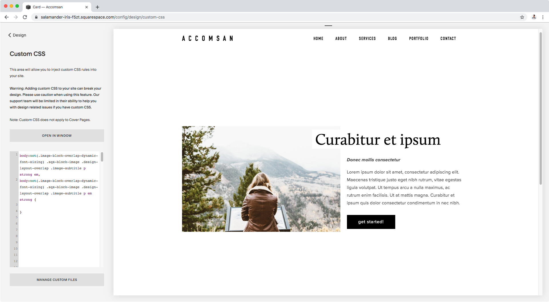
In other words, this:

Ready to find out how to achieve this?
Alright! Let’s jump into it.
Adding an extra title to the overlap image block
We’ll start out with an overlap block styled through the Site Styles.
Here you can see the different settings I used, in case you’re interested in replicating some of them:
You’ll notice that inside the subtitle section we have a few words on a different line.
That’s the phrase we’ll be turning into our second title.
Of course, you could simply set that text to caps and make it bold for it to stand out from the paragraph enough to call it a day. However, if you want to change its color, alter its font size or basically be able to style those words more heavily, we’re going to have to use some CSS.
To get there, we first need a way to isolate or differentiate that text from the rest of the content. Otherwise we’ll have NO way to target it separately through our code.
What we can do is use a trick we’ve talked about before on the blog to create an h4 without HTML: applying bold + italics to the thing you want to customize!

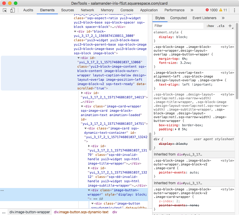
With those styles set, we can now take a look via Inspect Element at how to target the second-title-to-be:


As you can see, all of our subtitle text is inside paragraph elements, including our title-to-be.
However, the latter is ALSO inside a strong and an em element (highlighted in blue), which means we can use those as element selectors to target the standalone phrase inside the paragraph.
Now, strong em { } isn’t specific enough to refer to the styled text inside the subtitle paragraph of our overlap card block. We need something else…
BUT, before we go on building our own selector we should note that, on the right side of our Inspect window, Squarespace is already using a pretty specific one to set the font style of the paragraph text:

So, we can build on that!
We’ll copy what they are already using to target the subtitle’s paragraph of our overlap card, AND THEN add our strong and em element selectors to it to target just the title-to-be, like so:
body:not(.image-block-overlap-dynamic-font-sizing) .sqs-block-image .design-layout-overlap .image-subtitle p strong em {

}
Important: your selector may be different than mine! It depends on if you have dynamic font size activated or not in your Style Editor.
Additionally, we’ll group this with a second selector that’s exactly the same as the previous one buuut has the strong and em selectors inverted.
This is to make sure that, regardless of which tags get added first to the title-to-be (italics or bold), our CSS still applies:
body:not(.image-block-overlap-dynamic-font-sizing) .sqs-block-image .design-layout-overlap .image-subtitle p strong em,
body:not(.image-block-overlap-dynamic-font-sizing) .sqs-block-image .design-layout-overlap .image-subtitle p em strong {

}
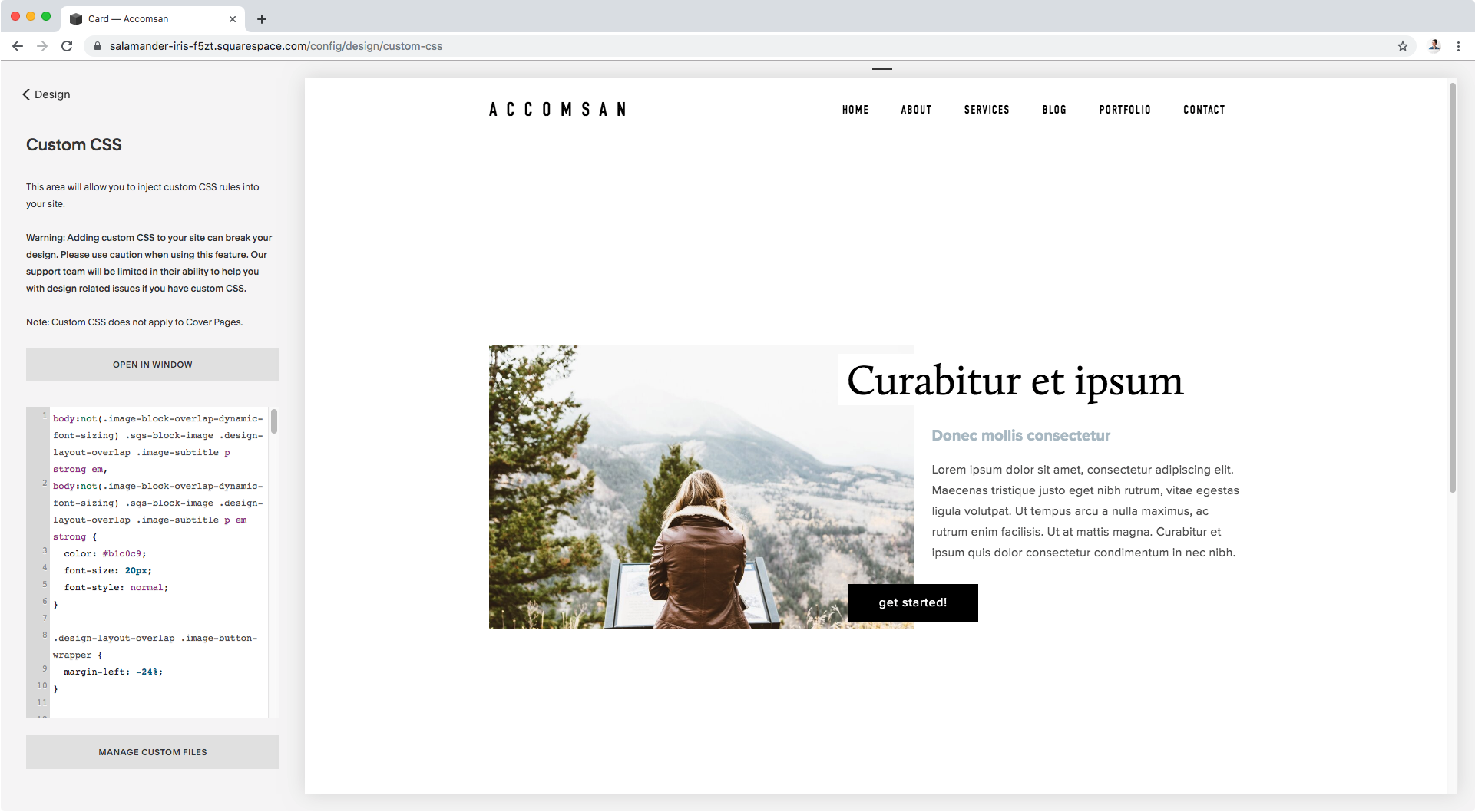
Ok, now it’s time to set the styles!
I’ll simply be changing the color, altering the font size and removing the italics:
body:not(.image-block-overlap-dynamic-font-sizing) .sqs-block-image .design-layout-overlap .image-subtitle p strong em,
body:not(.image-block-overlap-dynamic-font-sizing) .sqs-block-image .design-layout-overlap .image-subtitle p em strong {
  color: #b1c0c9;
  font-size: 20px;
  font-style: normal;
}

Awesome!
We now have a second title for our image!
Overlapping the button in an overlap image block
Now, let’s take care of the button’s position.
Let’s take a look at what our button container is called so we can target it via CSS:


Alright, so we can see it’s a div with a class of .image-button-wrapper.
We can use that but we need to make sure we’re not affecting any other image block style, and by the look of that class it doesn’t seem we’re being specific enough.
Let’s take a look at the parent/ancestor containers of our button to see where we can find a class that’s specific for our overlap layout:
Here we go.
We can see there’s a container with a bunch of classes, including one called .design-layout-overlap.
Now that’s specific!
Let’s build our selector and plop it into our Custom CSS window:
.design-layout-overlap .image-button-wrapper {

}
Now, let’s simply adjust the left-side margin to pull the button to the left!
I’ll set mine to -24% since it’s similar to the offset value I selected for the big title through the Style Editor:
.design-layout-overlap .image-button-wrapper {
  margin-left: -24%;
}
AWE-SOME!
But before we call it a day, let’s check mobile screens for a sec…
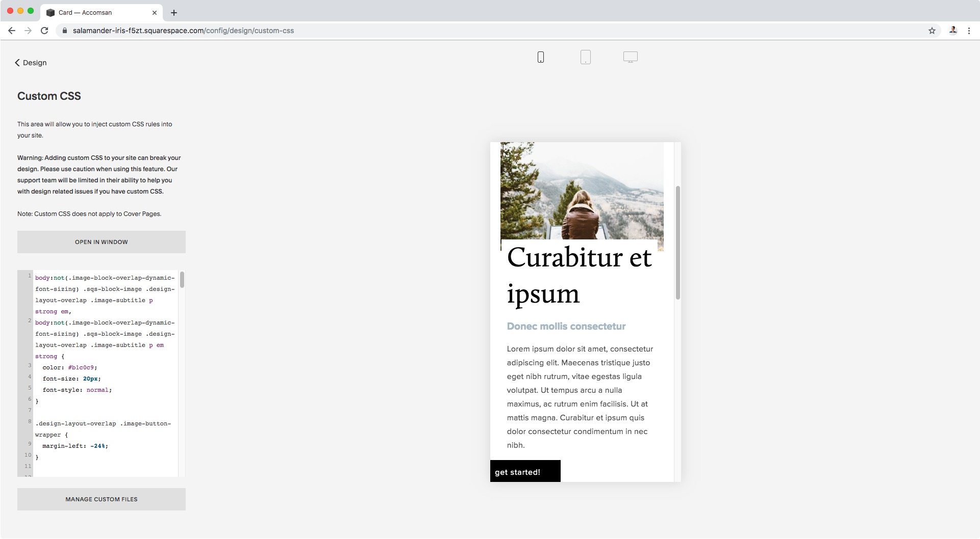
As you can see, our new button’s position gets it cut off on smaller screen sizes.
But no biggie!
What we can do here is simply wrap our code inside a media query to make sure the new position only happens when the screen is bigger than phones:
@media screen and (min-width: 640px) {
  .design-layout-overlap .image-button-wrapper {
    margin-left: -24%;
  }
}

Perfect!
Let’s check tablets and desktop to make sure it works right:


All good!
Now you know how to make these small adjustments to your overlap image blocks to have a secondary title and overlap the button over the image!
Until next time,
B.
Full code
/*ADDING A SECOND TITLE TO THE OVERLAP IMAGE BLOCK*/
/*Remember your code will be different if dynamic font sizing is checked!*/
body:not(.image-block-overlap-dynamic-font-sizing) .sqs-block-image .design-layout-overlap .image-subtitle p strong em,
body:not(.image-block-overlap-dynamic-font-sizing) .sqs-block-image .design-layout-overlap .image-subtitle p em strong {
  color: #b1c0c9;
  font-size: 20px;
  font-style: normal;
}

/*OVERLAPPING THE BUTTON OF THE OVERLAP IMAGE BLOCK*/
@media screen and (min-width: 640px) {
  .design-layout-overlap .image-button-wrapper {
    margin-left: -24%;
  }
}