
Customizing the index gallery slideshow in Squarespace (Brine 7.0)

Templates like Brine allow us to add big and bold imagery through its Index Gallery pages. Fortunately, Squarespace gives us a couple of different options to style them through the Style Editor however, and depending on the design you’re after, this may not be enough.
That’s why in today’s tutorial we’ll be covering how you can take your index gallery pages – particularly those set as slideshow – to the next level with a bit of custom code!
Let’s get going!
Prepping the index gallery slideshow
We’re going to be starting out with an index gallery page that has a couple of images, each with its corresponding title, description and link.

I already styled these slides as much as possible through the Style Editor.
The settings you’ll need to set before moving onto the customization, to save yourself some time and avoid having to make code adjustments, are the following:
Layout: Slideshow
Next/Previous Controls: Small Arrows
Content Position: Bottom Center
Content Offset (Bottom): 0
Content Max Width: 100%
Content Background: any color you like
And if you’re curious, these are ALL the settings I used (you can click on the images to expand):
Alrighty!
With that out of the way, the first thing we’re going to be doing is switching our slideshow arrows for custom arrows! Just like we did when we added custom arrows to the Summary Block carousel for testimonials.
Adding custom arrows to the index gallery slideshow
So, first let’s go ahead and look at how our existing arrows are built:

Zooming in, we can see that the arrow icon is an SVG and that it’s sitting inside a container with a class of .Index-gallery-control--left (highlighted in light blue below).
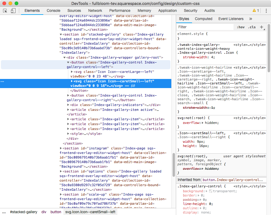
Ok, so we can use that information to target our current arrows and get rid of them!
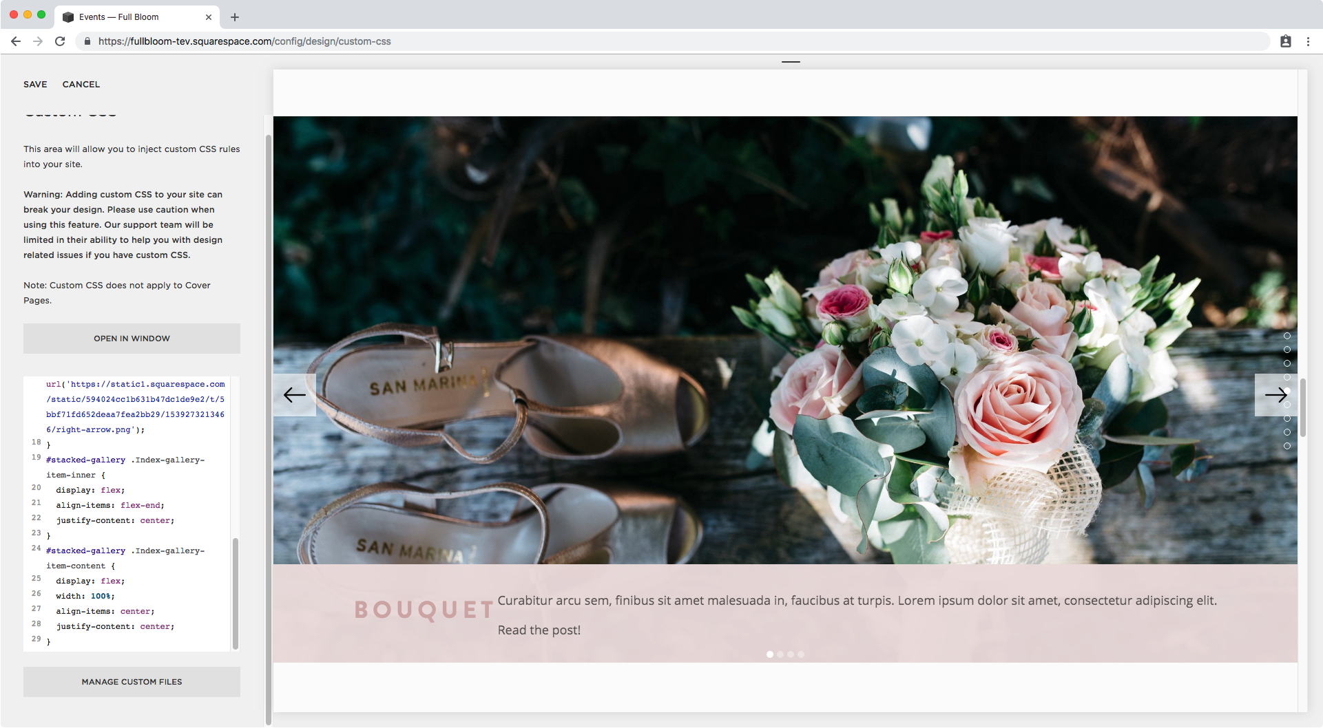
I’m also going to be using the ID for this particular index gallery page to make sure it’s the only one getting modified on my site. I gave mine a URL slug of /stacked-gallery.
#stacked-gallery .Index-gallery-control--left svg {

}
Now, since we want to get rid of BOTH arrows, let’s take a look at how to target the one on the right as well. I kinda have a feeling of what the selector is going to be but let’s check to make sure…

Ok, just like expected, we can see the SVG is inside a container with a class of .Index-gallery-control--right (light blue in the screenshot above).
So let’s group these two selectors and set display none for both of them to get rid of the arrow icons!
#stacked-gallery .Index-gallery-control--left svg,
#stacked-gallery .Index-gallery-control--right svg {
  display: none;
}

Awesome! They’re gone.
Now it’s time to bring in our NEW custom arrows.
First, we’ll set the pseudo-element just like we did in that previous tutorial to create a container that holds our arrow.
Make sure to set the width and height the same as the image you’ll be using as icon!
Here’s the container for our left arrow:
#stacked-gallery .Index-gallery-control--left::after {
  content: '';
  width: 32px;
  height: 32px;
  display: block;
}

See how the background expanded?
Awesome, let’s bring in our arrow image then!
I have mine saved inside the Custom CSS window so I’ll just click on it to get the URL and use that as a background for the pseudo-element:
#stacked-gallery .Index-gallery-control--left::after {
  content: '';
  width: 32px;
  height: 32px;
  display: block;
  background: url('https://static1.squarespace.com/static/594024cc1b631b47dc1de9e2/t/5bbf7067f4e1fca6b358bb02/1539272807468/left-arrow.png');
}

That’s looking great! Let’s repeat the same thing on the right side.
#stacked-gallery .Index-gallery-control--right::after {
  content: '';
  width: 32px;
  height: 32px;
  display: block;
  background: url('https://static1.squarespace.com/static/594024cc1b631b47dc1de9e2/t/5bbf71fd652deaa7fea2bb29/1539273213466/right-arrow.png');
}

Nice! We now have custom arrows in our Index Gallery slideshow!
Customizing the content of the index gallery slideshow
How about we make some tweaks to the text portion of our index slideshow?
We’ll keep it fairly simple and just expand it so it goes all the way across the width of the slide, set title and description side by side instead of stacked, and edit the link to make it look more like a link since right now it’s easily confused with the rest of the description.
Now, considering what we want to do with the text inside the container (place it side by side) our best approach would be to use flexbox – and if you’ve been following this blog for a while you know how useful it can be! – so we’re going to begin by making our pink section flex.
Let’s take a look at how to target it:

Zooming into our Inspect Element window…

We can see two classes.
I’m going to go with the first one since it doesn’t seem to rely on the fact that the slide has or doesn’t have text inside it, vs the second one.
#stacked-gallery .Index-gallery-item-content {
  display: flex;
}

Aaaand our pink container disappeared.
Let’s check out what happened.

In our Inspect Element window we can see that our content container has been vertically aligned to the bottom of our slide, which right now is an inconvenience for us.
Since the vertical-align property doesn’t work with flexbox – but we need flexbox to achieve the rest of our customization (aka placing title + desc side by side) – this means we have to go one step further and set the PARENT container holding our pink container (and our slide image) to flex as well, so we’re able to realign our text block inside the slide without having to use vertical-align.
Let’s take it one step at a time shall we?
First, we’re going to scroll back up a bit to find the class of the parent container we’ll be targeting.
We’re looking for the one that’s holding both our pink text container and the image of the slide.


Alright so .Index-gallery-item-inner (highlighted in light blue) is the parent container we’re looking for.
See how our pink container (highlighted in dark blue) and the figure element are its children? That’s what we want.
Let’s target this baby through our Custom CSS window and set it to flex.
#stacked-gallery .Index-gallery-item-inner {
  display: flex;
}

Ok, we have our pink container showing up again!
It expanded juuuuuust a tad as you may notice, but that’s ok.
The extra height is due to the default alignment to the top of the flex element, so once we align it to the bottom it will automatically reduce to fit the content.
Let’s do that through the align-items property and set the container to align to the “end“ or bottom of the flex element (the parent container).
#stacked-gallery .Index-gallery-item-inner {
  display: flex;
  align-items: flex-end;
}

Much better!
We can now center it again through the justify-content flexbox property.
#stacked-gallery .Index-gallery-item-inner {
  display: flex;
  align-items: flex-end;
  justify-content: center;
}

Full 360 right?
“Uhm yeah, why did we do all of that if we ended up with the same thing?“
Annoying perhaps, but it’s because we needed to prep the elements for the next step!
Let’s set title and description side by side shall we?
We’re going to go back to the selector for our content container and now finally set it back as flex.
Remember, this targets the pink container!
#stacked-gallery .Index-gallery-item-content {
  display: flex;
}

Ta-dá!
The container now stayed put AND we’re starting to get closer to our final result!
Let’s make some minor adjustments.
We’ll expand the pink container 100% through the width property:
#stacked-gallery .Index-gallery-item-content {
  display: flex;
  width: 100%;
}

Then, center the title with the description horizontally through the align-items flexbox property:
#stacked-gallery .Index-gallery-item-content {
  display: flex;
  width: 100%;
  align-items: center;
}

And now, if you want, center the entire text vertically inside the pink container through the justify-content flexbox property:
#stacked-gallery .Index-gallery-item-content {
  display: flex;
  width: 100%;
  align-items: center;
  justify-content: center;
}
Looking good! However the description is a tad too close to the title, so let’s add margin to it to give it some room.


Alright, we have a class of .Index-gallery-item-content-body we can use.
I’ll make top and bottom margins 0 and just add 20px to the sides.
#stacked-gallery .Index-gallery-item-content-body {
  margin: 0 20px;
}

Awesome!
Let’s preview this on smaller screens.


I love it on tablet but I think it’s going to look much better stacked on phones.
You can leave it like that but I’m going to wrap my code (minus the arrows) inside a media query that begins at 640px so the alignment is back to default on phone screens.
@media screen and (min-width: 640px) {
  #stacked-gallery .Index-gallery-item-inner {
    display: flex;
    align-items: flex-end;
    justify-content: center;
  }
  #stacked-gallery .Index-gallery-item-content {
    display: flex;
    width: 100%;
    align-items: center;
    justify-content: center;
  }
  #stacked-gallery .Index-gallery-item-content-body {
    margin: 0 20px;
  }
}

Perfect!
Styling the link inside an index gallery slideshow description
The last customization I’d like to do here is to style the “Read the post“ link a little bit to make it more obviously clickable.
Let’s check out how to target it.


Since we’re dealing with the only a element inside our content body, we can target it like so:
#stacked-gallery .Index-gallery-item-content-body a {

}
And add any styles we like.
These are the ones I’m using!
#stacked-gallery .Index-gallery-item-content-body a {
  text-transform: uppercase;
  font-size: .7em;
  font-family: montserrat;
  font-weight: bold;
}

And if we want to add something extra, like an arrow, we can simply create a pseudo-element with that same selector and paste in the character we want to use as the content:
#stacked-gallery .Index-gallery-item-content-body a::after {
  content: '→';
}

Perfect! Take a look at the final result in all screens.


And we’re officially done!
That’s how you can customize your Index Gallery slideshow in Squarespace!
Until next time,
B.
Full code
/*Customizing the arrows*/
#stacked-gallery .Index-gallery-control--left svg,
#stacked-gallery .Index-gallery-control--right svg {
  display: none;
}
#stacked-gallery .Index-gallery-control--left::after {
  content: '';
  width: 32px;
  height: 32px;
  display: block;
  background: url('image-url-goes-here');
}
#stacked-gallery .Index-gallery-control--right::after {
  content: '';
  width: 32px;
  height: 32px;
  display: block;
  background: url('image-url-goes-here');
}

/*Customizing the link inside the paragraph text*/
#stacked-gallery .Index-gallery-item-content-body a {
  text-transform: uppercase;
  font-size: .7em;
  font-family: montserrat;
  font-weight: bold;
}
#stacked-gallery .Index-gallery-item-content-body a::after {
  content: '→';
}

/*Setting the new side-by-side layout for the title and paragraph*/
@media screen and (min-width: 640px) {
  #stacked-gallery .Index-gallery-item-inner {
    display: flex;
    align-items: flex-end;
    justify-content: center;
  }
  #stacked-gallery .Index-gallery-item-content {
    display: flex;
    width: 100%;
    align-items: center;
    justify-content: center;
  }
  #stacked-gallery .Index-gallery-item-content-body {
    margin: 0 20px;
  }
}