
Custom testimonial carousel arrows with Summary Block (7.0, 7.1 CE & 7.1 FE)

March 2021: the code at the end of the post has been updated to work with Squarespace’s latest arrow update!
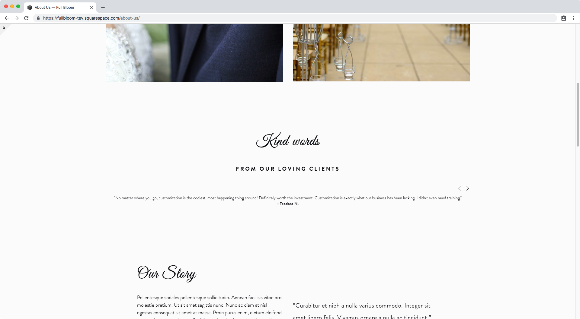
Moving the carousel arrows
First thing’s first, we need a Summary Block set as carousel inside our page.
The one I’m working with is pulling the testimonial + client name from the excerpt of a blog page I aptly named Testimonials. In case you were wondering.
Now, let’s start by finding out how to target our arrows so we can start moving them around.
You can skip this part if you only want to replace them with your own custom arrow.

Zooming in…

We can see that the container holding both our arrows has two classes.
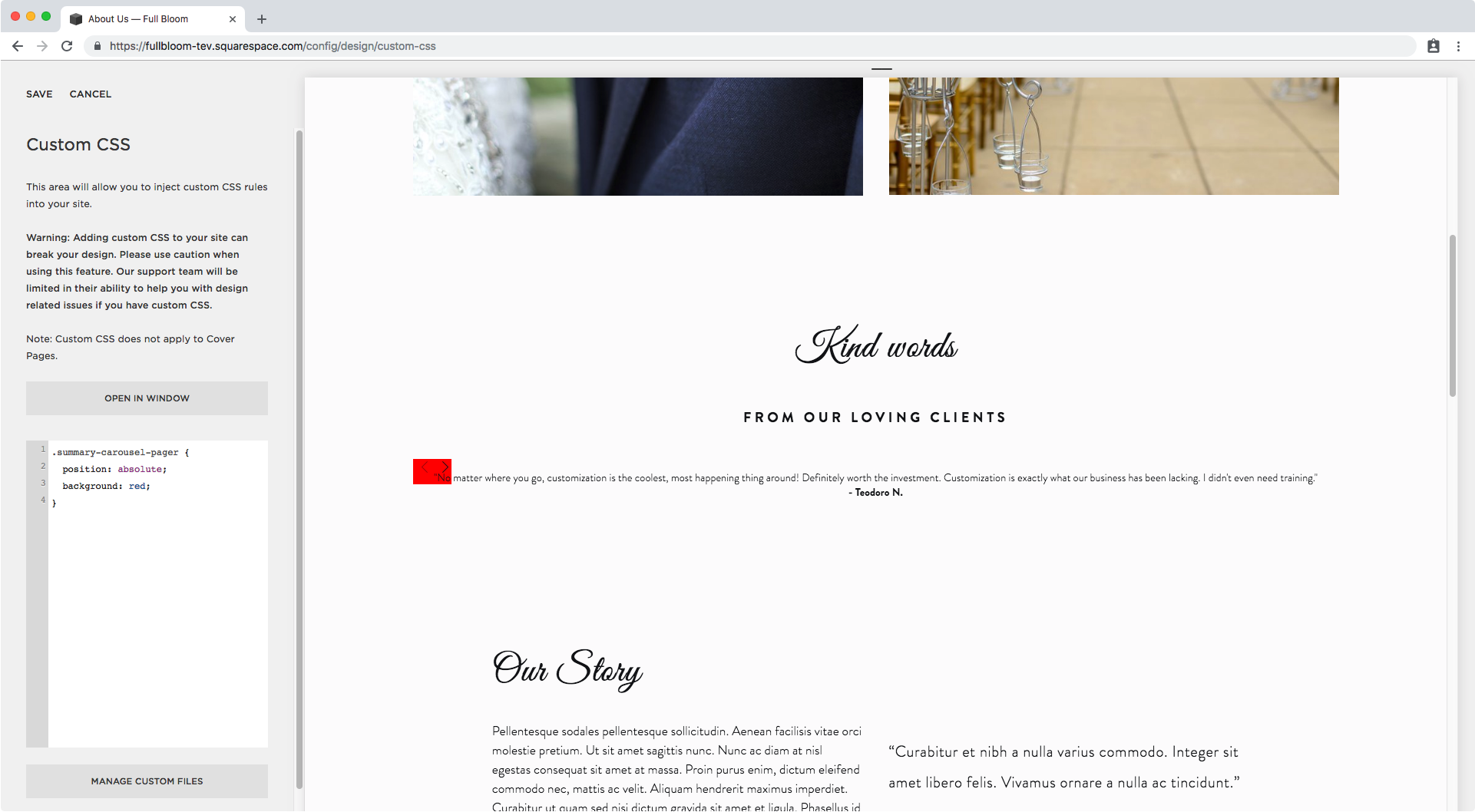
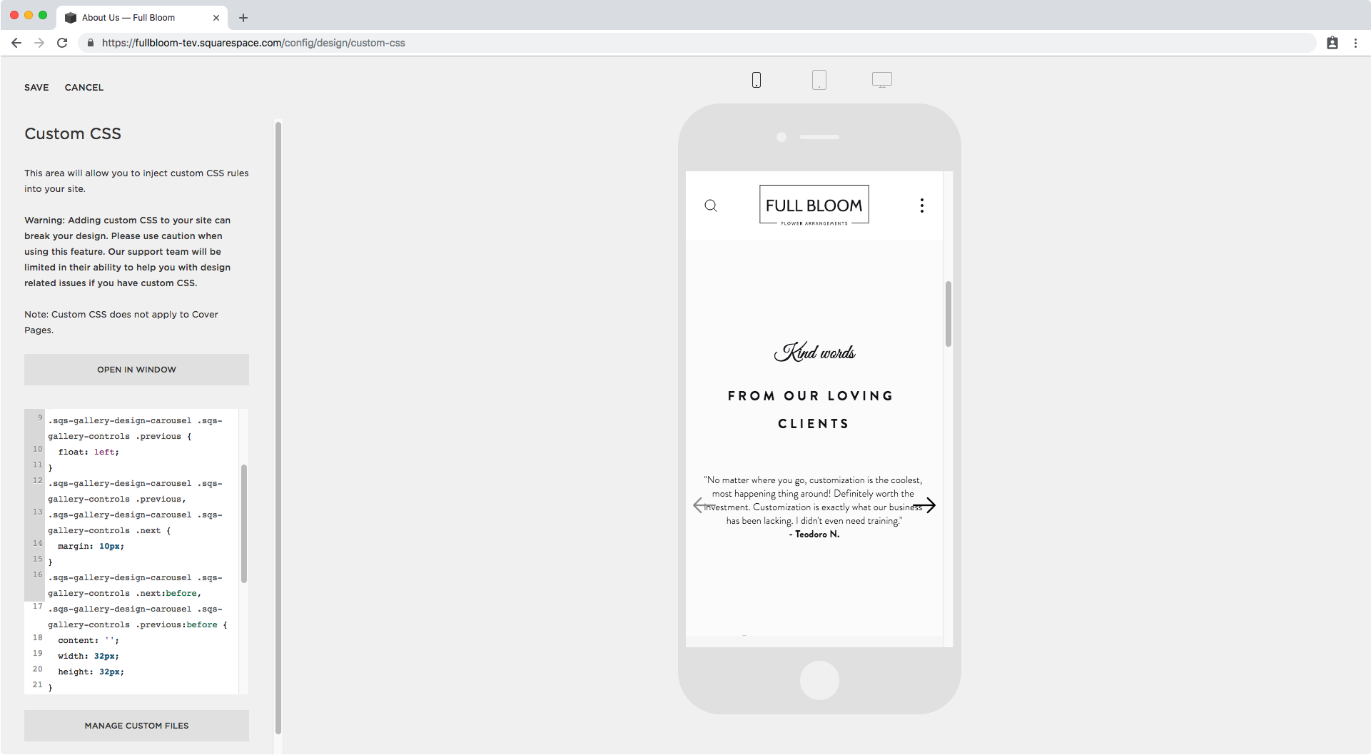
I’m going to use the first one called .summary-carousel-pager and add it into my Custom CSS window
.summary-carousel-pager {

}
And to be able to move the arrows freely, I’ll be setting them absolutely:
.summary-carousel-pager {
  position: absolute;
}

Did you see them move?
I’m going to highlight them so they’re easier to spot.
Alright, so now let’s start putting them in place.
I want them to be aligned to the center of the block horizontally, and then have each arrow to the sides of the testimonial.
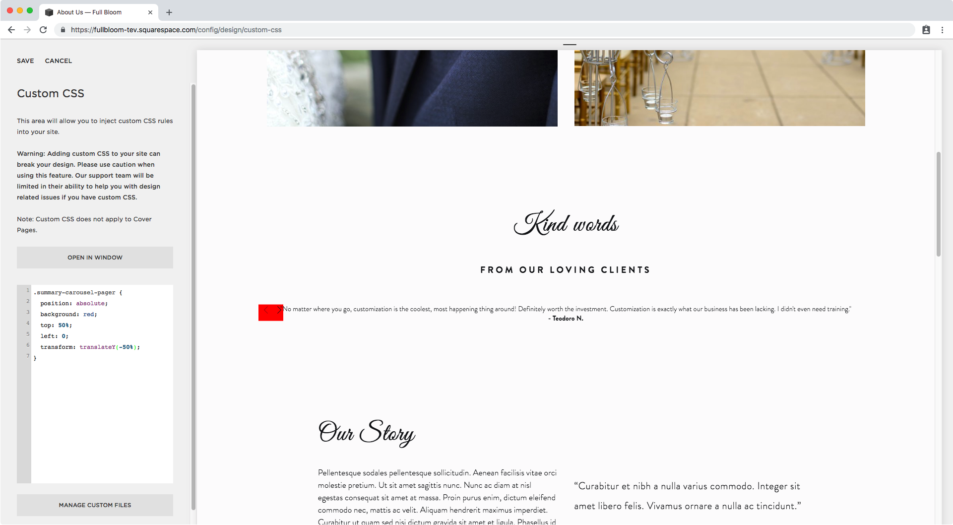
To do this, I’m going to start with setting the top and left offsets:
.summary-carousel-pager {
  position: absolute;
  top: 50%;
  left: 0;
}

It seems like it’s a bit too low right now so we’re going to use our old friend the transform property to bring our element slightly back up from where it’s currently sitting.
.summary-carousel-pager {
  position: absolute;
  top: 50%;
  left: 0;
  transform: translateY(-50%);
}
Great! Now let’s take care of the side placement.
We have a couple of options at this point to move the arrows, but I’m going to go with floating one of the arrows.
First, we have to expand the container holding both our arrows so it fits the entire width of our testimonial:
.summary-carousel-pager {
  position: absolute;
  top: 50%;
  left: 0;
  transform: translateY(-50%);
  width: 100% !important;
}

If you check the “clickability“ of the arrows right now, you’ll notice only one or neither of them are working.
This is because the arrow container is currently BEHIND our testimonial text container – that’s why we can read it! – so we have to bring it to the front and have the arrows be useful once again.
.summary-carousel-pager {
  position: absolute;
  top: 50%;
  left: 0;
  transform: translateY(-50%);
  width: 100% !important;
  z-index: 1;
}
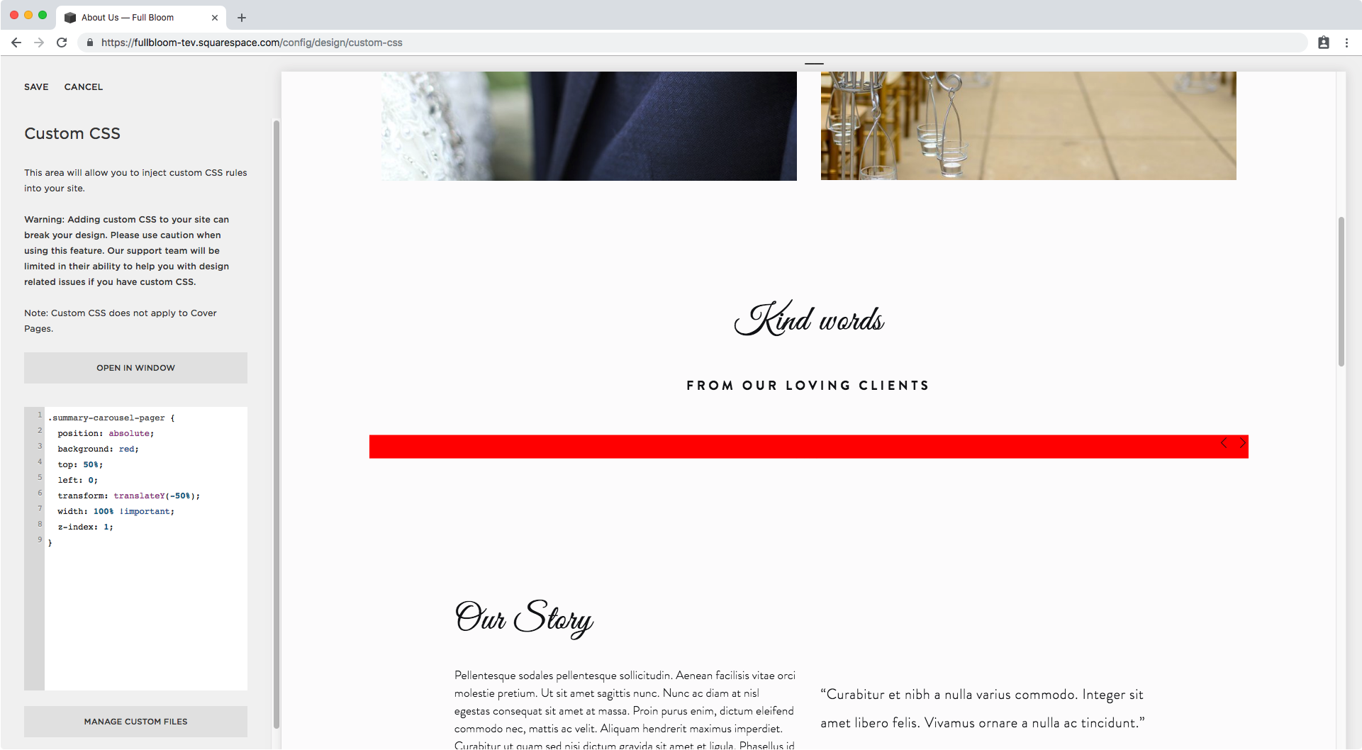
Cool, they’re on top of the testimonial and therefore available for clicks again!
And don’t worry about not seeing the testimonial text right now, we’re not going to keep that background color!
Alrighty, so I mentioned we were going to go with floating one of the arrows to place each of them at the sides of the text.
Since the right – next – one is already in place, we just need to target the left – previous – one and float it to the left of the red container.

A little zoom here…

And we can see that our arrow has a few classes in there that we can use, however, if we look into the right sidebar of the Inspect Element window, we notice there’s a selector all ready for us that’s also including the big parent container that indicates we’re dealing with a carousel.
In fact, if we look even closer, we can notice it has the float property set to right. The same property we’re looking to switch up to the left.
Note: we’re dealing with a group of selectors here (notice the comma). One is grayed out and the other isn’t. I’m only copying the part that isn’t grayed out because it’s the selector that corresponds to the previous arrow, the one we’re targeting.

Ok, so now in our Custom CSS window we have:
.sqs-gallery-design-carousel .sqs-gallery-controls .previous {

}
I’m going to give that arrow a temporary darker color so we can see it better once we move it:

See that little dark square there? Ok, let’s float it to the left!
.sqs-gallery-design-carousel .sqs-gallery-controls .previous {
  float: left;
}

Nice! It’s on the left side now.
Now, it seems like our arrows have some extra space below them.
Let’s check that out so we can remove it.

Just by highlighting it we can see there’s a little orange square below it indicating there’s some margin involved.
Let’s look for the selector we’re gonna use to remove it:

Ok, so we have a couple of classes on this arrow as well, but as you may notice, we have a selector ready to go inside the same group of selectors we saw for the previous arrow!

This means that if we use both groups of selectors at once, we can kill two birds with one stone because the margin has been set for both! Meaning we can also get rid of it for both arrows at the same time.
.sqs-gallery-design-carousel .sqs-gallery-controls .previous,
.sqs-gallery-design-carousel .sqs-gallery-controls .next {

}

Let’s go ahead and do that! Set our new margin to 0 all around.
.sqs-gallery-design-carousel .sqs-gallery-controls .previous,
.sqs-gallery-design-carousel .sqs-gallery-controls .next {
  margin: 0;
}

Alright! With all that prep out of the way, it’s time for the juicy stuff.
Changing the carousel arrow icons
Let’s switch those default carousel summary block arrows for some custom ones shall we?!
I’m going to be using a pair of really nice arrows I got from Flaticon but you can use ones you made on your own, or any other type of symbol or image you like!
The way we’re going to be doing this is by taking advantage of the existing structure of the Summary Block arrows.
These are being set by Squarespace as pseudo-elements, so we’re going to be substituting the contents of those pseudo-elements with our own (aka our custom arrows)!
If we look for the arrow icons in our Inspect Element window…

We notice they’ve been set under a ::before pseudo-element, where the arrow icon is a unicode character as indicated below:

So what we’re going to do here is grab the selector Squarespace already used to set that icon so we can replace it with our own.

We’ll do the same thing for the other arrow, located further down the code.

Perfect!
We can group these two to set the general styles they’ll both have, and then use them separately to add each corresponding arrow image.
.sqs-gallery-design-carousel .sqs-gallery-controls .next:before,
.sqs-gallery-design-carousel .sqs-gallery-controls .previous:before {

}

For both arrows, we’ll set the content property as an empty container and set the width and height of the image we’re going to be using.
In this case, my arrows are 32x32 so that’s the size I’ll be working with.
Since we’re not using the background size property in this tutorial, make sure to use a width and height based on the size of the image you’re using, aka check that your image is as big or as small as you want it to display from the get-go.
.sqs-gallery-design-carousel .sqs-gallery-controls .next:before,
.sqs-gallery-design-carousel .sqs-gallery-controls .previous:before {
  content: '';
  width: 32px;
  height: 32px;
}

See how the space grew a bit? Awesome!
Now it’s time to add our new arrows separately under its corresponding selector.
I already uploaded both images to my Custom CSS window by clicking on “Manage Custom Files“.
Let’s start with the right one.
Here’s the selector for that one (that we previously used inside a group with the left arrow):
.sqs-gallery-design-carousel .sqs-gallery-controls .next:before {

}
We only need to add the image as a background by using the url that we get from Squarespace when clicking over the uploaded file:
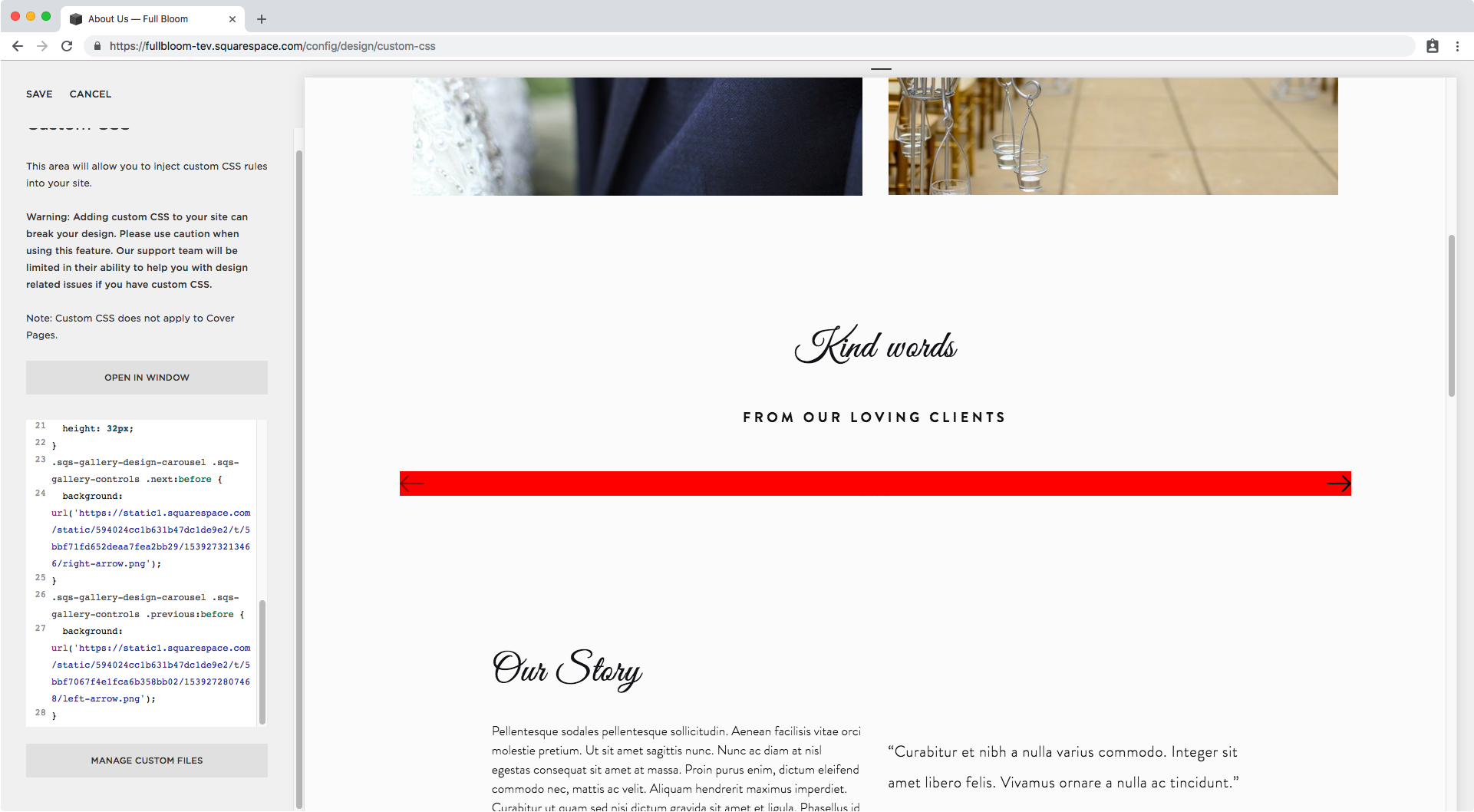
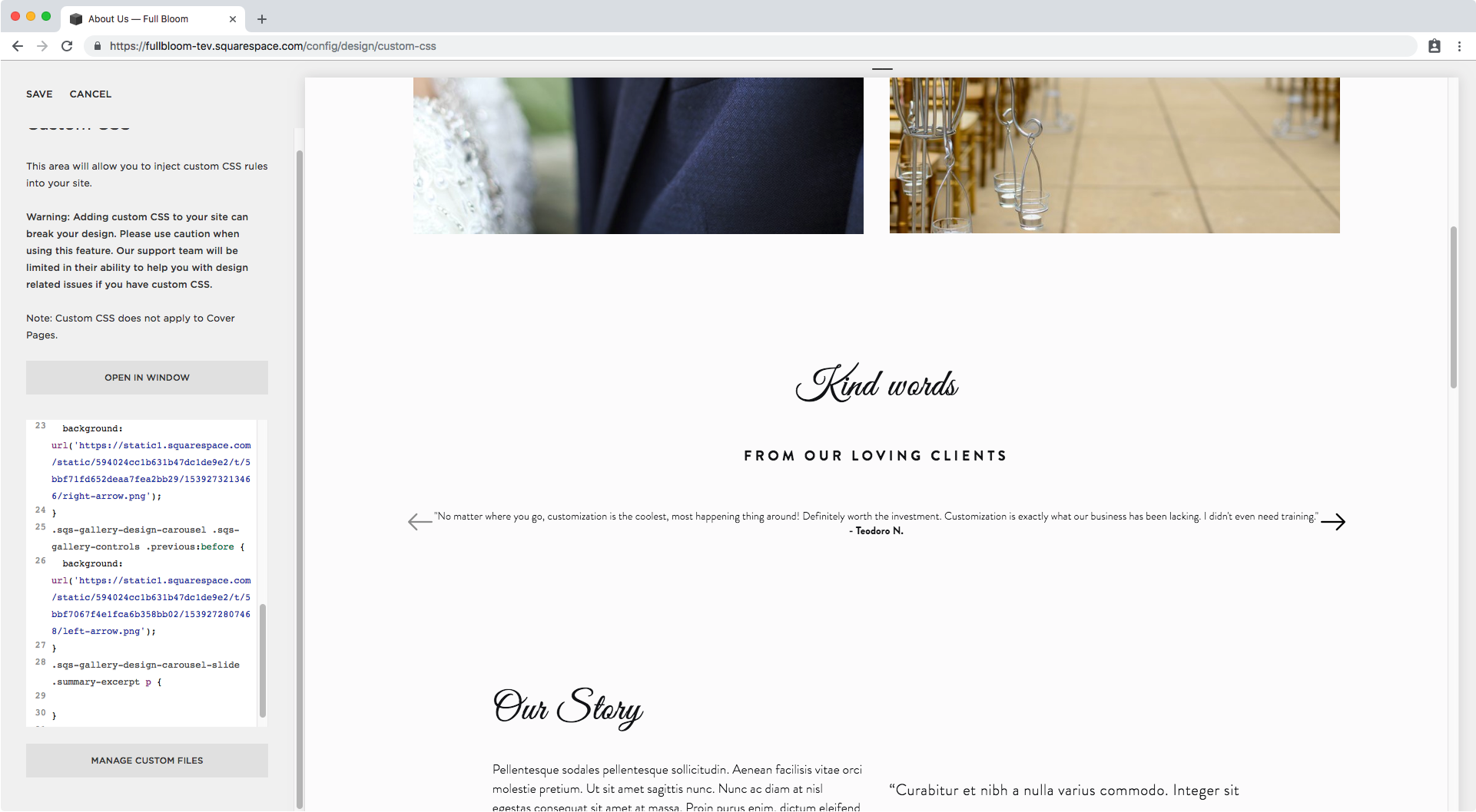
.sqs-gallery-design-carousel .sqs-gallery-controls .next:before {
  background: url('https://static1.squarespace.com/static/594024cc1b631b47dc1de9e2/t/5bbf71fd652deaa7fea2bb29/1539273213466/right-arrow.png');
}


Look at that! One arrow down!
Let’s do the other one exactly the same way, but by using the corresponding selector and image.
.sqs-gallery-design-carousel .sqs-gallery-controls .previous:before {
  background: url('https://static1.squarespace.com/static/594024cc1b631b47dc1de9e2/t/5bbf7067f4e1fca6b358bb02/1539272807468/left-arrow.png');
}

And let’s remove that black box highlight we had before to check…
Alright!
We have custom arrows!
Now, let’s get rid of the awful red background as well.

Beautiful!
We now have custom arrows for our testimonial carousel in Squarespace!

Adjusting the carousel for mobile
Let’s check this on smaller screens…


I don’t know about you but it feels the arrows are a tad too close to the edges of the browser screen, so let’s go back to where we removed the margin on all sides, and set some margin all around to give that extra spacing there that we’re missing!
.sqs-gallery-design-carousel .sqs-gallery-controls .previous,
.sqs-gallery-design-carousel .sqs-gallery-controls .next {
  margin: 10px;
}

Much better!
But I think it will be a good idea to reduce the width of the testimonial itself so the arrows don’t overlap it.
Let’s take a look at how to target it.
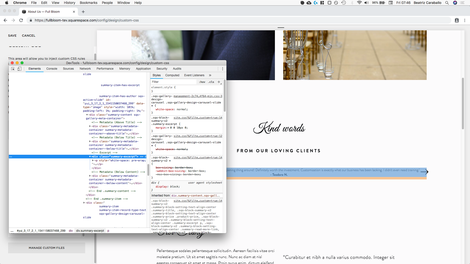

We can see the container is called .summary-excerpt, and that the actual text is a p element inside it.
Let’s target that paragraph element to add some padding and separate it from the arrows.
We should also target the carousel block directly to avoid making changes to any other summary excerpts we may have on our site.
Scrolling up a bit through the parent containers we have one that explicitly indicates we’re dealing with a carousel slide, so we can use that.

Putting it together we get:
.sqs-gallery-design-carousel-slide .summary-excerpt p {

}
So, let’s make some changes!
I’m going to be taking advantage of this to style the font a bit as well as giving it the padding I want to add some whitespace around the text.
.sqs-gallery-design-carousel-slide .summary-excerpt p {
  font-size: 25px;
  font-family: minion;
  font-style: italic;
  padding: 10px 80px;
}

Nice! Let’s take a look at this on tablets and phones:

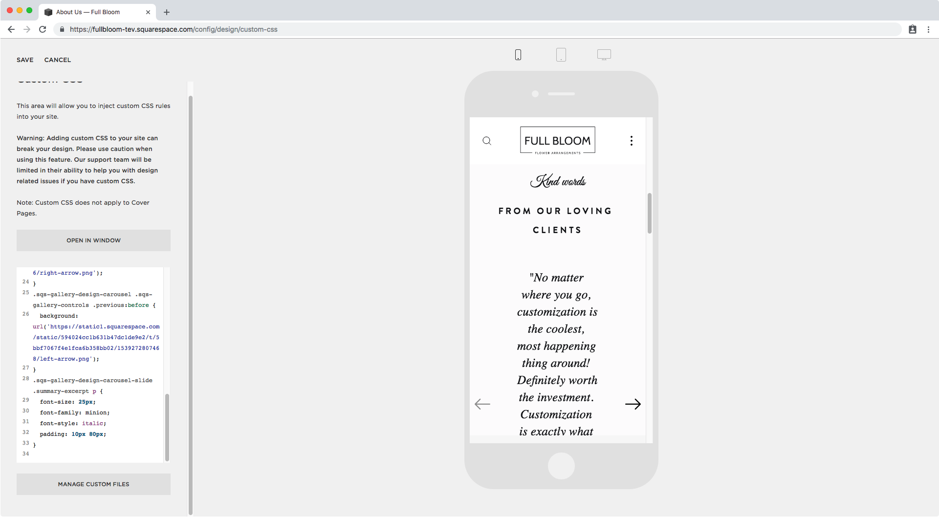
Great! This is turning out fantastic!
Now, I want the name of the testimonial giver to be different from the actual testimonial.
Therefore, I’m going to be taking advantage of the fact that I made the name bold – completely on purpose – to be able to target it separately from the rest of the text and give it its own styles!

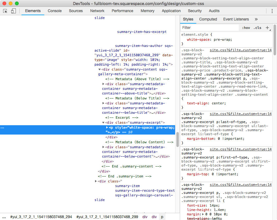
See how the person’s name is wrapped around a strong tag inside the p element we targeted before?
We can use that extra element selector in our code to change the font of the name.
I’m also setting it as block so it sits entirely in a new line below the rest of the testimonial.
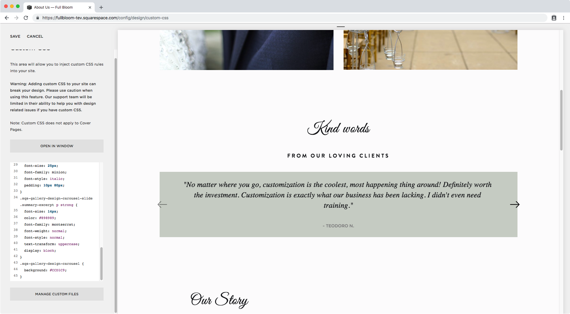
.sqs-gallery-design-carousel-slide .summary-excerpt p strong {
  font-size: 14px;
  color: #898989;
  font-family: montserrat;
  font-weight: normal;
  font-style: normal;
  text-transform: uppercase;
  display: block;
}

Beautiful!
Customizing the rest of the Summary Carousel
You can stop here if you like and enjoy the absolutely gorgeous customized arrows you added to your carousel Summary Block along with the new font style!
However, if you want to take this customization one step further and make your testimonial carousel block more visible, keep going because we’re going to be giving it a nice branded background!
I don’t want my background to move with each slide, so I’m going to be adding it to the bigger container holding all of my slides instead.

Zooming in we can see A BUNCH of classes…

But we don’t need all of them, so I’m going to go with .sqs-gallery-design-carousel since it doesn’t seem to depend on any of the settings of the block itself.
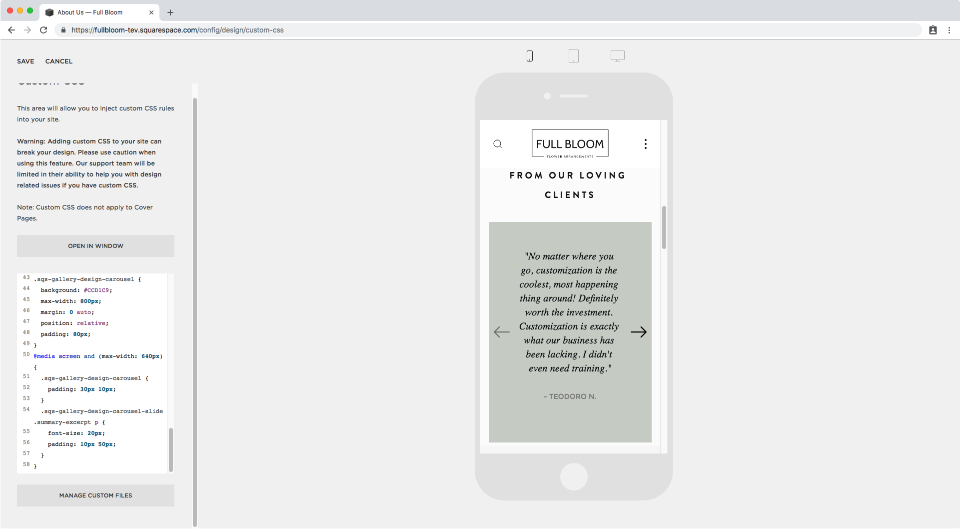
.sqs-gallery-design-carousel {

}
And I’ll just give it a nice green background.
.sqs-gallery-design-carousel {
  background: #CCD1C9;
}
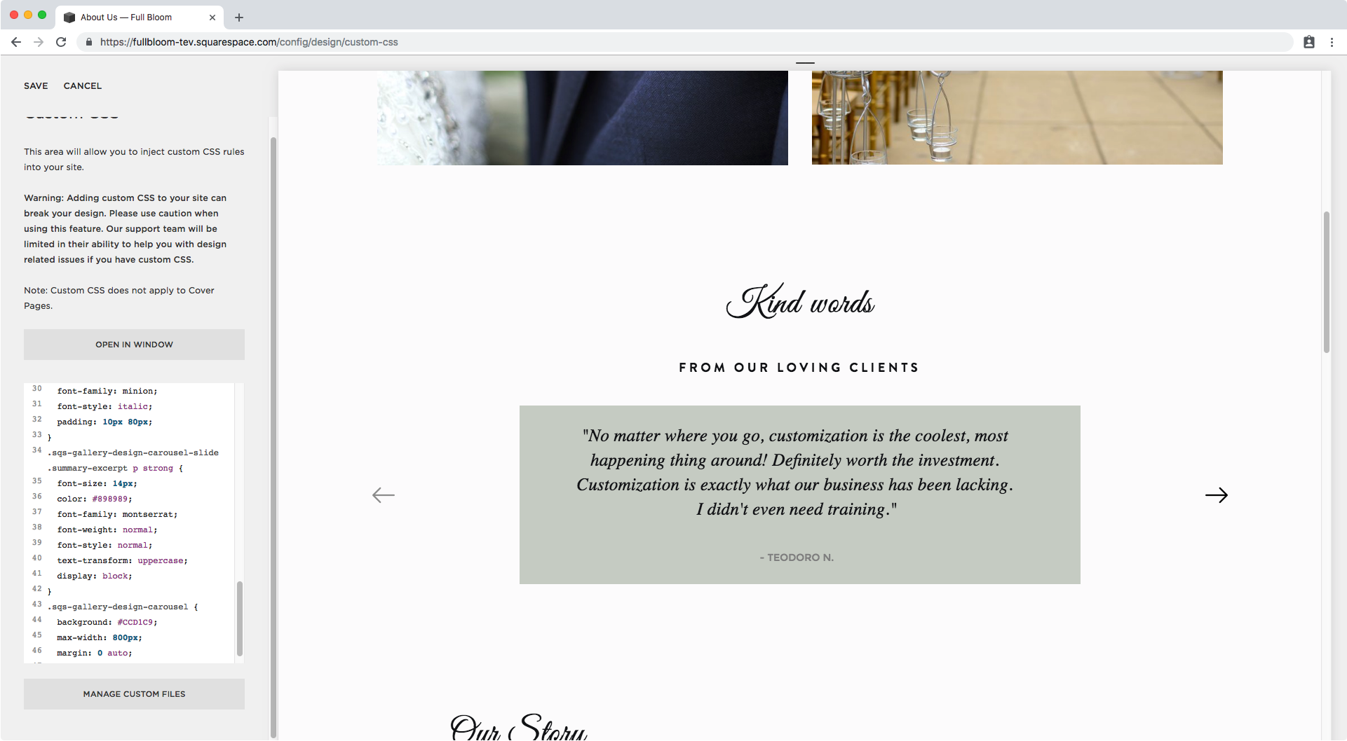
Next, let’s reduce the overall size of the container and set it to a max-width of about 800px and center it:
.sqs-gallery-design-carousel {
  background: #CCD1C9;
  max-width: 800px;
  margin: 0 auto;
}
Alright, now how about we place the arrows inside the green background?
To do it, we simply need to set this container as relative, so it acts as the parent container of reference for the arrow container.
.sqs-gallery-design-carousel {
  background: #CCD1C9;
  max-width: 800px;
  margin: 0 auto;
  position: relative;
}

Ok! Let’s add some additional padding for the green background.
.sqs-gallery-design-carousel {
  background: #CCD1C9;
  max-width: 800px;
  margin: 0 auto;
  position: relative;
  padding: 80px;
}

Nice! Let’s check mobile devices


It looks good in tablet but we have to do something about the padding and font size on phone screens, so let’s set up a media query to fix it!
@media screen and (max-width: 640px) {
  .sqs-gallery-design-carousel {
    padding: 30px 10px;
  }
  .sqs-gallery-design-carousel-slide .summary-excerpt p {
    font-size: 20px;
    padding: 10px 50px;
  }
}
Awesome!
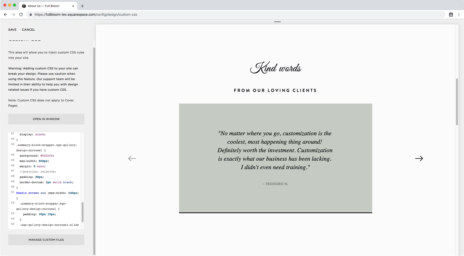
I want to do ooooone last customization to this.
I’ll be placing the arrows outside of the block again, by removing the position relative we gave to our green container:
.sqs-gallery-design-carousel {
  background: #CCD1C9;
  max-width: 800px;
  margin: 0 auto;
  padding: 80px;
}

And then adding the bottom border:
.sqs-gallery-design-carousel {
  background: #CCD1C9;
  max-width: 800px;
  margin: 0 auto;
  padding: 80px;
  border-bottom: 3px solid black;
}

We got two lines popping up instead of one, which means that the selector we’re using for our green container might not be specific enough.
We just couldn’t tell solely by the background color.
Let’s head back to our Inspect Element window to look for another class name that we can bundle up with our current one to make it clear we’re just targeting the big container, and not the one that seems to be for our individual slides.

Alright, we can use .summary-block-wrapper as well, so now our previous selector:
.sqs-gallery-design-carousel {

}
Becomes this instead:
.summary-block-wrapper.sqs-gallery-design-carousel {

}
And now we can simply replace this inside our code…
.summary-block-wrapper.sqs-gallery-design-carousel {
  background: #CCD1C9;
  max-width: 800px;
  margin: 0 auto;
  padding: 80px;
  border-bottom: 3px solid black;
}
And voilá!
That’s what it looks like with the arrows on the outside.
And this is what it looks like with the arrows on the inside:
.summary-block-wrapper.sqs-gallery-design-carousel {
  background: #CCD1C9;
  max-width: 800px;
  margin: 0 auto;
  position: relative;
  padding: 80px;
  border-bottom: 3px solid black;
}


Neat right?!
So there you have it, that’s how you can replace the carousel Summary Block arrows for your custom arrows and also style the heck out of your testimonials!
Until next time,
B.
Full code
/*Customizing the controls*/
.summary-carousel-pager {
  position: absolute;
  top: 50%;
  left: 0;
  transform: translateY(-50%);
  width: 100% !important;
  z-index: 1;
}
.sqs-block-summary-v2 .sqs-gallery-design-carousel .sqs-gallery-controls {
  display: flex;
  justify-content: space-between;
  position: absolute;
  top: 50%;
  left: 0;
  transform: translateY(-50%);
  width: 100%;
}
.sqs-gallery-design-carousel .sqs-gallery-controls .previous,
.sqs-gallery-design-carousel .sqs-gallery-controls .next {
  margin: 10px;
}
.sqs-gallery-design-carousel .sqs-gallery-controls .next:before,
.sqs-gallery-design-carousel .sqs-gallery-controls .previous:before {
  content: '';
  width: 32px;
  height: 32px;
}
.sqs-gallery-design-carousel .sqs-gallery-controls .next:before {
  background: url('image-url-goes-here');
}
.sqs-gallery-design-carousel .sqs-gallery-controls .previous:before {
  background: url('image-url-goes-here');
}

/*Styling the fonts*/
.sqs-gallery-design-carousel-slide .summary-excerpt p {
  font-size: 25px;
  font-family: minion;
  font-style: italic;
  padding: 10px 80px;
}
.sqs-gallery-design-carousel-slide .summary-excerpt p strong {
  font-size: 14px;
  color: #898989;
  font-family: montserrat;
  font-weight: normal;
  font-style: normal;
  text-transform: uppercase;
  display: block;
}

/*Styling the background*/
.summary-block-wrapper.sqs-gallery-design-carousel {
  background: #CCD1C9;
  max-width: 800px;
  margin: 0 auto;
  position: relative; /*remove to keep arrows outside of the box*/
  padding: 80px;
  border-bottom: 3px solid black;
}