How to create custom shapes for images in Squarespace (7.0, 7.1 CE & 7.1 FE)
Today's video is all about having fun creating custom shapes for images in Squarespace!
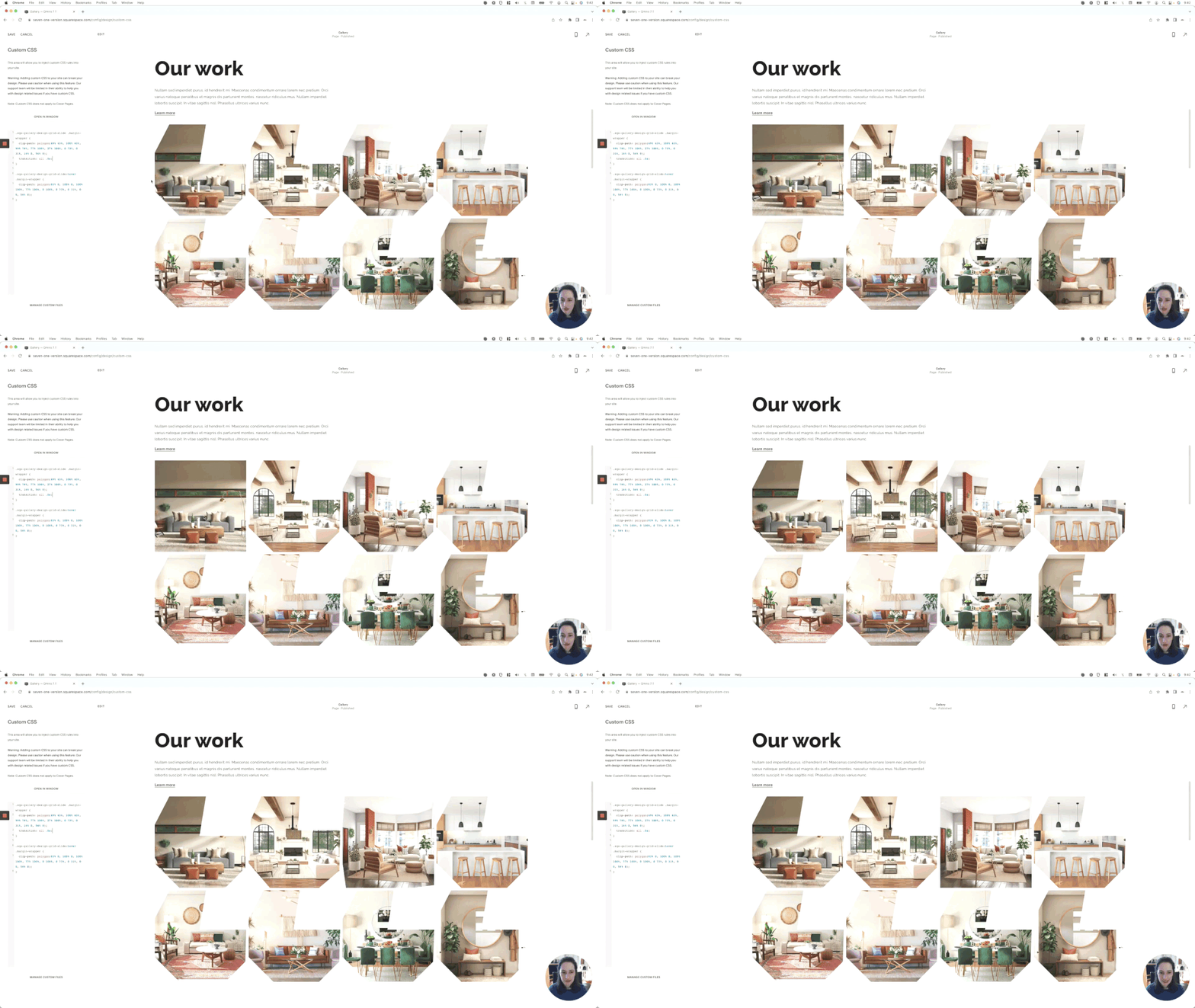
I'll be sharing with you an awesome online tool you can use to bring your ideas into code AND how to create hover modes with them to go from one shape to another!
We'll look at how the process works for Gallery Blocks in Squarespace 7.1, but you can implement the exact same customization on pretty much anything else you want on your project, on both 7.1 and 7.0.
I’m super pumped about this one so let’s dive right into it!
Tutorial
Overview & timestamps
00:00 - Intro
00:41 - To keep in mind to replicate the customization anywhere
Before we get started, note that even when I’ll be applying this CSS trick to Gallery Block slides in Squarespace 7.1, you can absolutely use this customization on any other element you have on the site! It’s a matter of looking for the right container to target in your situation.01:24 - Introducing the clip-path property
Alright, so with the example block in place, we’ll take a look at the property we’ll be using to be able to create custom shapes with CSS, i.e clip-path01:46 - How clip-path works
To be able to use it, we first need to understand how it works. You’ll see that it’s kinda like a Photoshop mask but for websites!02:12 - Looking for a container to target
With that information in mind, it’s time to look through our existing element to find an appropriate container to apply this mask and make sure that it’ll actually look the way we want it to.03:20 - Quick tip to avoid issues with the Gallery Block
It’s worth noting that, when possible, it’s always a good idea to avoid the img element itself. Otherwise, we may get some unwanted cropping in the final result.03:57 - Building a more specific selector
After making our decision, it’s time to build a selector that will ensure only the Gallery Block slides will get modified, and nothing else.04:47 - Basic values of the clip-path property
Next, we’ll take a look at some of the basic functions we can use with clip-path to start getting a good idea of what can be done with this awesome property.06:38 - Looking into a third and awesome value: polygon()
And now, it’s time to talk about the polygon( ) function, aka the one that’ll help us achieve lovely shapes in no time!06:56 - Understanding how the browser sees the polygon() coordinates
First, it’s important to understand how the coordinates we pass on to our browser work. Knowing this will make it much easier to create our own shapes from scratch, and have a better sense of how the following tool is doing that for us…09:09 - Introducing an AWESOME free online tool to create shapes
Get ready, because you’re about to meet your new best shape-creating friend in the CSS world: Clippy! This awesome tool is super user-friendly, completely free, and can help us build all those custom shapes we want to display on our client sites.10:13 - Playing with shapes in Squarespace
Starting out with something simple, we’ll just take a look at how we can use the predefined shapes and apply the corresponding code to our site in just a few clicks.11:07 - Keeping in mind the image ratio
Before moving on tho, it’s important to keep in mind that, in these cases, the image ratio DOES matter and influence the final shape.11:56 - Trying out more default shapes
We’ll try one more default shape here just to play around, before moving on to the good stuff…12:21 - Creating CUSTOM shapes in Squarespace
Ok, it’s time to create our first custom shape and apply it to our Gallery Block slides!13:43 - Quick tip to create straight lines
But make sure you don’t miss this golden nugget to help you create straight lines when making your own shapes.14:51 - Creating AMAZING hover modes with custom shapes in Squarespace
Now, it’s time to take things to the next level by looking into how we can create awesome hover modes that alternate between shapes!15:03 - Quick tip to make sure the hover mode works correctly
Just keep in mind this other golden nugget to ensure your animation looks super sleek!16:18 - Creating the hover mode shape
Starting out with our previous custom shape, we’ll see how we can turn it back into its original square shape by shifting the coordinates position inside Clippy, and using the new code under a hover mode snippet.17:23 - Playing with a second hover mode example
Now that we know the mechanics of it, let’s have fun with another example to make a chevron shape change its direction on hover!18:06 - Quick tip on increasing browser compatibility
And last but not least, we’ll finish out our custom shape customization by making sure a browser prefix is included to increase compatibility.
Well, how about that?!
Now you know not only how to create custom shapes for images in Squarespace, but also how to take things to the next level by creating shape-shifting hover modes as well.
Hope you enjoyed this one!
Until next time,
B.
Full code
/*HOW TO CREATE CUSTOM SHAPES FOR IMAGES IN SQUARESPACE (7.0 & 71.)*/
//Circle example
.sqs-gallery-design-grid-slide .margin-wrapper {
  clip-path: circle();
}

//Oval example
.sqs-gallery-design-grid-slide .margin-wrapper {
  clip-path: ellipse();
}

//Custom shape with hover mode example
.sqs-gallery-design-grid-slide .margin-wrapper {
  -webkit-clip-path: polygon(100% 0%, 75% 50%, 100% 100%, 25% 100%, 0% 50%, 25% 0%);
  clip-path: polygon(100% 0%, 75% 50%, 100% 100%, 25% 100%, 0% 50%, 25% 0%);
  transition: all .5s;
}
.sqs-gallery-design-grid-slide:hover .margin-wrapper {
  -webkit-clip-path: polygon(75% 0%, 100% 50%, 75% 100%, 0% 100%, 25% 50%, 0% 0%);
  clip-path: polygon(75% 0%, 100% 50%, 75% 100%, 0% 100%, 25% 50%, 0% 0%);
}

