
Creating big category thumbnails with a rollover effect (Brine 7.0)

I love all the customizations I’ve shared with you on this blog but I’m particularly excited about this one because it’s one of my absolute favorites!
Today we’re going to be taking advantage of the grid layout of an Index Gallery to create big and bold category thumbnails that you can use to showcase your different service packages, blog categories, photo galleries, or pretty much anything else you want!
So without further ado, let’s get to it.
Adding a rollover effect to your grid Index Gallery
I’m going to start with a 4-image gallery, where each of the images has a title, a description and a link.


Regarding the settings inside the Style Editor, the ones you’ll need to avoid having to make major adjustments to the code are:
Layout: Grid
Hover Style: Plain
As for the rest of them, feel free to use the same I used for this tutorial or experiment with different ones to suit your needs.
These are all of mine (click to enlarge):
Ok, we pretty much have the “normal“ style of our thumbnails ready to go, so let’s take care of the rollover effect to make all the text appear only on hover.
To achieve this, we’re going to need to target the container holding all our text.
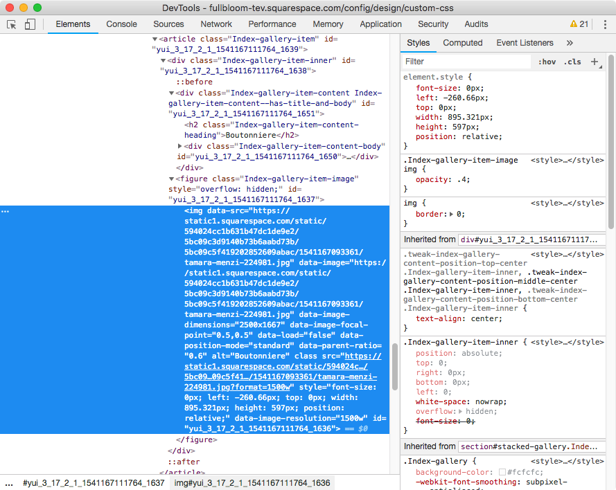
Let’s take a look through Inspect Element:

Alrighty, zooming in…

We can see our text container has two classes, however we can go with just the first one: .Index-gallery-item-content
Notice on the right sidebar that Squarespace is already using it to set styles for the container and the text inside it!
I’m going to be targeting that class then, along with the URL slug of my entire gallery section since I don’t want any other gallery to be affected.
#stacked-gallery .Index-gallery-item-content {

}
Ok so regarding the effect, I think it would be cool for the text to seem like it’s coming down from the top of the thumbnail.
To achieve this we need to place it higher up in its “normal state“ and then bring it back into place on hover, without moving anything else around.
This can be easily achieved through the transform property, so let’s use that:
#stacked-gallery .Index-gallery-item-content {
  transform: translateY(-10%);
}

Not sure if you can notice but the text moved slightly upwards, it’s not in the center anymore.
Perfect!
Note: you can also make it look like the text is rising from the bottom of the thumbnail by using a positive value instead (10% in this example)!
Alright, let’s test this out shall we?
What we want is that when someone hovers over the ENTIRE thumbnail, the text moves downwards to get back into the center of the thumbnail.
Therefore, let’s look for a way to target our entire thumbnail container.


See how we have 4 of those article elements?
Those are our 4 thumbnails, so let’s use the class associated to them, .Index-gallery-item, to create our hover mode!
We want to tell our browser to bring back our text container to the initial position – zero – when we hover over its corresponding thumbnail (.Index-gallery-item), inside our gallery index section, so:
#stacked-gallery .Index-gallery-item:hover .Index-gallery-item-content {
  transform: translateY(0);
}

Awesome!!
Now, I don’t know about you but I’d like a smoother effect here.
So let’s use the transition property to make that happen! We’ll add it to our normal-state snippet:
#stacked-gallery .Index-gallery-item-content {
  transform: translateY(-10%);
  transition: transform .5s ease-out;
}


Wonderful! This looks amazing!
Ok, we can now take care of removing the text from the normal state and having it show up on hover (which along with the movement will make it look like the text is appearing from the top!).
Going back to our normal-state snippet, we’re going to set the opacity to 0 in there so the text isn’t visible when you first see the thumbnails:
#stacked-gallery .Index-gallery-item-content {
  transform: translateY(-10%);
  opacity: 0;
  transition: transform .5s ease-out;
}

Right, now let’s bring back the opacity to 1 inside our :hover state:
#stacked-gallery .Index-gallery-item:hover .Index-gallery-item-content {
  transform: translateY(0);
  opacity: 1;
}

And to make things smoother, we’re going to be adding a bit of a transition for the opacity property as well inside our initial state snippet:
#stacked-gallery .Index-gallery-item-content {
  transform: translateY(-10%);
  opacity: 0;
  transition: transform .5s ease-out, opacity .5s;
}


Love it!
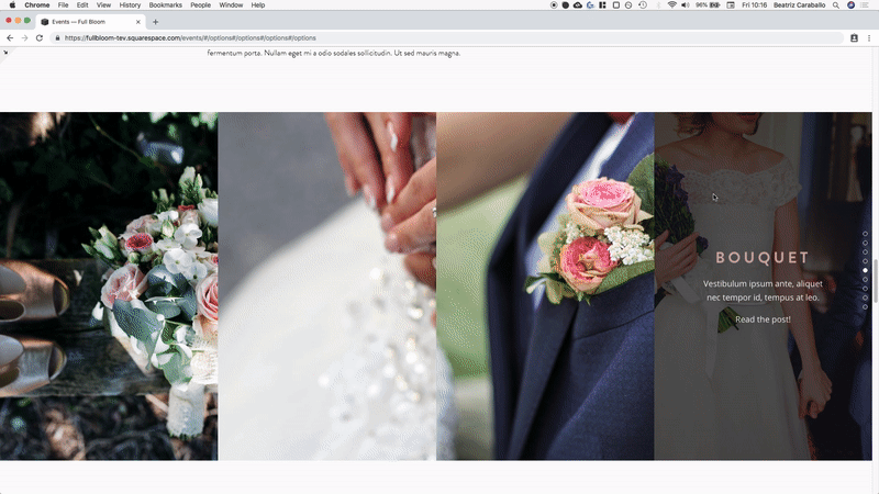
Now, you can leave it like this if you like, however I want to take the effect one step further by having the background overlay change with the hover!
Changing the overlay on hover for the grid Index Gallery
What I want to do here is have the original dark semi transparent overlay show up only on hover along with the text, and in normal state just have the image in its full glory.
Now, Squarespace offers overlays for a couple of blocks/elements that can be set through the Style Editor.
However, they’re not all built the same way.
Some overlays are actual containers or divs that sit in front of the image, but in other cases it’s a “fake” overlay because its the background that shows up through an image with lower opacity.
In the case of grid Index Galleries, we’re dealing with the latter – at least when se to Plain hover mode.
That being said, let’s take a look at what we’re going to do!
If we target the image inside one of our thumbnails…

And we take a close look at the styles on the right side that Squarespace gave that image…

We can see that the opacity has been set to .4.
That’s why we can see the so called overlay (aka the thumbnail background) we previously set inside our Style Editor.
So, that’s how we can finish up our effect!
We’ll use that image selector and bring the opacity to 1 in our normal thumbnail state:
#stacked-gallery .Index-gallery-item-image img {
  opacity: 1;
}
And then bring it back down to .4 when hovering over the entire thumbnail.
Let’s also add a bit of a transition for that change:
#stacked-gallery .Index-gallery-item-image img {
  opacity: 1;
  transition: opacity .5s;
}
#stacked-gallery .Index-gallery-item:hover .Index-gallery-item-image img {
  opacity: .4;
}
Ta-dá!
That looks fantastic my friend!
Since we’re here, why not style the link inside our text a bit? Make it look more like a clickable thing.


I’ll simply target the a element inside the description of our text container like we have on the right side of our Inspect Element window:

And then set the text container temporarily opaque again to be able to see how my new styles will look:
#stacked-gallery .Index-gallery-item-content-body a {
  text-transform: uppercase;
  font-size: .7em;
  font-family: montserrat;
  font-weight: bold;
}

Alright! How about we include a small arrow next to that link?
We can use a super simple pseudo-element for that:
#stacked-gallery .Index-gallery-item-content-body a::after {
  content: '→';
}

Good! I’ll set back the opacity to 0 for our text container to take a look at the full effect!

Great!
Now, there’s something that’s been bugging me that I want to take care of.
You may not have this issue depending on the settings for the size of your text container and title font size, but just in case!
I noticed that the word “Boutonniere“ is overflowing its thumbnail, so I’m going to add the hyphens property to the text container so it breaks as necessary.
#stacked-gallery .Index-gallery-item-content {
  transform: translateY(-10%);
  opacity: 0;
  transition: transform .5s ease-out, opacity .5s;
  hyphens: auto;
}

Much better!
Let’s check out these thumbnails on smaller screens.

Ok, so this looks weird as it is.
Since there’s no way to bring up the hover effect on touch devices (unless pressing and holding) it will make more sense if we simply show the entire content on these screens and keep the rollover effect only for desktop users.
We can use a media query that starts around tablet size to switch back the position to the center of the container and flip the overlay opacity back to .4
@media screen and (max-width: 960px) {
  #stacked-gallery .Index-gallery-item-content {
    transform: translateY(0);
    opacity: 1;
  }
  #stacked-gallery .Index-gallery-item-image img {
  opacity: .4;
  }
}


And then we simply keep the effect on desktop:

So there you go!
You can now go and create a rollover effect for the text of your grid Index Gallery to create awesome-ly bold thumbnails for your categories, packages, galleries, etc!
Until next time,
B.
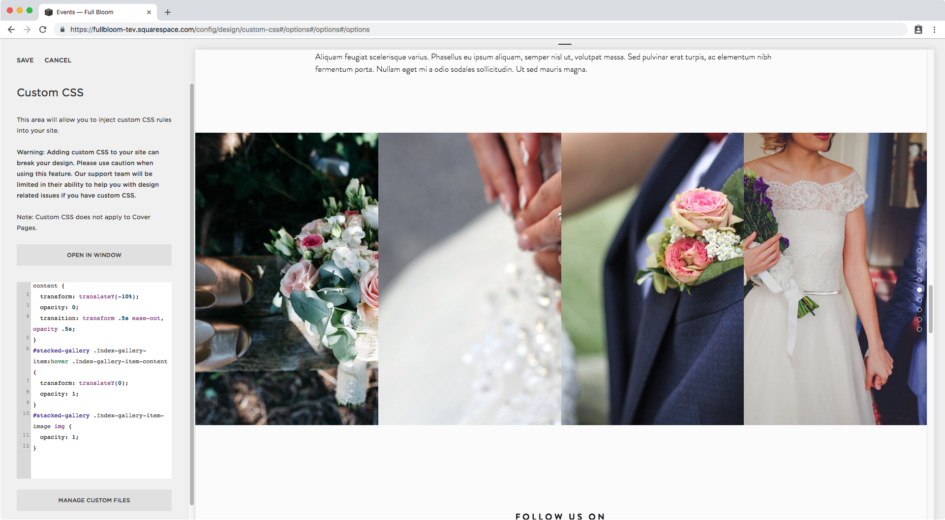
Full code
/*Creating the overlay text hover mode*/
#stacked-gallery .Index-gallery-item-content {
  transform: translateY(-10%);
  opacity: 0;
  transition: transform .5s ease-out, opacity .5s;
  hyphens: auto;
}
#stacked-gallery .Index-gallery-item:hover .Index-gallery-item-content {
  transform: translateY(0);
  opacity: 1;
}

/*Creating the overlay bg hover mode*/
#stacked-gallery .Index-gallery-item-image img {
  opacity: 1;
  transition: opacity .5s;
}
#stacked-gallery .Index-gallery-item:hover .Index-gallery-item-image img {
  opacity: .4;
}

/*Styling the link inside the text*/
#stacked-gallery .Index-gallery-item-content-body a {
  text-transform: uppercase;
  font-size: .7em;
  font-family: montserrat;
  font-weight: bold;
}
#stacked-gallery .Index-gallery-item-content-body a::after {
  content: '→';
}

/*Mobile styles to showcase overlay*/
@media screen and (max-width: 960px) {
  #stacked-gallery .Index-gallery-item-content {
    transform: translateY(0);
    opacity: 1;
  }
  #stacked-gallery .Index-gallery-item-image img {
  opacity: .4;
  }
}