Adding a fixed background to your Squarespace site
Have you ever seen those gorgeous site examples where everything seems to just float on top of the background image while scrolling?
Well, if you’ve been inspired by them at some point and would like to implement the look in your client’s design, today’s tutorial is for you!
Here’s what we’ll end up with:
So, if you’re interested in finding out how to make this happen for your client, keep reading!
Design setup
We’ll be working with one of the templates from the Brine family, and using an index to create our sections.
The layout I have as an example has a couple of sections with some text and no banner backgrounds:
Reasoning and initial code
To create our effect, we’ll be adding a background image to the entire body of our site.
This will make the image show up behind our header and footer, if we want to.
Now, we’re not going to add it directly to the body element, instead we’ll be creating a pseudo-element to hold it.
The reason behind this is that if we want the image to stay put on scroll, we need to fix it to the background somehow.
A quick way to do that is by using the background-attachment property when setting a background image via CSS, but the problem is that the final result seems to be inconsistent for different browsers, particularly mobile browsers, so your background may not behave the way you want it to all the time if you take this route (you can learn more about its browser compatibility here).
And, since we can’t fix the whole body element without messing up our site’s layout, a better solution is to use a pseudo-element.
So, that being said, let’s target our body container and create a ::before pseudo-element so it sits behind all of our site’s content:
body::before {

}
Ok, and now we’ll need to set up a basic pseudo container, with an empty content property, and a height and width of 100%:
body::before {
  content: '';
  height: 100%;
  width: 100%;
}
Next, we’ll also have to set it to position absolute to place it and fit it over our body container.
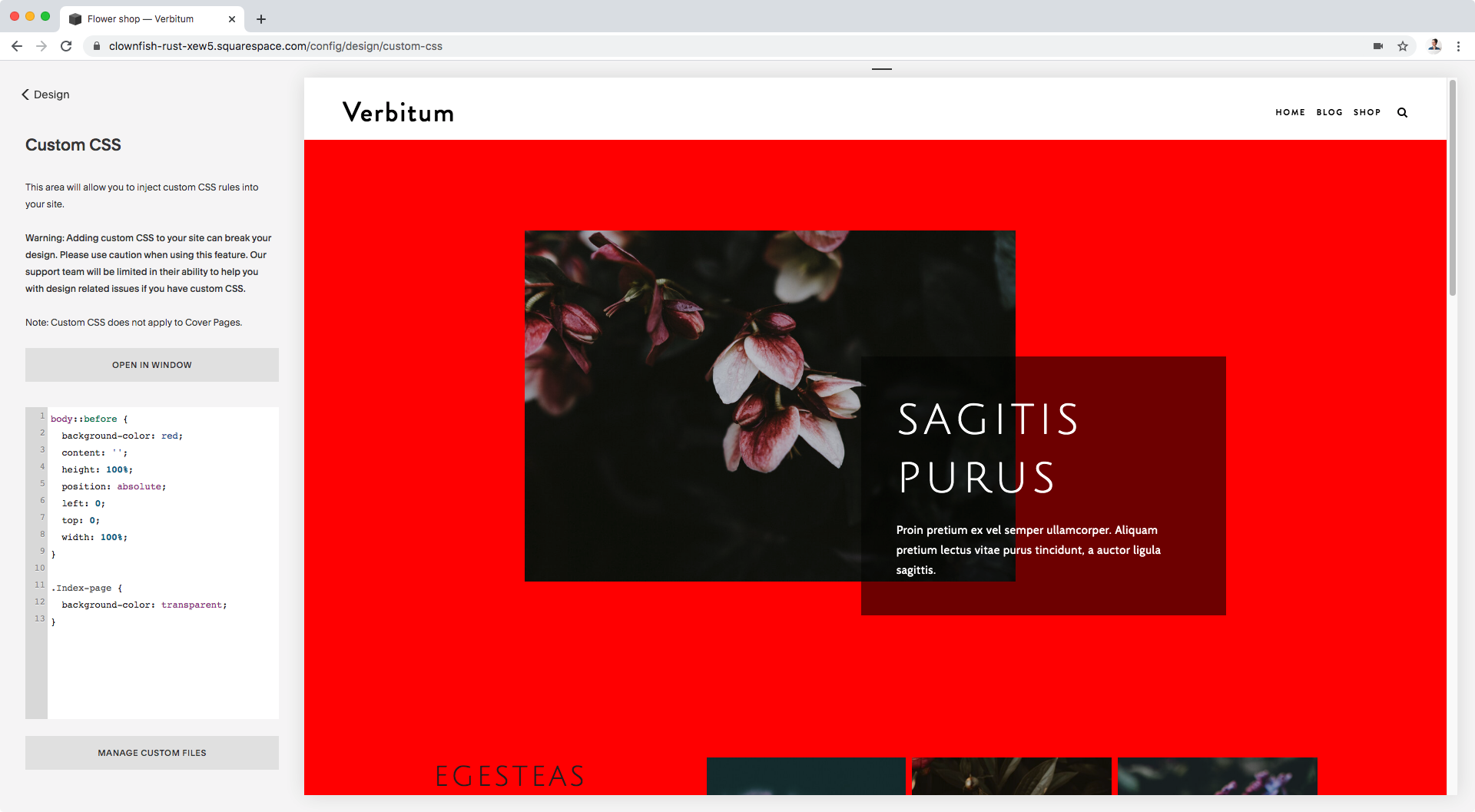
I’ll also give it a temporary color so we can check it out:
body::before {
  background-color: red;
  content: '';
  height: 100%;
  position: absolute;
  left: 0;
  top: 0;
  width: 100%;
}
Aaaaaaaand of course, nothing’s happening… or is it?
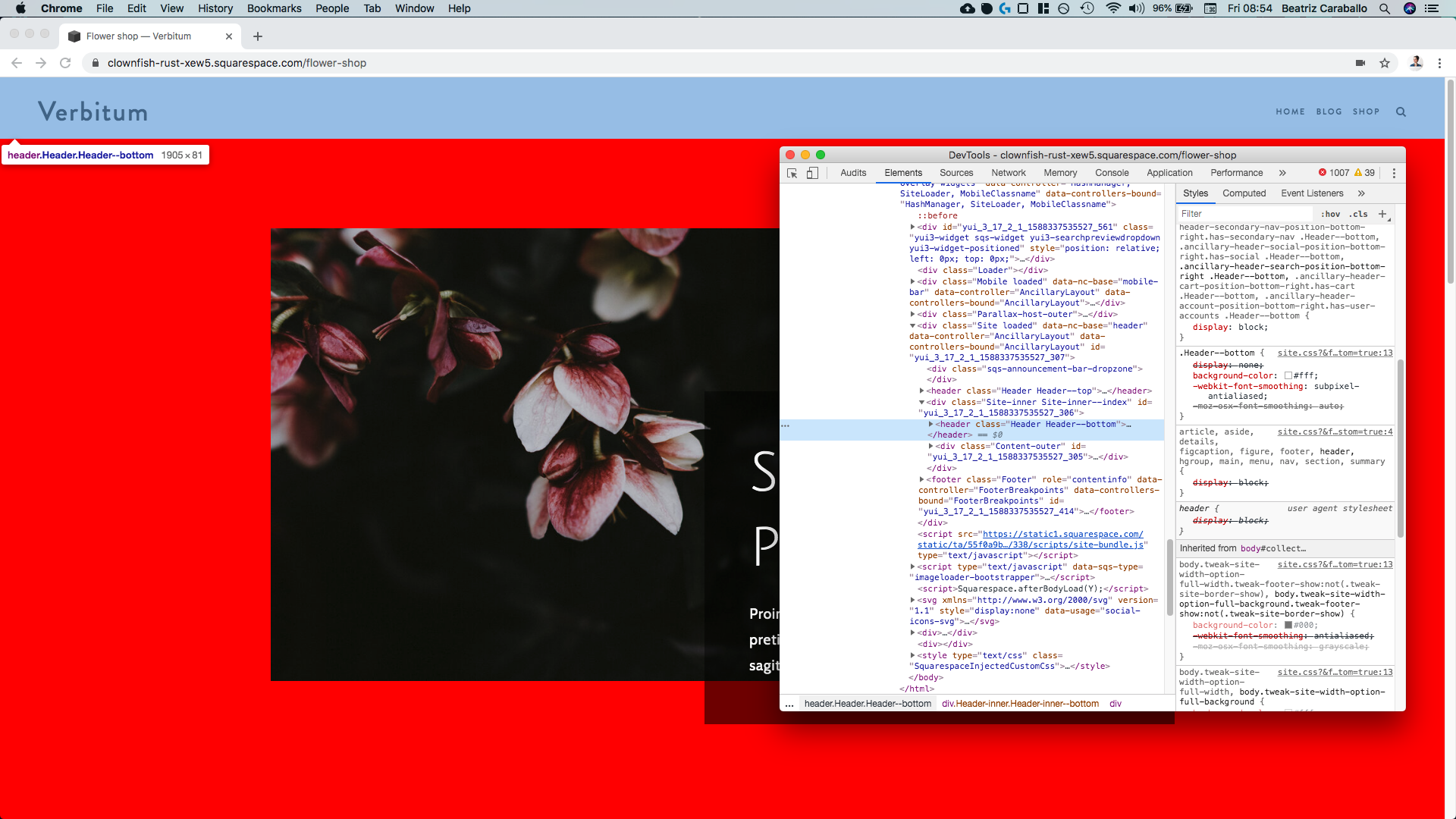
If we check with our handy dandy Inspect Element tool, we can see that our Index sections have a white background:
And, since the background we’re adding is sitting behind our sections, the white color isn’t letting us see it.
So, let’s remove it for all of our sections by using their common class .Index-page:
.Index-page {
  background-color: transparent;
}
Heck yeah!
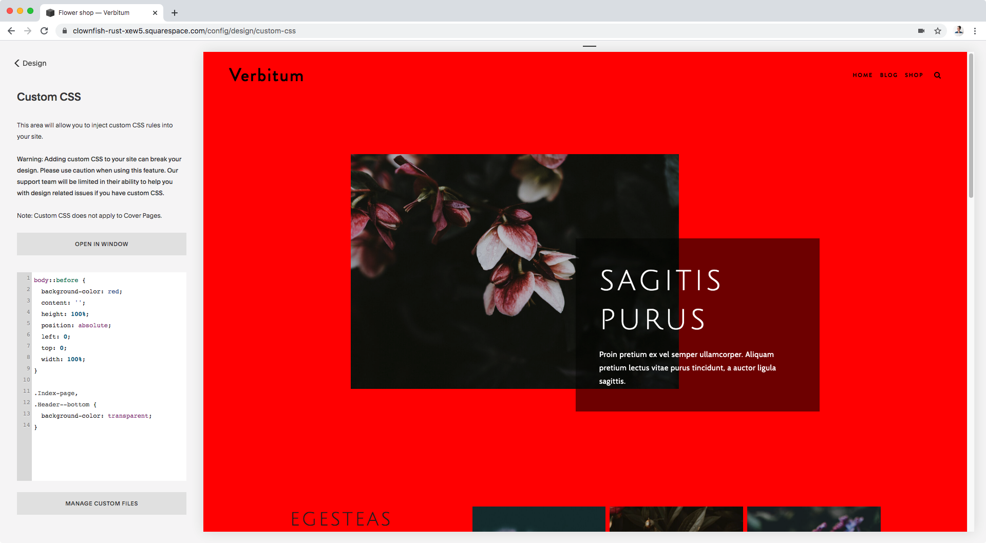
Ok, now we can choose here if we want to remove the background color of our header or not.
The red background is still sitting behind it because of its position inside our HTML, so if we make it transparent we’ll see it.
Personally, I want the image to show. Therefore, I’ll target my header and set its background to transparent as well, by grouping its selector with the .Index-page one.
My header is a bottom header…
…so I’ll target it with .Header--bottom:
.Index-page,
.Header--bottom {
  background-color: transparent;
}
Perfect!
We’re all set to bring out our image.
Adding our background image
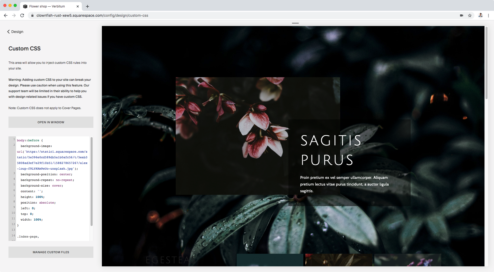
Let’s remove that red background color and use background-image instead to set our image URL:
body::before {
  background-image: url('https://static1.squarespace.com/static/5e396e0cd589db5a1b0afc56/t/5eab35808ad3ef7e29f10b51/1588278657267/alex-loup-f9LYKKm9eUo-unsplash.jpg');
  content: '';
  height: 100%;
  position: absolute;
  left: 0;
  top: 0;
  width: 100%;
}
Cool!
Now, we need to set a couple more properties to make it look good because it’s all stretched out and weird at the moment.
I’ll be making mine a single image without repetition, as big as it can get to cover the whole area, and centered:
body::before {
  background-image: url('https://static1.squarespace.com/static/5e396e0cd589db5a1b0afc56/t/5eab35808ad3ef7e29f10b51/1588278657267/alex-loup-f9LYKKm9eUo-unsplash.jpg');
  background-position: center;
  background-repeat: no-repeat;
  background-size: cover;
  content: '';
  height: 100%;
  position: absolute;
  left: 0;
  top: 0;
  width: 100%;
}
Much better!
Let’s take a look:
Alrighty!
So, the image is definitely not covering the whole body area because it’s most likely not using the body element as its reference point to set the 100% height.
Note: remember that when using position absolute, the element looks for a parent or ancestor element with a defined position to use as reference for its placement and size!
However, that doesn’t matter to us because we want the image to be fixed in the background, therefore we will be changing its absolute position anyways.
We’ll be using fixed instead.
So:
body::before {
  background-image: url('https://static1.squarespace.com/static/5e396e0cd589db5a1b0afc56/t/5eab35808ad3ef7e29f10b51/1588278657267/alex-loup-f9LYKKm9eUo-unsplash.jpg');
  background-position: center;
  background-repeat: no-repeat;
  background-size: cover;
  content: '';
  height: 100%;
  position: fixed;
  left: 0;
  top: 0;
  width: 100%;
}
Whoop! Will you look at that?
Our image is now fixed and set as the whole background!
Fixing details
If you’re happy with the way your design looks, then you’re done!
However, I noticed that my footer doesn’t have a background color anymore and I’d like to change that.
All we have to do here, is push our background image further back “into” our monitors, so that everything else sits in front of it, including our footer background (just like it was happening for the white background for our Index sections!).
To achieve that, we’ll make use of a negative z-index value:
body::before {
  background-image: url('https://static1.squarespace.com/static/5e396e0cd589db5a1b0afc56/t/5eab35808ad3ef7e29f10b51/1588278657267/alex-loup-f9LYKKm9eUo-unsplash.jpg');
  background-position: center;
  background-repeat: no-repeat;
  background-size: cover;
  content: '';
  height: 100%;
  position: fixed;
  left: 0;
  top: 0;
  width: 100%;
  z-index: -10;
}
Perfect!
Now, I’ll just change the color of the header font through my Site Styles:
And then the color of the text and headings of my index sections via CSS:
#about h1,
#about p {
  color: white;
}
Awesome!
Playing with opacity
Now, I feel my image is looking too busy and clashing with the text and floating images.
So, I have 2 options:
Edit the image in Photoshop and add a color overlay to dim down the business.
Alter the image’s opacity with CSS.
Both routes achieve the same result, but I’ll be using CSS just because.
So, what we need to do is simply set a new opacity value for our pseudo-element, like so:
body::before {
  background-image: url('https://static1.squarespace.com/static/5e396e0cd589db5a1b0afc56/t/5eab35808ad3ef7e29f10b51/1588278657267/alex-loup-f9LYKKm9eUo-unsplash.jpg');
  background-position: center;
  background-repeat: no-repeat;
  background-size: cover;
  content: '';
  height: 100%;
  opacity: .2;
  position: fixed;
  left: 0;
  top: 0;
  width: 100%;
  z-index: -10;
}
Much better, right?
And then, to switch up the overlay color we can rely on our Site Styles!
However, the color will need to be changed in two different ways depending on the layout.
If we DON’T have a banner image on our page, or if we do have one but WITHOUT parallax on, then we can change the overlay color by adjusting the Footer Background Color (of course, this will also alter the color of the footer):
If we DO have a banner image somewhere on our page AND have parallax on, then we have to change the Main Color:
And that’s it!
That’s how you can set up an awesome fixed background for your client sites.
Until next time,
B.
Full code
Squarespace 7.1
Custom CSS Window
/*ADDING A FIXED BACKGROUND TO YOUR SQUARESPACE SITE (7.1)*/
body::before {
  background-image: url('YOUR-IMAGE-HERE.PNG');
  background-position: center;
  background-repeat: no-repeat;
  background-size: cover;
  content: '';
  height: 100%;
  opacity: .2;
  position: fixed;
  left: 0;
  top: 0;
  width: 100%;
  z-index: -10;
}

.page-section,
.page-section .section-background {
  background-color: transparent !important;
}
Squarespace 7.0
Custom CSS Window
/*ADDING A FIXED BACKGROUND TO YOUR SQUARESPACE SITE (7.0)*/
body::before {
  background-image: url('YOUR-IMAGE-HERE.PNG');
  background-position: center;
  background-repeat: no-repeat;
  background-size: cover;
  content: '';
  height: 100%;
  opacity: .2;
  position: fixed;
  left: 0;
  top: 0;
  width: 100%;
  z-index: -10;
}

.Index-page,
.Header--bottom {
  background-color: transparent;
}

#about h1,
#about p {
  color: white;
}


