
Overlapping a block between 2 index sections (Brine 7.0)

If you’re working with indexes in Squarespace, you may be wondering how the heck to make your blocks float between two of the sections.
We’ve covered how to achieve that illusion by using a background gradient in a previous post, however, as always, that’s not the only way to do it.
So, if you don’t want to use that background trick and want to know how to truly MOVE your blocks around so they overlap between two index sections, stick around ‘cause that’s exactly what we’ll be doing today!
For the sake of this tutorial, we’ll be focusing on moving a block that’s in the bottom section of 2 index sections.
Overlapping a block between index sections using a fixed value
We’re starting out with the following index layout, where we have some text and a button on the top section, and a poster image block plus some more content on the bottom section:

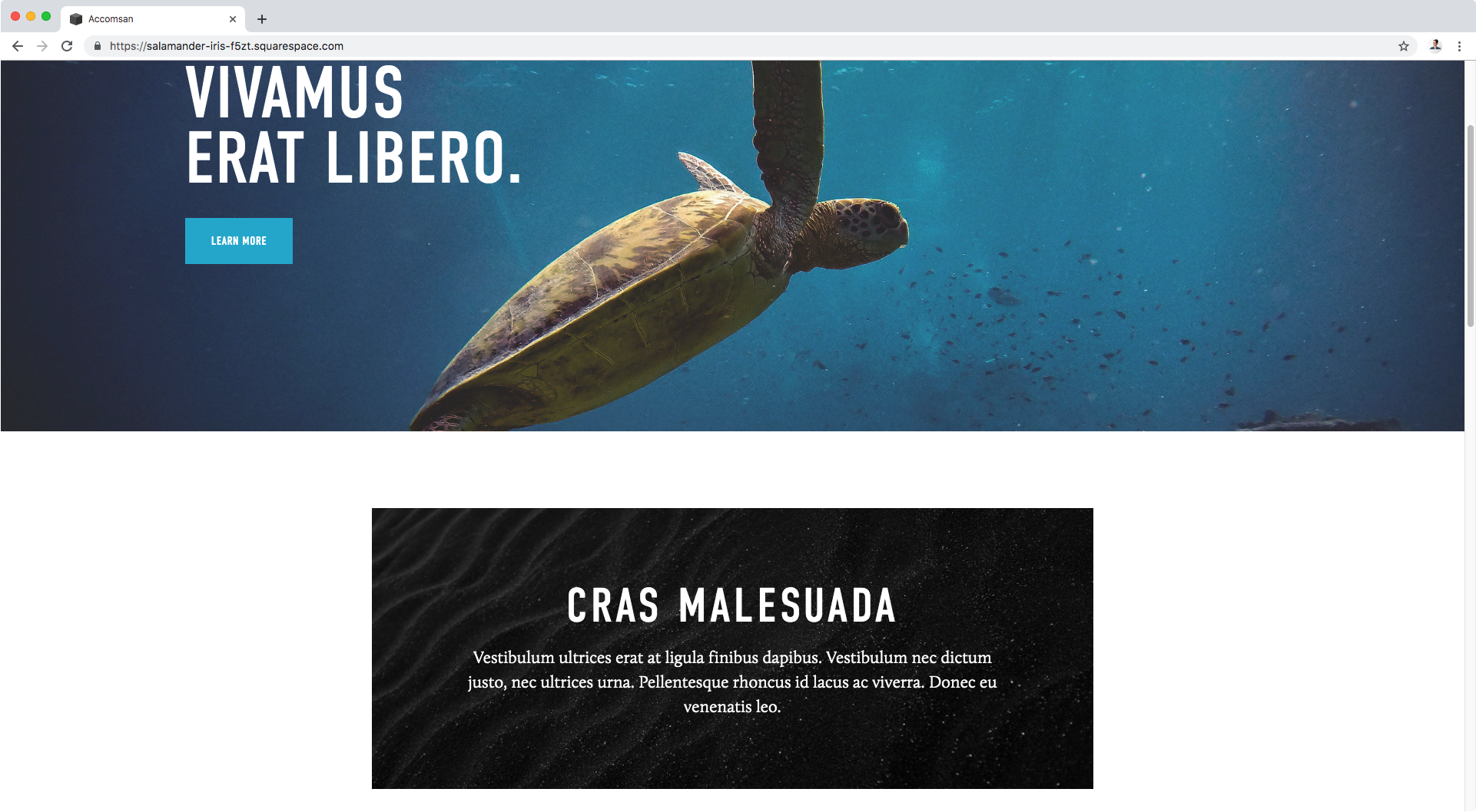
We’re going to be making that black poster block overlap between the top banner image and the white background of its section.
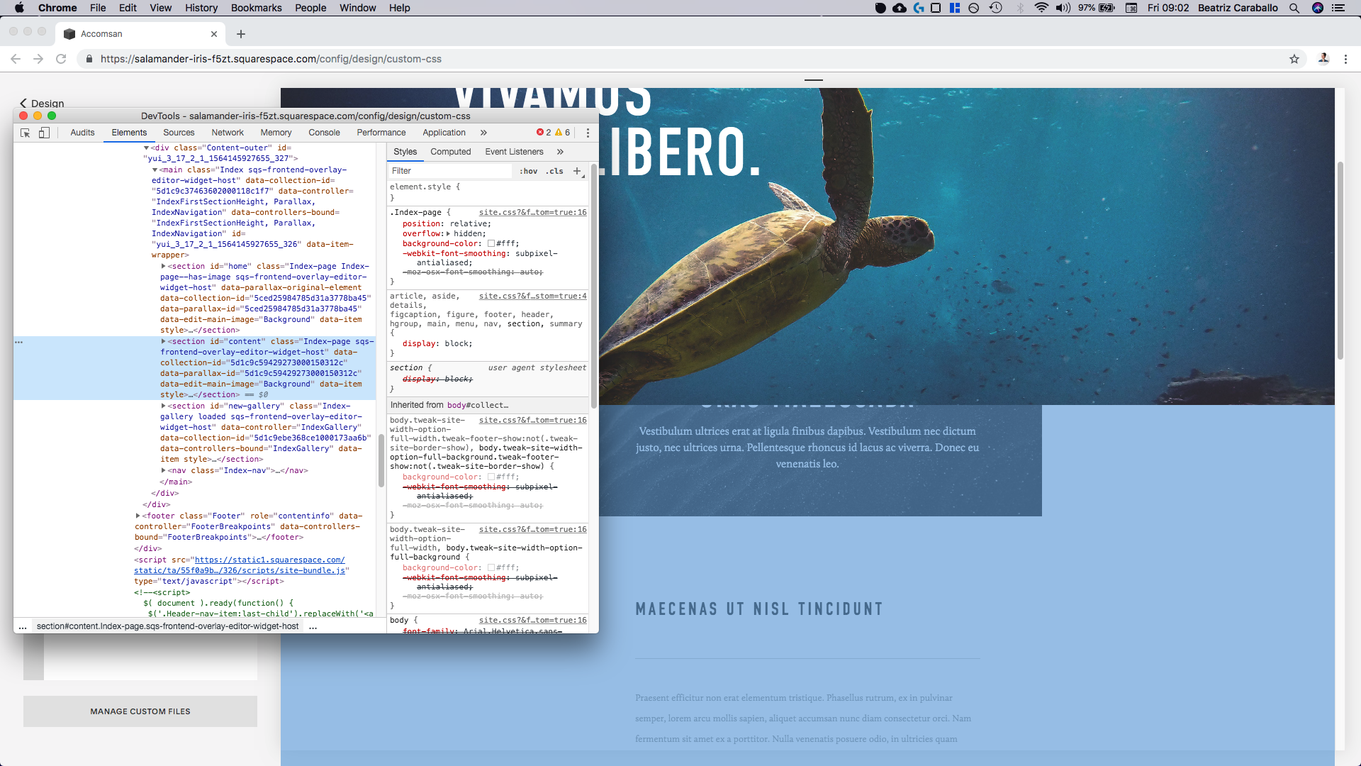
The first thing we need to do is find out what our poster block is called, so we can target it via CSS.
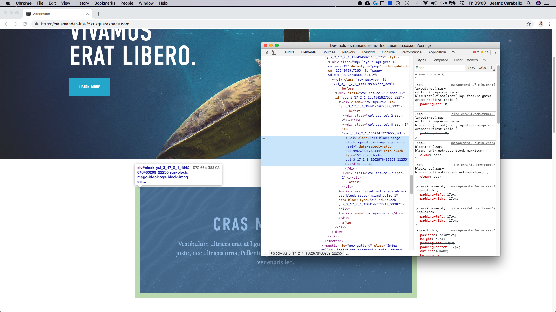
Let’s take a closer look at our Inspect Element window:

Since we only have one poster block inside this area, we could target it through one of its classes along with the ID of our index section (to make sure no other poster block gets altered on our site), but to keep things simple we’ll be using the block’s ID instead.
This one is called #block-yui_3_17_2_1_1562678483269_22255
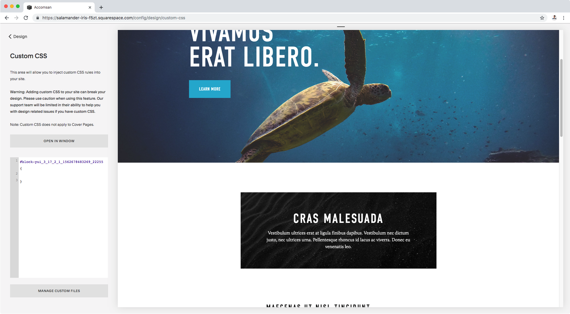
Let’s plop that selector in our Custom CSS window!
#block-yui_3_17_2_1_1562678483269_22255 {

}
Now, what we want to do is move it upwards.
We can use margin-top for this, setting a negative number that’s going to “pull” it towards the top banner:
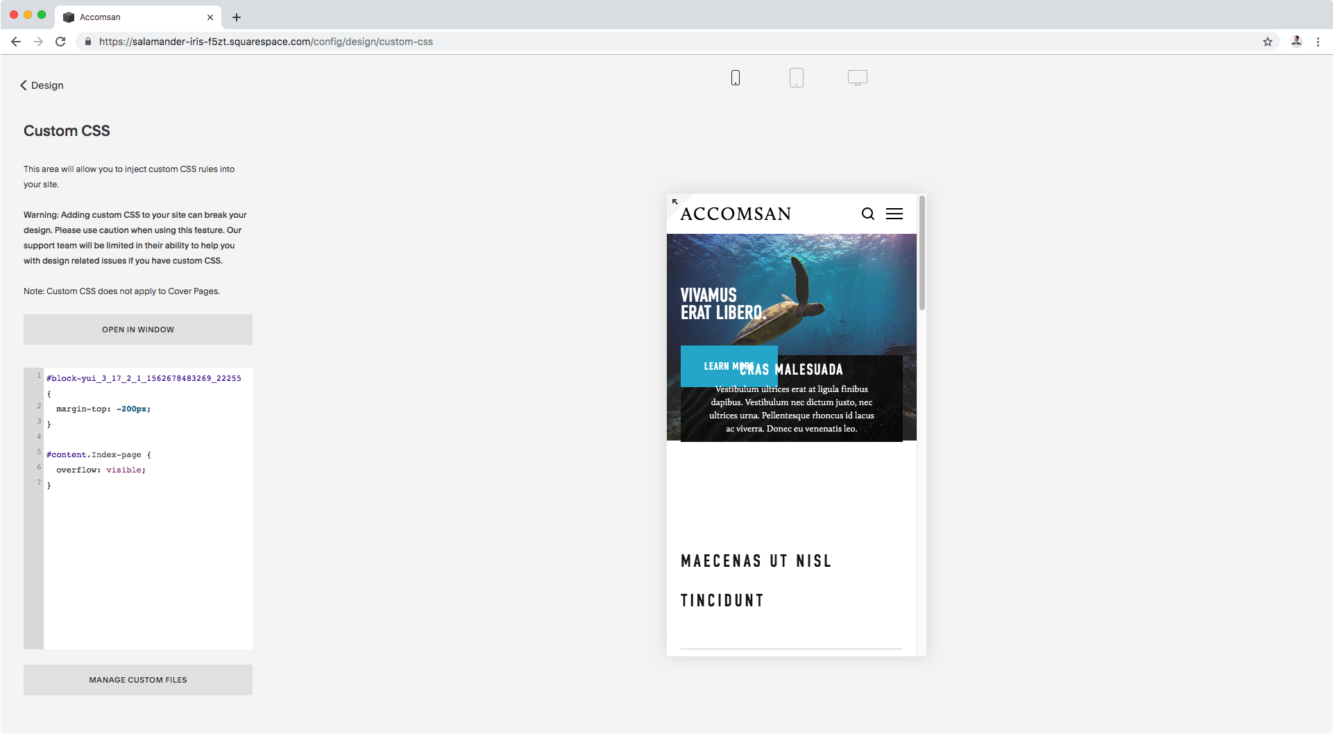
#block-yui_3_17_2_1_1562678483269_22255 {
  margin-top: -200px;
}
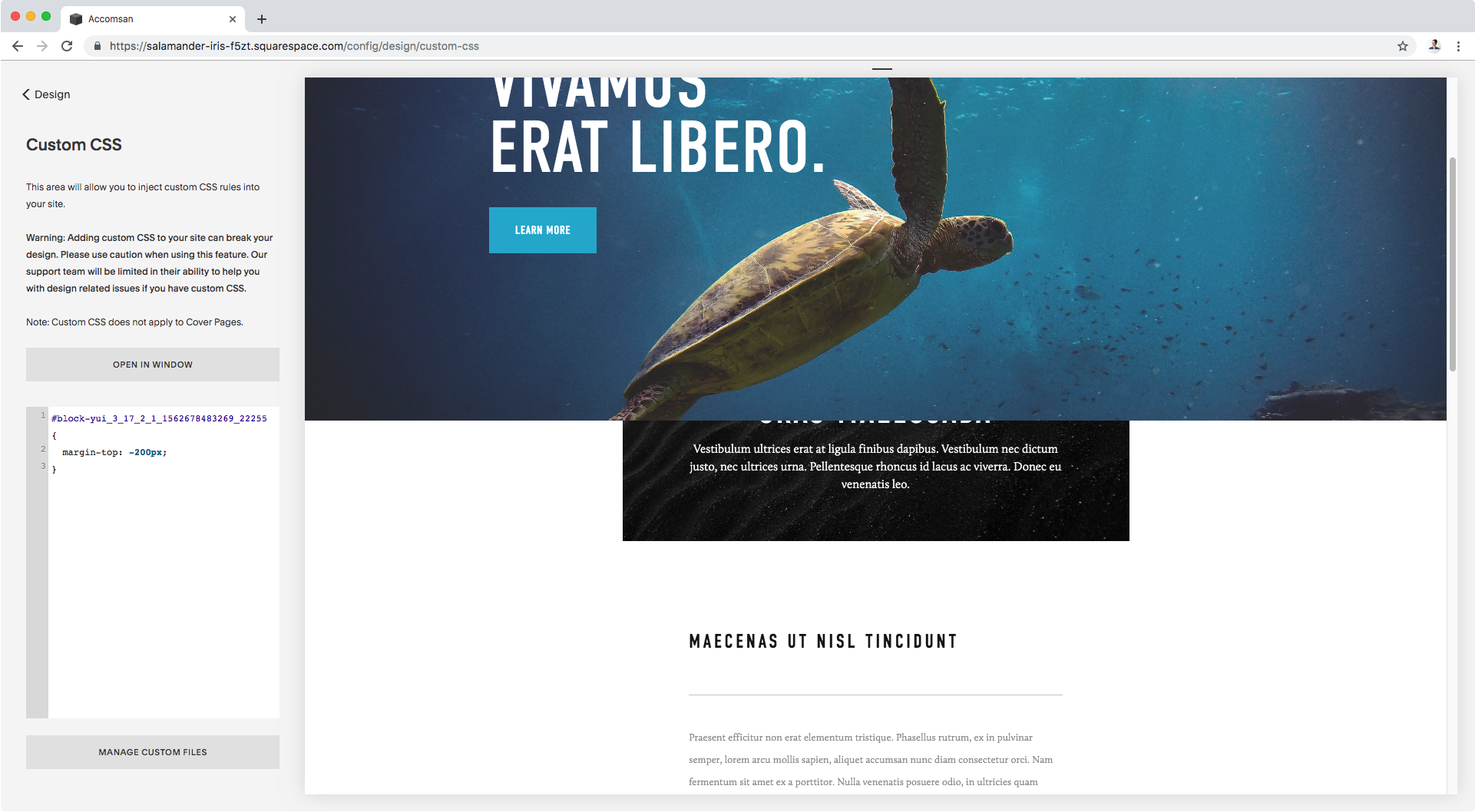
Well, ok.
That definitely did the trick but the block seems to be getting cut off.
Whenever this happens, there are usually 2 things that could be the cause:
The container that’s holding our content on the bottom section has been set to hide any overflowing elements that could expand beyond its boundaries.
The element you’re moving is getting covered by another element that’s “in front” of it, thanks to a difference in their z-index. In this case, it could be that the top section has a higher z-index (as if it’s been brought forward towards you from the depths of your screen) than our poster block, effectively covering part of it.
Let’s check out the overflowing hypothesis first.
What we need to do is see if there’s a parent or ancestor container holding our content that has explicitly been set to overflow: hidden to cut off any elements that could overstep its boundaries.
Starting with our entire bottom section container…

We can see it has been, in fact, set to overflow: hidden
Bingo!
All we have to do then is target this section container and set it to visible.
The current property has been set for the .Index-page class (as you can see on the right side where the declaration has been highlighted), which is one of the classes for our section.
We can use that class, along with the ID of the section (#content in this case) to make sure we don’t alter any other index page!
Note: you could use the ID #content on its own, without the class! But in this case since we’re using both, and they belong to the same element (ie. the section), there must be NO SPACES between the selectors.
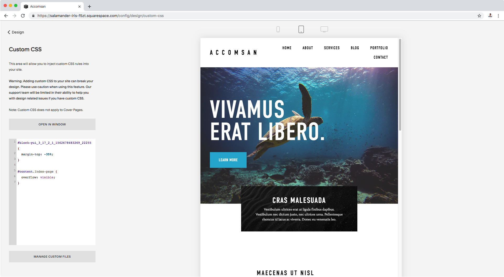
#content.Index-page {
  overflow: visible;
}

Perfect!
Our poster block is now completely visible AND overlapping both index sections!
Let’s check this out on tablet:

Cool, cool.
And on phones?
Ok, things get a bit messed up here.
Let’s create a media query for screens smaller than 640px to tweak the margin value:
@media screen and (max-width: 640px) {
  #block-yui_3_17_2_1_1562678483269_22255 {
    margin-top: -100px;
  }
}

Alright! Awesome!
Overlapping a block between index sections using a relative value
Ok, now what if instead of using a fixed pixel number we make things more relative.
Let’s do exactly the same thing we did before, but change the margin-top from pixels to percentage:
#block-yui_3_17_2_1_1562678483269_22255 {
  margin-top: -35%;
}
#content.Index-page {
  overflow: visible;
}

That’s about the same position as before, let’s check tablets!
Nice! And phone screens?

Perfect!
We don’t even need to set a media query for this. Win!
Overlapping a block between index sections using a different property
I don’t know if you noticed but by using the margin property we were able to “pull” upwards not only the poster block but everything else inside that bottom section as well.
That method doesn’t leave any gaps or extra spacing.
But what if you WANT that gap?
In that case, you’re better off using the transform property.
We’ll keep the exact same code as before.
The only difference is that we’ll be switching the margin-top for transform: translateY()
That translateY() function is going to allow us to move our block vertically from its original position.
#block-yui_3_17_2_1_1562678483269_22255 {
  transform: translateY(-80%);
}
#content.Index-page {
  overflow: visible;
}

That’s why this method leaves a gap below the block, because that’s where the block originally was positioned. The poster moved 80% upwards from its original place, but the space remains:

Now, let’s take a look at this layout on tablets:

Ok, and let’s see this on phone screens:

Awesome!
Now you know you have this alternative if you WANT to have that gap below your overlapping element.
"What if I want to overlap a block that's on the top section?"
Great question!
The process is exactly the same, with a few variations.
You’ll need to use the corresponding block ID and section ID that matches the section you’re targeting
Set margin-bottom instead of margin-top, so instead of “pulling” your block upwards you basically reduce the space that the block can occupy, without altering its size.
Or use a positive number instead of a negative one if you’re going with the translateY() function, so your element gets pushed downwards.
Until next time,
B.
Full code
/*OPTION #1: USING A FIXED VALUE*/
#block-yui_3_17_2_1_1562678483269_22255 {
  margin-top: -200px;
}
#content.Index-page {
  overflow: visible;
}
@media screen and (max-width: 640px) {
  #block-yui_3_17_2_1_1562678483269_22255 {
    margin-top: -100px;
  }
}

/*OPTION #2: USING A RELATIVE VALUE*/
#block-yui_3_17_2_1_1562678483269_22255 {
  margin-top: -35%;
}
#content.Index-page {
  overflow: visible;
}

/*OPTION #3: USING A DIFFERENT PROPERTY*/
#block-yui_3_17_2_1_1562678483269_22255 {
  transform: translateY(-80%);
}
#content.Index-page {
  overflow: visible;
}