Creating a bold Index Gallery slideshow (Brine 7.0)
In a previous tutorial we saw how we can customize the Index Gallery slideshow in Squarespace to add fancy new arrows and subtly switching up the layout of the description portion.
In today’s tutorial, we’re going to take a similar approach code-wise to achieve that gorgeous bold look we’ve seen on other sites where we half the slide split into two: one half for the content, one half for the image.
This is perfect to showcase things like your services, photo gallery previews or even testimonials!
Let’s get to it!
Splitting the index gallery slideshow slides in half
If you went through that tutorial I mentioned in the beginning, you may recall we achieved a similar look with very little effort, while trying to set our layout the way we needed to complete our customization.
Well guess what? We’re going to get to that point again today!
It’s ok if you don’t remember or have zero clue what we’re talking about here, let’s go through it step by step.
Let’s start by prepping our Index Gallery.
These are the settings you’ll need to easily replicate what we’re doing here, however feel free to experiment changing all of them and adapting the code if necessary!
Layout: Slideshow
Next/Previous Controls: Small Arrows
Content Position: Bottom Center
Content Offset (Bottom): 0
Content Max Width: 100%
Content Background: any color you like
And in case you’re curious, here are aaaaall the settings I used to achieve this particular style (click to zoom):
The initial goal is to have our image and our content side by side. From there we can decide how to align it, style it, split it, etc.
Now, if we look at one of our slide containers through Inspect Element, we’ll notice that our content container and our figure element holding our image are siblings inside it.
This makes our customization a whole lot simpler because there’s a handy method we can use to align these babies however we want.
Can you guess what I’m talking about?
Yep, flexbox.
So, we’re going to be making our slide – aka our parent container – flex so we can easily move around the children – aka the content container and the image.
We’ll target it through that class .Index-gallery-item-inner, and I’ll also make sure to target the index gallery itself through its URL slug.
#stacked-gallery .Index-gallery-item-inner {
  display: flex;
}
Perfect!
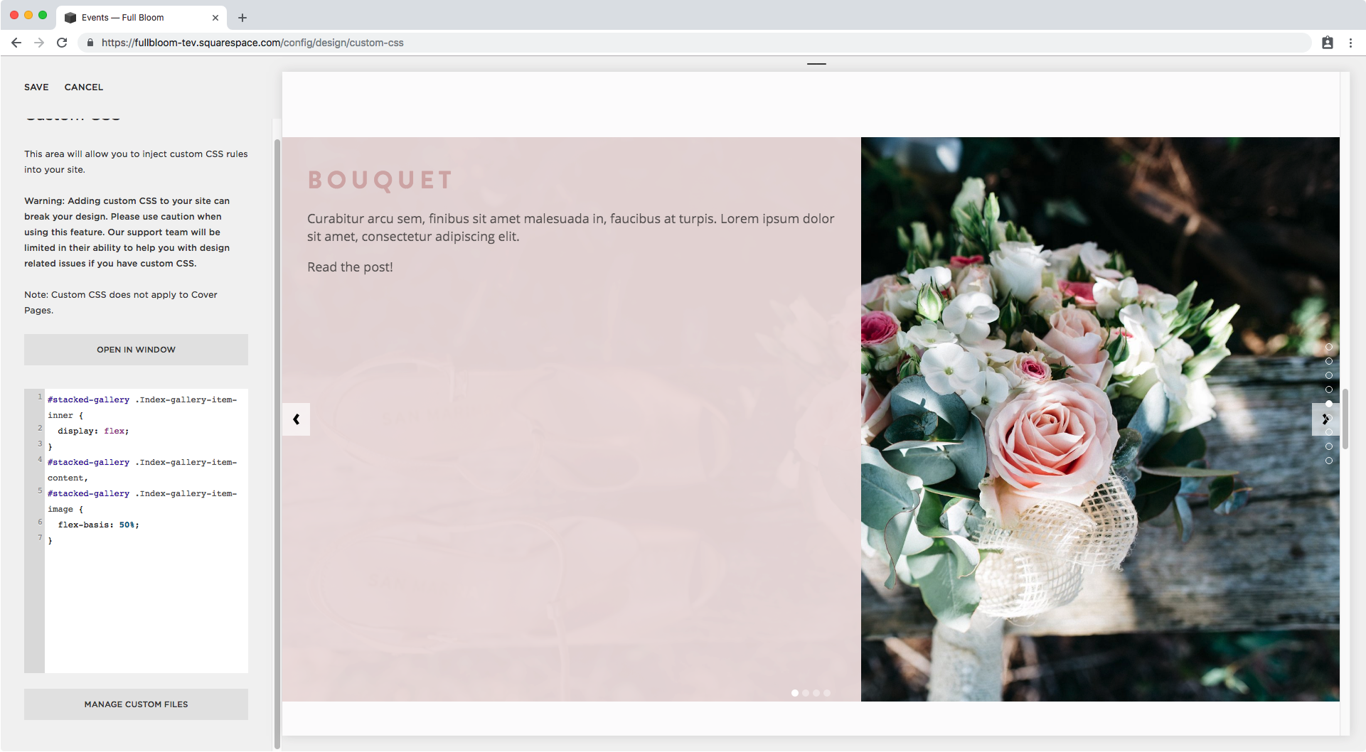
Right away we can already see our content container occupying a good chunk of the slide, so let’s make both sides even and split them 50/50.
To do that, we need to set the initial size of both our children containers as 50% through the flex-basis property.
Let’s take a look at how we can target them.
In our Inspect Element window we can see that the text container has a class called .Index-gallery-item-content (highlighted in light blue) and our figure element holding our image has a class of .Index-gallery-item-image, so let’s use those.
We’ll bring these two together inside the same selector group since we’ll be applying the same styles to both of them.
#stacked-gallery .Index-gallery-item-content,
#stacked-gallery .Index-gallery-item-image {

}
And now let’s set that initial size:
#stacked-gallery .Index-gallery-item-content,
#stacked-gallery .Index-gallery-item-image {
  flex-basis: 50%;
}
Alright, looking better.
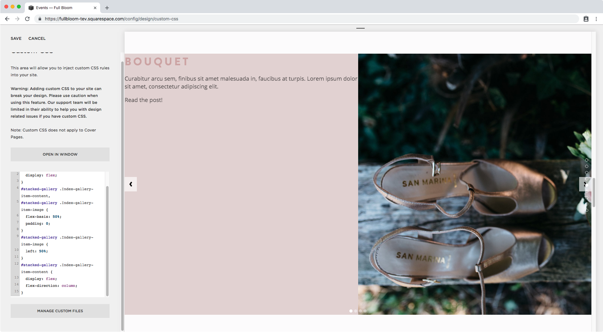
Now, as you may notice, the pink container is still not exactly covering just half of the slide.
If we take a look through Inspect Element…
We immediately notice there’s a padding hanging around that we’ll need to get rid of.
I’ll be setting the padding to 0 inside our same group of selectors to make sure the image container doesn’t have any either.
#stacked-gallery .Index-gallery-item-content,
#stacked-gallery .Index-gallery-item-image {
  flex-basis: 50%;
  padding: 0;
}
Great!
Now, you can choose to leave your image covering the entire space and sitting behind the content container if you like, however if you want to make sure the left – or right – side of your image is visible then let’s go ahead and set a left offset just for the image.
#stacked-gallery .Index-gallery-item-image {
  left: 50%;
}
Nice!
Let’s move onto fixing the alignment of the content in the pink container.
To do this easily we’re going to be relying on flexbox once again, so let’s make our pink container flex and set the direction as column so the heading stays stacked over the description and doesn’t sit next to it.
#stacked-gallery .Index-gallery-item-content {
  display: flex;
  flex-direction: column;
}
Seems like nothing changed right?
However we can now simply use the justify-content property to center our text in the middle of our container!
#stacked-gallery .Index-gallery-item-content {
  display: flex;
  flex-direction: column;
  justify-content: center;
}
Alright, now how about we add some padding to both the title and the description to unstuck it from the edges of the container?
Taking a peek inside Inspect Element we can see we have an h2 for the title and a class of .Index-gallery-item-content-body for the description container.
Let’s target both inside the same selector group and add the same padding so they remain aligned.
#stacked-gallery .Index-gallery-item-content h2,
#stacked-gallery .Index-gallery-item-content-body {
  padding: 10px 80px;
}
Beautiful!!
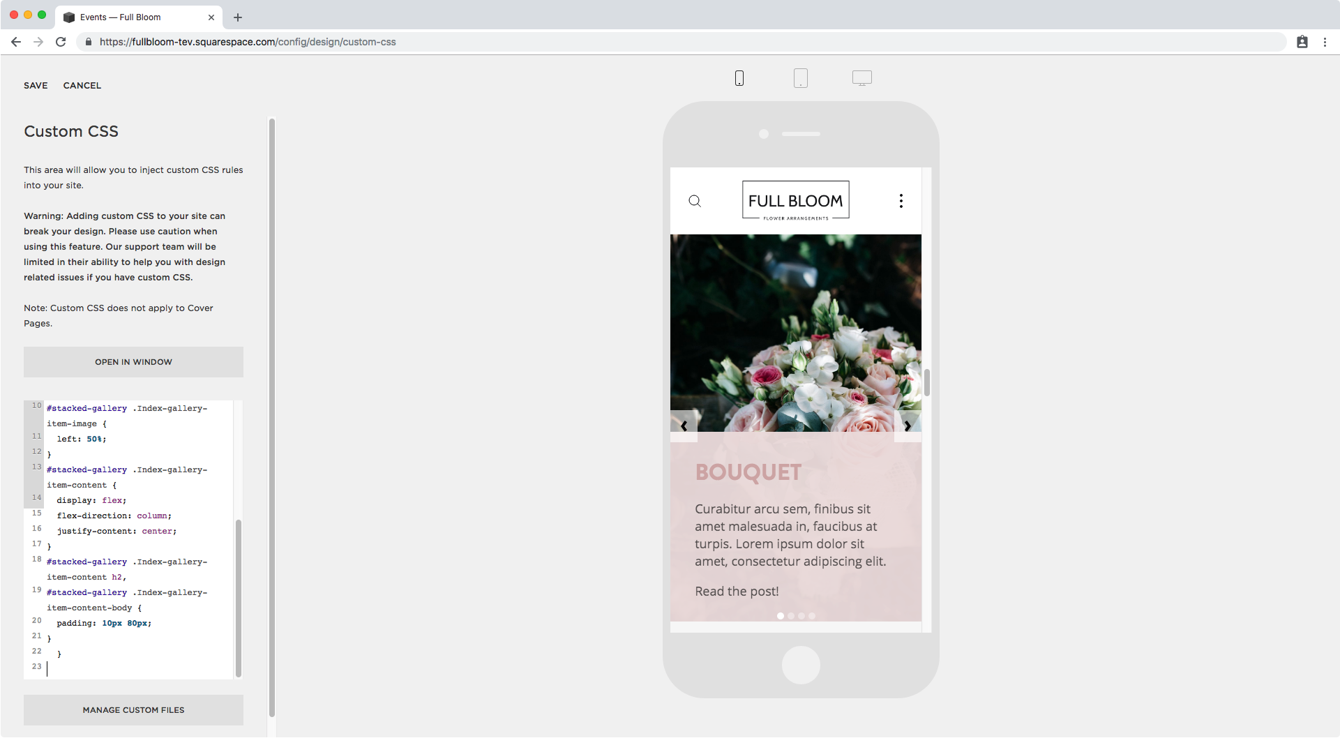
Let’s check out our customization on mobile devices:
It’s looking awesome on tablet but we should do something about phone screens.
I’ll simply remove the customization from that screen size by using a media query to keep it for tablets and desktop only!
@media screen and (min-width: 640px) {
  #stacked-gallery .Index-gallery-item-inner {
    display: flex;
  }
  #stacked-gallery .Index-gallery-item-content,
  #stacked-gallery .Index-gallery-item-image {
    flex-basis: 50%;
    padding: 0;
  }
  #stacked-gallery .Index-gallery-item-image {
    left: 50%;
  }
  #stacked-gallery .Index-gallery-item-content {
    display: flex;
    flex-direction: column;
    justify-content: center;
  }
  #stacked-gallery .Index-gallery-item-content h2,
  #stacked-gallery .Index-gallery-item-content-body {
    padding: 10px 80px;
  }
}
Love it!
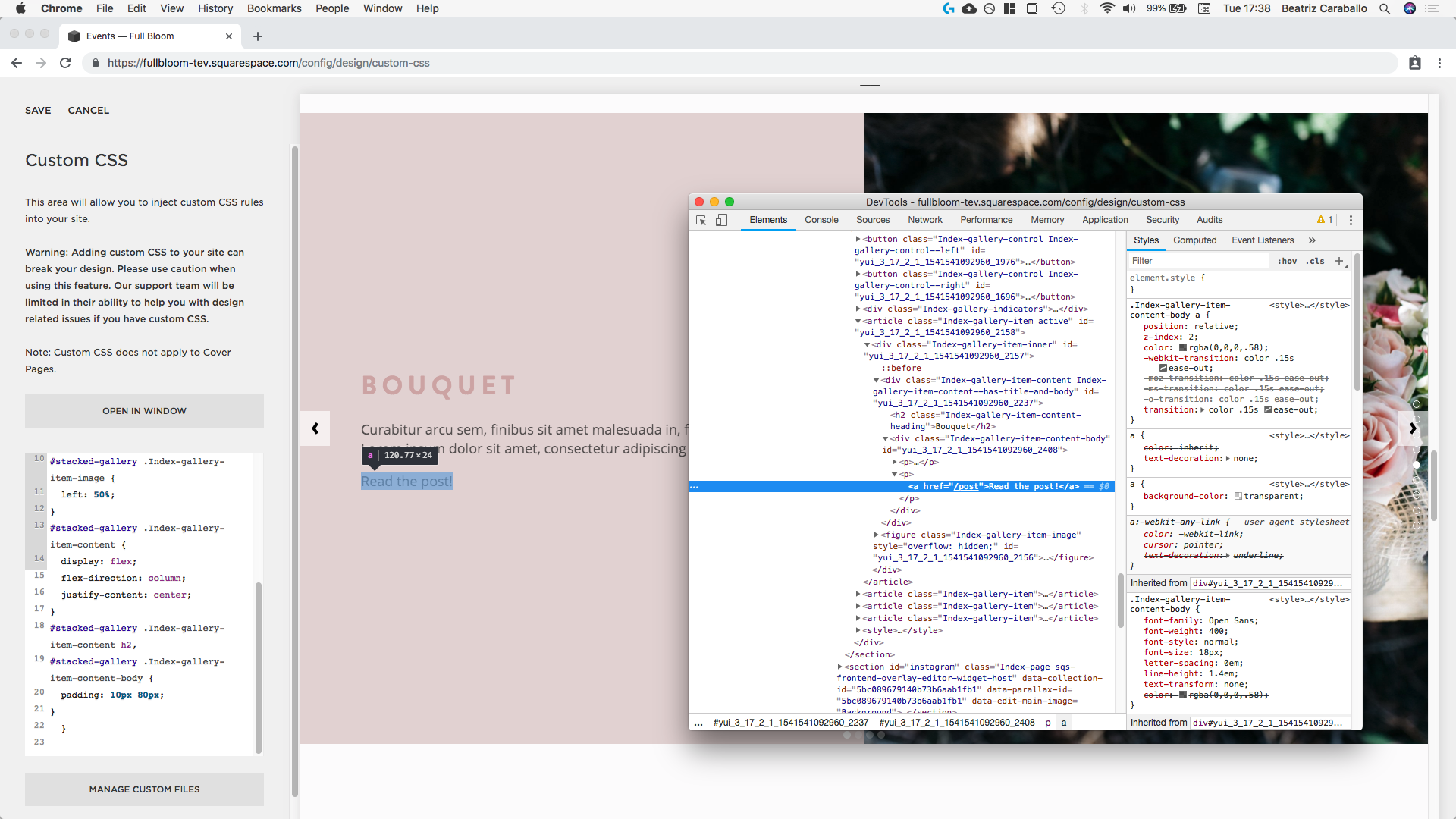
Now before we call it a day, I want to style that “Read the post“ link a bit more, so I’ll look for a way to target it:
Alrighty so we can simply use the text container class and then target the a element inside it since it’s the only one.
I’ll just add a couple of styles to it, nothing fancy!
#stacked-gallery .Index-gallery-item-content-body a {
  text-transform: uppercase;
  font-size: .7em;
  font-family: montserrat;
  font-weight: bold;
}
And I’ll include a nice little arrow through a quick pseudo-element:
#stacked-gallery .Index-gallery-item-content-body a::after {
  content: '→';
}
Yess! Perfect!
This is the final result in all screens:
Alright my friend there you have it!
That’s how you can create a bold Index Gallery slideshow in Squarespace using the Brine template!
Until next time,
B.
Full code
/*Setting the vertically-halved layout for tablets and desktop only*/
@media screen and (min-width: 640px) {
  #stacked-gallery .Index-gallery-item-inner {
    display: flex;
  }
  #stacked-gallery .Index-gallery-item-content,
  #stacked-gallery .Index-gallery-item-image {
    flex-basis: 50%;
    padding: 0;
  }
  #stacked-gallery .Index-gallery-item-image {
    left: 50%;
  }
  #stacked-gallery .Index-gallery-item-content {
    display: flex;
    flex-direction: column;
    justify-content: center;
  }
  #stacked-gallery .Index-gallery-item-content h2,
  #stacked-gallery .Index-gallery-item-content-body {
    padding: 10px 80px;
  }
}

/*Styling the link inside the text*/
#stacked-gallery .Index-gallery-item-content-body a {
  text-transform: uppercase;
  font-size: .7em;
  font-family: montserrat;
  font-weight: bold;
}
#stacked-gallery .Index-gallery-item-content-body a::after {
  content: '→';
}


