
Adding a back to top button to your Squarespace template
Option 1: Adding a link to your footer
You’re going to laugh at how simple this is.
To create a link that jumps back to the top of your page, you can add a Code Block to your footer and paste this snippet inside:
<a href="#" class="btt"> Back to Top </a>
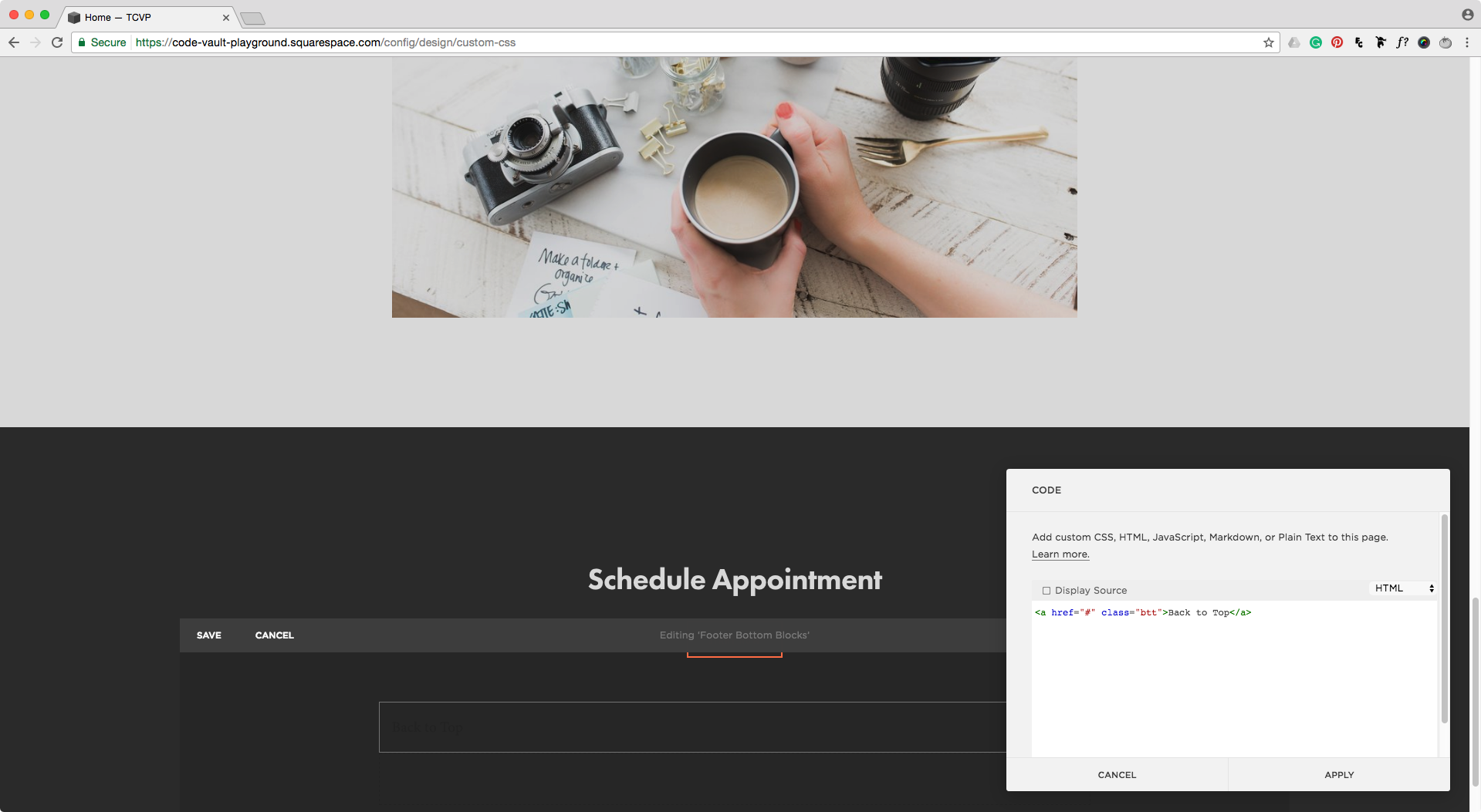
That’s it. Seriously. And by the way you can change "Back to Top" to your own phrase.
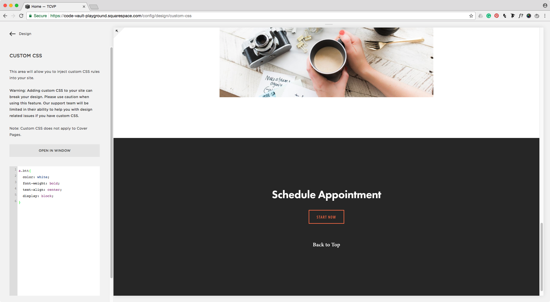
Now to style it, you can target the .btt class on your CSS injection window and change all the properties your heart desires to make it look stunning.
For example, you can change the font color, make it bold and align it to the center like this:
.btt {
  color: white;
  font-weight: bold;
  text-align: center;
  display: block;
}
Option 2: Adding a floating button
This option might work best for really long pages, or pages that have a menu box of some sort with several links that jump to different places of your page (anchor points). That way, your readers can easily go back up to the menu box and select a different link with just two clicks.
To create this button, you’ll need three different code snippets: one for the HTML to create the actual button on your page, one for the CSS to style the button, and one for the JQuery for the magic.
HTML
We’ll use the code from option one, but instead of having the Back to Top text, we’ll use an icon from Font Awesome.
Note: if you don't have the latest version of Font Awesome embedded on your site, you'll need to click on Start Using Free, copy the code inside the "SVG" tab and paste that in your Squarespace site header by going into Settings > Advanced > Code Injection.
For this example, we'll go with a nice chevron up arrow.
Copy the code right below it and insert it into the HTML snippet of the previous style option like so:
<a href="#" class="btt"> <i class="fas fa-chevron-up"></i> </a>
Note: if you rename the btt class, make sure to change the name everywhere else in the code.
This code should go into the header portion of your individual page (Gear icon > Advanced > Page header code injection):

or into your entire’s site header if you want to have it show up everywhere (Settings > Advanced > Code Injection > Header)

Once you’ve done that, we’ll style the button first and then add the magical script to make it do its thing.
CSS
This part of the code should go inside Squarespace's CSS window, you can find it by going into Design > Custom CSS.
Within the following code chunks, there are some properties that should remain as they are to make the button stays in place, but you can alter others to style the arrow however you like.
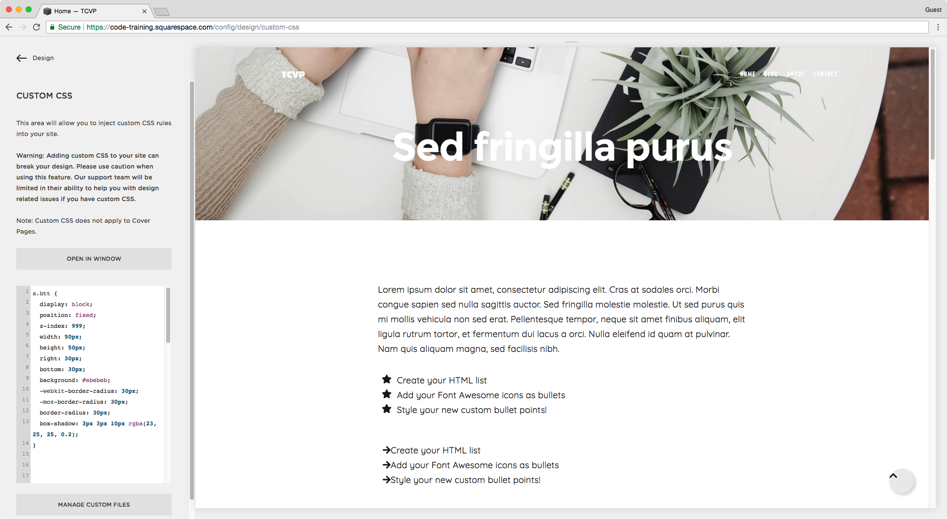
First, to style the button itself, you can use the following snippet. This will help you position it and make it stick there the whole time.
Note: while tweaking the properties, set display: block; instead of display: none; so you can see what you're doing!
a.btt {
  display: none;
  position: fixed;
  z-index: 999;
  width: 50px;
  height: 50px;
  right: 30px;
  bottom: 30px;
  background: #ebebeb;
  -webkit-border-radius: 30px;
  -moz-border-radius: 30px;
  border-radius: 30px;
  box-shadow: 3px 3px 10px rgba(23, 25, 25, 0.2);
}
Next, we'll target the arrow by its class name .svg-inline--fa, change its color, and center it inside the button with the help of the left offset and transform property, like so:
a.btt .svg-inline--fa {
  color: #191717;
  position: relative;
  height: 100%;
  top: 0;
  left: 50%;
  transform: translateX(-50%);
}

Note: if your arrow is not centered, check that you're using the code snippet given inside the "SVG" tab, since that's the one this tutorial was made for.
If you want to add a nice hover effect to the button, you can do that too! In this example, we can make the arrow move up just a tad with this:
a.btt:hover {
  transform: translatey(-10%);
}
And in order to make the transition a bit smoother, you can use the transition property by adding an extra line to the normal mode of the button (without the hover):
a.btt {
  display: none;
  position: fixed;
  z-index: 999;
  width: 50px;
  height: 50px;
  right: 30px;
  bottom: 30px;
  background: black;
  -webkit-border-radius: 30px;
  -moz-border-radius: 30px;
  border-radius: 30px;
  box-shadow: 3px 3px 10px rgba(23, 25, 25, 0.2);
  transition: transform 0.3s ease-in-out;
}
In this case, the transition property will make the transformation (translatey(-10%)) happen during 0.3 seconds with a slow entry into and out of the movement.
In other words, your button will be lifted up gently in the span of 0.3 seconds and then gently put back in its place once the cursor stops touching it.

Cool right?!
You’ve been doing great so far, now for the last piece of code.
Note: remember to change back display: block; to display: none; in your CSS snippet after you're done tweaking the button!
JQUERY
First, you have to load the JQuery library on your site if you haven’t already.
“Load the what...?”
Just go to Settings > Advanced > Code Injection and check if you have this either in the header or footer section:
<script src="https://ajax.googleapis.com/ajax/libs/jquery/3.2.1/jquery.min.js"></script>
If you don’t have it, you'll need to paste it right before the script below.
Note: keep in mind you might have another version installed, if you have a newer version than “3.2.1”, don’t paste anything.
As with most scripts, this is best implemented on your site’s footer to avoid slowing down your page speed. So go to Settings > Advanced > Code Injection > Page Footer and paste the following:
<script>
  var scrolled = 400; $(window).scroll(function() {
    if ( $(window).scrollTop() > scrolled ) {
      $('a.btt').fadeIn('slow');
    } else {
      $('a.btt').fadeOut('slow');
    }
  });
</script>
<script>
  $('a.btt').click(function() {
    $('html, body').animate({ scrollTop: 0 }, 700);
    return false;
  });
</script>

Briefly, what that does is 1) make the button appear after a certain amount of pixels have been scrolled – 400 in this case – and 2) make a nice scroll movement upwards when it’s clicked in 0.7 seconds (700 milliseconds).
Once you have all those code snippets in their right places, you’ll have something like this!

That wasn't that hard was it? And now you have an awesomely helpful button for your visitors to use!
Until next time,
B.
Full code
August 2022: the code for Option #2 has been updated so you can use any custom image you like as your icon, instead of working with Font Awesome.
Option #1: Text only
Header Code Injection
<!-- ADDING A BACK TO TOP BUTTON TO YOUR SQUARESPACE TEMPLATE -->
<a href="#" class="btt"> Back to Top </a>
Custom CSS Window
/*ADDING A BACK TO TOP BUTTON TO YOUR SQUARESPACE TEMPLATE*/
.btt {
  color: white;
  font-weight: bold;
  text-align: center;
  display: block;
}
Option #2: Custom icon
Header Code Injection
<!-- ADDING A BACK TO TOP BUTTON TO YOUR SQUARESPACE TEMPLATE -->
<a href="#" class="btt"> <span class="btt-icon"></span> </a>
Footer Code Injection
<!-- ADDING A BACK TO TOP BUTTON TO YOUR SQUARESPACE TEMPLATE -->
<script src="https://ajax.googleapis.com/ajax/libs/jquery/3.2.1/jquery.min.js"></script>
<script>
  var scrolled = 400; $(window).scroll(function() {
    if ( $(window).scrollTop() > scrolled ) {
      $('a.btt').fadeIn('slow');
    } else {
      $('a.btt').fadeOut('slow');
    }
  });
</script>
<script>
  $('a.btt').click(function() {
    $('html, body').animate({ scrollTop: 0 }, 700);
    return false;
  });
</script>
Custom CSS Window
/*ADDING A BACK TO TOP BUTTON TO YOUR SQUARESPACE TEMPLATE*/
//Button styles and position
a.btt {
  background: #ebebeb;
  -webkit-border-radius: 30px;
  -moz-border-radius: 30px;
  border-radius: 30px;
  box-shadow: 3px 3px 10px rgba(23, 25, 25, 0.2);
  display: none;
  height: 50px;
  position: fixed;
  bottom: 30px;
  right: 30px;
  transition: transform 0.3s ease-in-out;
  width: 50px;
  z-index: 999;
}

//Hover mode
a.btt:hover {
  transform: translatey(-10%);
}

//Button icon
.btt-icon {
  background-image: url(YOUR-IMAGE-GOES-HERE.png);
  background-position: center;
  background-repeat: no-repeat;
  background-size: 70%;
  height: 100%;
  position: absolute;
  left: 0;
  top: 0;
  width: 100%;
}
Font Awesome icon centering fix
Custom CSS Window
//Font Awesome icon centering fix
.btt .fa-chevron-up {
  align-items: center;
  color: white;
  display: flex;
  font-size: 25px;
  height: 100%;
  justify-content: center;
}