
Creating a simple overlay for your Summary Blocks (7.0, 7.1 CE & 7.1 FE)

Want to see and learn how to do a reaaaaaally cool Squarespace customization?
Then you’re in the right place my friend because today we’ll be going through how you can create or add a nice overlay to your summary block thumbnails!
We’ll be adding some text with a semi transparent background to our thumbnails so they pop up on hover and wow your visitors and clients.
Ready for this? Let’s go!
Adding an overlay to Summary Block thumbnails
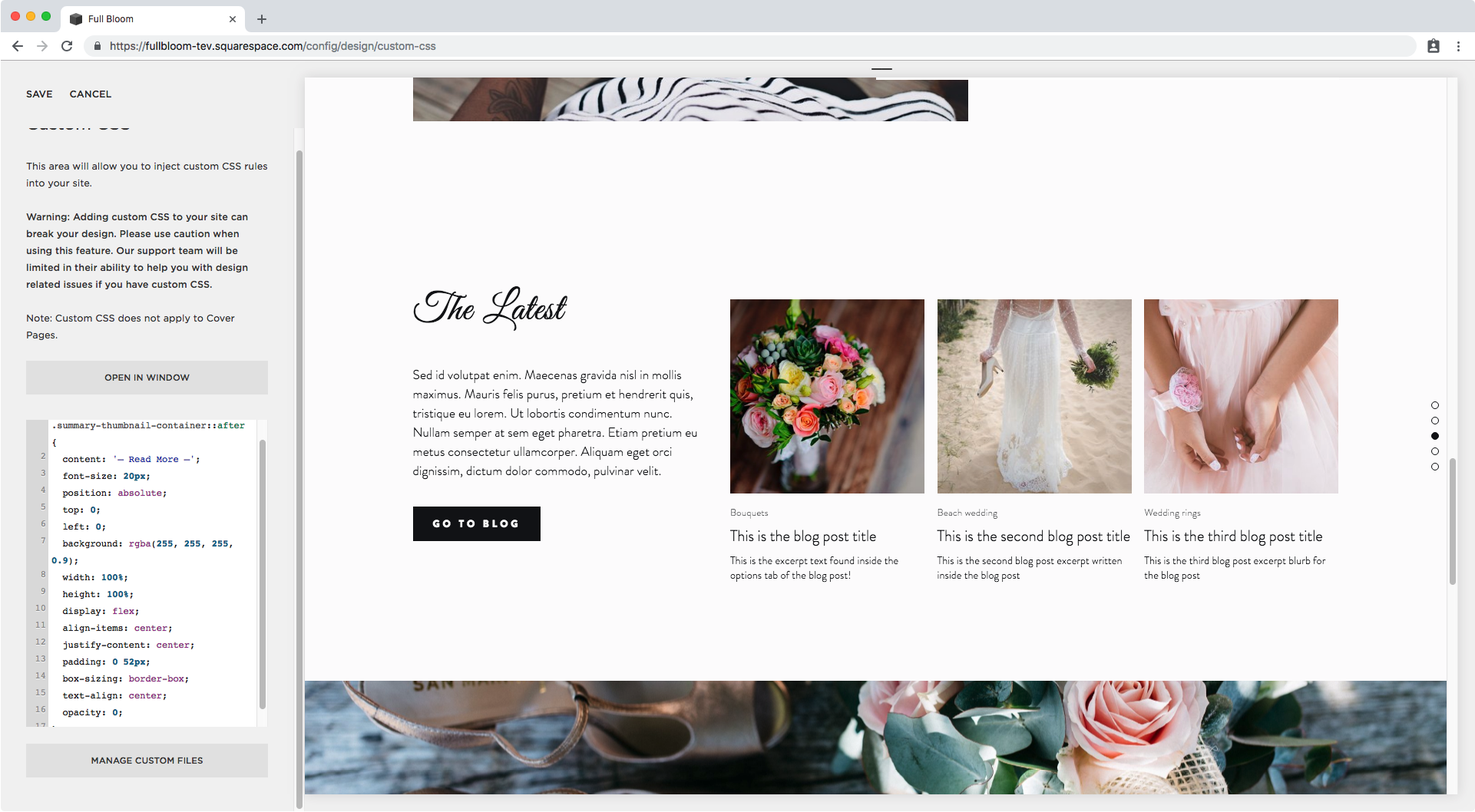
K, so first thing’s first, we need a summary block.
I’m going to be working with a Carousel Summary Block, but feel free to use any other layout you like, just keep in mind you will need to change up the selectors in the code to match your block type.

Since we want to add the overlay to our thumbnail, we need to find out what that container is called so we can target it.

Here I can see it has a bunch of classes. I’m going to go with .summary-thumbnail-container.
Then, I also want to make sure I’m targeting the thumbnails for my type of summary block, so I’ll scroll up a bit in my Inspect Element window and see which container and class I can use to do that.

Ok, so we don’t have to go to far. The container for the slide has a class of .sqs-gallery-design-carousel-slide that we can use since it seems to be explicitly for the carousel block.
With these two names, our selector looks like this:
.sqs-gallery-design-carousel-slide .summary-thumbnail-container {

}
However, since we’re going to be adding the overlay as something EXTRA, we need to create a pseudo element that sits in front of our thumbnail. Therefore, we’ll use ::after
.sqs-gallery-design-carousel-slide .summary-thumbnail-container::after {

}

Good! Now, let’s start creating our overlay shall we?
As always with any pseudo element, we need to add the content property to determine what extra stuff we’ll be adding.
I want to add some text to invite people to click through:
.sqs-gallery-design-carousel-slide .summary-thumbnail-container::after {
  content: '– Read More –';
}

You may notice we now have a bit more spacing between the thumbnail and the excerpt content, however we’re not seeing the text yet so I’ll be increasing its font size to see if that’s the problem.
.sqs-gallery-design-carousel-slide .summary-thumbnail-container::after {
  content: '– Read More –';
  font-size: 20px;
}

Great! We can see it now.
Ok, time to reposition this baby. Since I want it to be over the image and not leave any extra space under the image, I’m going to set it to position absolute.
.sqs-gallery-design-carousel-slide .summary-thumbnail-container::after {
  content: '– Read More –';
  font-size: 20px;
  position: absolute;
}

And now, I’ll be setting the top and left offset to start moving it.
.sqs-gallery-design-carousel-slide .summary-thumbnail-container::after {
  content: '– Read More –';
  font-size: 20px;
  position: absolute;
  top: 0;
  left: 0;
}

Now let’s add a random background color to see it better and keep adjusting its placement.
.sqs-gallery-design-carousel-slide .summary-thumbnail-container::after {
  content: '– Read More –';
  font-size: 20px;
  position: absolute;
  top: 0;
  left: 0;
  background: red;
}

We’ll make it expand the entire width of the thumbnail by making it 100% in width.
.sqs-gallery-design-carousel-slide .summary-thumbnail-container::after {
  content: '– Read More –';
  font-size: 20px;
  position: absolute;
  top: 0;
  left: 0;
  background: red;
  width: 100%;
}

Ok, now let’s make it fill everything by setting the height as well to 100%.
.sqs-gallery-design-carousel-slide .summary-thumbnail-container::after {
  content: '– Read More –';
  font-size: 20px;
  position: absolute;
  top: 0;
  left: 0;
  background: red;
  width: 100%;
  height: 100%;
}

Alright, we’re getting there!
There are a couple of ways we can center the text now, but the easiest and quickest way to do it is through our forever handy friend: flexbox.
We’re going to be setting our pseudo-element to flex and then using two of the flexbox properties to center it.
The first one will be align-items and in this case its going to help us move it to the center, vertically.
.sqs-gallery-design-carousel-slide .summary-thumbnail-container::after {
  content: '– Read More –';
  font-size: 20px;
  position: absolute;
  top: 0;
  left: 0;
  background: red;
  width: 100%;
  height: 100%;
  display: flex;
  align-items: center;
}

Then, we’re going to use justify-content to align it horizontally to the center.
.sqs-gallery-design-carousel-slide .summary-thumbnail-container::after {
  content: '– Read More –';
  font-size: 20px;
  position: absolute;
  top: 0;
  left: 0;
  background: red;
  width: 100%;
  height: 100%;
  display: flex;
  align-items: center;
  justify-content: center;
}

Perfect!!
Checking overlay on mobile screens
This part is optional, however I wanted to include it here in case:
You want to have the overlay show up at all times and then disappear on hover,
Or just to make sure that if people tap on hold over any of these thumbnails on mobile devices – to bring up the hover mode – the overlay still looks good.
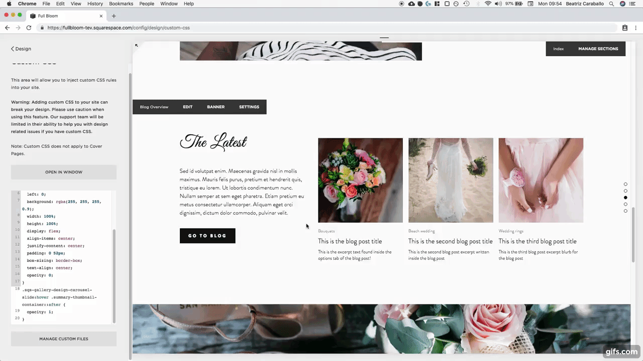
If we check what this looks like on tablets…

It’s ok, but the text is a bit too close to the edges, so I want to add some padding to that.
.sqs-gallery-design-carousel-slide .summary-thumbnail-container::after {
  content: '– Read More –';
  font-size: 20px;
  position: absolute;
  top: 0;
  left: 0;
  background: red;
  width: 100%;
  height: 100%;
  display: flex;
  align-items: center;
  justify-content: center;
  padding: 0 20px;
}

The text seems to be about to overflow the thumbnail now, so we’ll fix that by making sure box-sizing is set to border-box, to contain the overlay inside the thumbnail.
.sqs-gallery-design-carousel-slide .summary-thumbnail-container::after {
  content: '– Read More –';
  font-size: 20px;
  position: absolute;
  top: 0;
  left: 0;
  background: red;
  width: 100%;
  height: 100%;
  display: flex;
  align-items: center;
  justify-content: center;
  padding: 0 20px;
  box-sizing: border-box;
}

Alright, now let’s align the text to the center.
.sqs-gallery-design-carousel-slide .summary-thumbnail-container::after {
  content: '– Read More –';
  font-size: 20px;
  position: absolute;
  top: 0;
  left: 0;
  background: red;
  width: 100%;
  height: 100%;
  display: flex;
  align-items: center;
  justify-content: center;
  padding: 0 20px;
  box-sizing: border-box;
  text-align: center;
}

Now I don’t know about you but I don’t like the way the lines look right now like that so I’ll increase the padding to make them stack along with the words.
.sqs-gallery-design-carousel-slide .summary-thumbnail-container::after {
  content: '– Read More –';
  font-size: 20px;
  position: absolute;
  top: 0;
  left: 0;
  background: red;
  width: 100%;
  height: 100%;
  display: flex;
  align-items: center;
  justify-content: center;
  padding: 0 52px;
  box-sizing: border-box;
  text-align: center;
}

Much better! Let’s check phone screens too…

Perfect! Now we can continue.
Adding an overlay on hover to Summary Block thumbnails
We’re almost done with our overlay!
We just need to fix the color – unless you like that bright red – and set it to appear only on mouseover.
I’ll be switching the red for a white rgba that’s aaaaaalmost completely opaque.
.sqs-gallery-design-carousel-slide .summary-thumbnail-container::after {
  content: '– Read More –';
  font-size: 20px;
  position: absolute;
  top: 0;
  left: 0;
  background: rgba(255, 255, 255, 0.9);
  width: 100%;
  height: 100%;
  display: flex;
  align-items: center;
  justify-content: center;
  padding: 0 52px;
  box-sizing: border-box;
  text-align: center;
}

And to make it appear on hover, I’m going to set the normal mode’s opacity to 0…
.sqs-gallery-design-carousel-slide .summary-thumbnail-container::after {
  content: '– Read More –';
  font-size: 20px;
  position: absolute;
  top: 0;
  left: 0;
  background: rgba(255, 255, 255, 0.9);
  width: 100%;
  height: 100%;
  display: flex;
  align-items: center;
  justify-content: center;
  padding: 0 52px;
  box-sizing: border-box;
  text-align: center;
  opacity: 0;
}
…and now setting the hover mode.
Keep in mind that depending on when you want the hover to appear (e.g. when hovering over the image itself, when hovering over the excerpt or at any point when the mouse enters the entire slide) you may need to target the :hover mode of a different selector.
The way I’m doing it here, I’m telling my browser that at any point when the mouse enters the SLIDE, the overlay will appear.
.sqs-gallery-design-carousel-slide:hover .summary-thumbnail-container::after {

}
So I’m going to be setting my pseudo-element’s opacity to 1 here:
.sqs-gallery-design-carousel-slide:hover .summary-thumbnail-container::after {
  opacity: 1;
}
Alright, this is AWESOME!
Buuuuut…. I feel the hover mode just pops in and out way too harshly.
To make this smoother there’s one last property we can add: transition.
This one will go into our original snippet and I’ll be setting it so the opacity property value takes 1s to change.
.sqs-gallery-design-carousel-slide .summary-thumbnail-container::after {
  content: '– Read More –';
  font-size: 20px;
  position: absolute;
  top: 0;
  left: 0;
  background: rgba(255, 255, 255, 0.9);
  width: 100%;
  height: 100%;
  display: flex;
  align-items: center;
  justify-content: center;
  padding: 0 52px;
  box-sizing: border-box;
  text-align: center;
  opacity: 0;
  transition: opacity 1s;
}

Gaaaah! Beautiful!!
Congratulations my friend, you just added a sweet overlay to your Squarespace Summary Block thumbnails.
Until next time,
B.
Full code
.sqs-gallery-design-carousel-slide .summary-thumbnail-container::after {
  content: '– Read More –';
  font-size: 20px;
  position: absolute;
  top: 0;
  left: 0;
  background: rgba(255, 255, 255, 0.9);
  width: 100%;
  height: 100%;
  display: flex;
  align-items: center;
  justify-content: center;
  padding: 0 52px;
  box-sizing: border-box;
  text-align: center;
  opacity: 0;
  transition: opacity 1s;
}
.sqs-gallery-design-carousel-slide:hover .summary-thumbnail-container::after {
  opacity: 1;
}