Creating a simple hover mode for Gallery Strips (7.1)
We’ve covered different kinds of hover modes for blocks on this blog, but we haven’t yet touched page sections like the Gallery Sections from Squarespace 7.1.
And, since I’ve been playing around with some of the different layouts, I thought I’d share one of the customizations I came up with recently!
It’s quite simple but I think it looks really good and could be a great addition to any client site that uses the Strips layout as a portfolio/overview of some sort.
So, without further ado, let’s see how we can achieve this.
Setting up the Gallery Section
Alright, first thing first.
We’ll need to set up a section of the site with a Gallery Section set to Grid: Strips.
Make sure to add a caption to each image, and check that they’re enabled in the sections’ settings:
Repositioning the captions
In order to create the hover mode, we’ll start by moving the caption container on top of each corresponding image.
Let’s look through our Inspector tool to find out what that container is called:
Ok, so we have here a figcaption element with a class of .gallery-caption and another of .gallery-caption-grid-strips.
The second one is more specific to the type of gallery we’re using, so let’s go with that one to make sure that no other gallery section we may have gets affected:
.gallery-caption-grid-strips {

}
Alright, and now to move things on top of the image we’ll give it a position: absolute and set the bottom offset to 0, since we want it to be stuck to that part of the thumbnail:
.gallery-caption-grid-strips {
  position: absolute;
  bottom: 0;
}
Good!
Now, let’s add a background-color to it, I’ll go with something semi-transparent, give it some padding and also text-align to the center:
.gallery-caption-grid-strips {
  background-color: rgba(255, 255, 255, 0.7);
  padding: 20px 50px;
  position: absolute;
  bottom: 0;
  text-align: center;
}
Hmmm… the captions seem to be overflowing the thumbnails so let’s add the box-sizing fix to make sure that the final width of the container is including the padding, and not adding it as extra width:
.gallery-caption-grid-strips {
  background-color: rgba(255, 255, 255, 0.7);
  box-sizing: border-box;
  padding: 20px 50px;
  position: absolute;
  bottom: 0;
  text-align: center;
}
Perfect!
Styling the font
Now, let’s move onto styling the caption text.
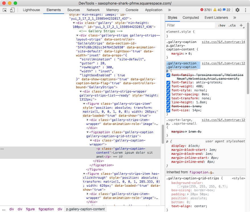
Looking through our Inspect Element tool…
…we can see we’re dealing with a paragraph element that has a class of .gallery-caption-content we could use.
However, if we take a look at the right side of the screen, we can see that the font-family and all other font styles have been added through a different selector called .gallery-section .gallery-caption p:
I prefer going with this existing selector to avoid any overriding issues.
However, it’s fairly generic as it doesn’t refer to the strip gallery anywhere, so let’s look for an additional class that can help us make it even more specific.
If we search for the container that carries the class .gallery-caption…
…we’ll see it’s accompanied by a second class called .gallery-caption-grid-strips which is way more specific.
So, let’s include it in our final selector like so:
.gallery-section .gallery-caption.gallery-caption-grid-strips p {

}
And set up the font however we like!
I’ll go with the following changes:
.gallery-section .gallery-caption.gallery-caption-grid-strips p {
  font-family: 'Lato';
  font-size: 15px;
  font-weight: bold;
  text-transform: uppercase;
}
Beautiful!
Creating the hover mode
Now, let’s take care of the hover mode!
What we want is to make the caption slide up from the bottom of the thumbnail.
We already have it in it’s final position, so we need to set the initial position through the transform property, to then adjust that transform value on hover and make the whole thing snap back into place.
I want mine to be completely hidden from sight before the hover mode is enabled, so I’ll push it all the way to the outside edge of the bottom of the thumbnail by using translateY(100%):
.gallery-caption-grid-strips {
  background-color: rgba(255, 255, 255, 0.7);
  box-sizing: border-box;
  padding: 20px 50px;
  position: absolute;
  bottom: 0;
  text-align: center;
  transform: translateY(100%);
}
Good!
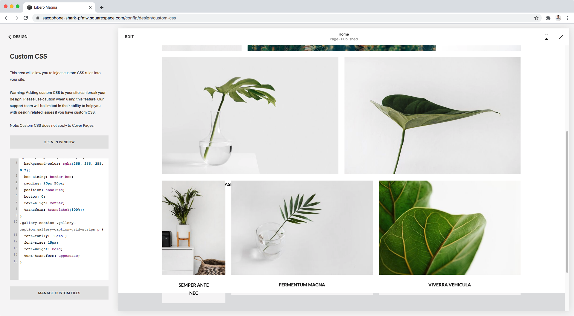
However, we can see that at the bottom of the screen the captions are showing under the thumbnails.
We don’t want to see them unless they’re on top of the image when hovered over, so we’ll need to hide them.
We could do this by setting an opacity value of 0, and then bringing that up to 1 on hover, but we would still see a little bit of the caption before it’s completely over the image.
So, instead, we’re going to keep it from sight it by hiding the overflow of the entire thumbnail + caption container, so that nothing is visible outside its limits.
Let’s find out what our container is called:
Ok, so we have a figure element with a class of .gallery-strips-item that we can use:
.gallery-strips-item {
  overflow: hidden;
}
And now we can’t see the text anymore! Perfect.
Let’s make it pop up again only on hover.
I want the caption container (.gallery-caption-grid-strips) to move into its original position when we hover over any part of the thumbnail + caption container (.gallery-strips-item), so I’ll set mine up like this:
.gallery-strips-item:hover .gallery-caption-grid-strips {
  transform: none;
}
Not bad!
However, we can’t really see the full effect because the change happens too suddenly.
Let’s add a nice transition by setting it under the initial state of the caption:
.gallery-caption-grid-strips {
  background-color: rgba(255, 255, 255, 0.7);
  box-sizing: border-box;
  padding: 20px 50px;
  position: absolute;
  bottom: 0;
  text-align: center;
  transform: translateY(100%);
  transition: transform .3s;
}
Lovely!
Now, before we move onto mobile, let’s just make sure that the caption won’t get in the way of any link or lightbox mode we may have for each of our thumbnails.
We can do this by simply adding a pointer-events: none declaration inside our caption’s code:
.gallery-caption-grid-strips {
  background-color: rgba(255, 255, 255, 0.7);
  box-sizing: border-box;
  padding: 20px 50px;
  pointer-events: none;
  position: absolute;
  bottom: 0;
  text-align: center;
  transform: translateY(100%);
  transition: transform .3s;
}
Ok! Now we can move on.
Adjusting mobile
The effect looks amazing on desktop and mobile screens (where the hover mode is still active), however, in tablets it looks a bit off:
The caption doesn’t cover the thumbnail edge to edge for some reason, so let’s take a look and see why that is:
Here it is.
There’s a max-width applied to the caption container (the one we targeted to reposition and style) that’s not letting it go as big as needed to cover the thumbnail.
Let’s change that by making the max-width: 100%:
.gallery-caption-grid-strips {
  background-color: rgba(255, 255, 255, 0.7);
  box-sizing: border-box;
  padding: 20px 50px;
  max-width: 100%;
  pointer-events: none;
  position: absolute;
  bottom: 0;
  text-align: center;
  transform: translateY(100%);
  transition: transform .3s;
}
Faaaantastic!
So, there you have it!
That’s how you can create a very simple but awesome-looking sliding caption for your Gallery Strips in Squarespace 7.1.
Until next time,
B.
Full code
/*CREATING A SIMPLE HOVER MODE FOR GALLERY STRIPS IN 7.1*/
.gallery-caption-grid-strips {
  background-color: rgba(255, 255, 255, 0.7);
  box-sizing: border-box;
  padding: 20px 50px;
  max-width: 100%;
  pointer-events: none;
  position: absolute;
  bottom: 0;
  text-align: center;
  transform: translateY(100%);
  transition: transform .3s;
}
.gallery-section .gallery-caption.gallery-caption-grid-strips p {
  font-family: 'Lato';
  font-size: 15px;
  font-weight: bold;
  text-transform: uppercase;
}
.gallery-strips-item {
  overflow: hidden;
}
.gallery-strips-item:hover .gallery-caption-grid-strips {
  transform: none;
}


