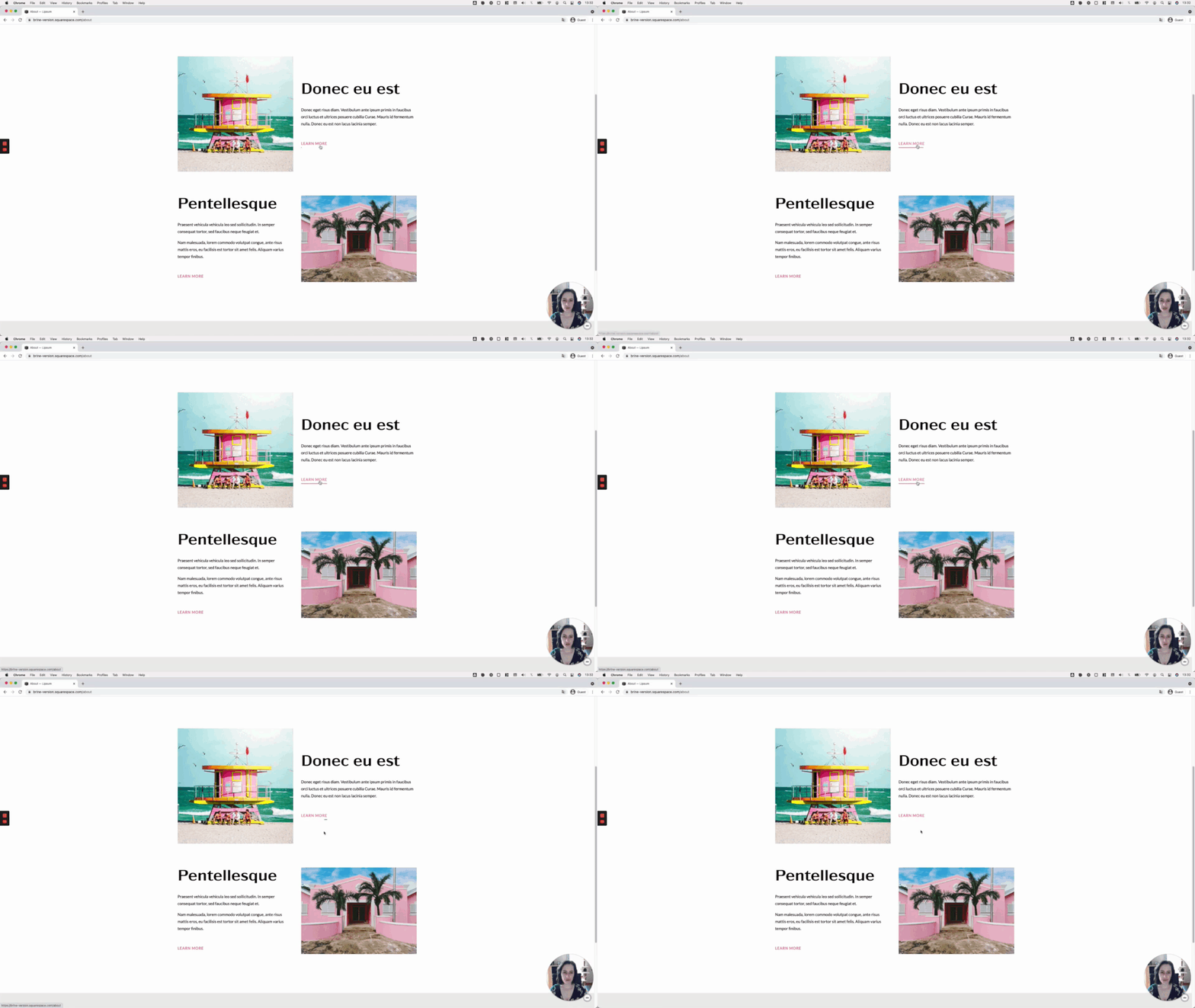
One-way sliding underline on hover for button blocks (7.0, 7.1 CE & 7.1 FE)
We haven’t really covered a lot of button customizations on the blog, so I thought I’d share one with you today!
The final effect makes it seem like the underline loops around the button, so it’s a pretty cool effect.
The code isn’t too complicated AND is flexible enough to allow you to target one particular button size or all at the same time.
Just keep in mind that we’re working with Squarespace’s Button Block, so the code won’t work right off the bat for those buttons within Image Blocks, Newsletter Blocks, or any other kind of block.
That being said, without further ado, let’s get started!
Tutorial
Overview & timestamps
Alrighty!
Let’s break down this customization:
(00:23) - Initial setup
To create this effect, we’ll start off with a Large Button Block, however, you’ll be able to achieve the same customization with any button size.(01:04) - Fixing button padding
We’ll first take care of the padding on the sides of the button, to make sure that the text looks aligned to the text above it.(03:08) - Adding the underline
Next, we’ll be able to bring in the underline by using a pseudo-element. This will make things easier for us when it’s time to create the hover mode. We’ll see how to pick the right container and fix a very common issue that happens when position elements absolutely, in Squarespace or any other website.(08:11) - Creating the hover mode
Last but not least, it’ll be time to create the hover mode! We’ll break down the reasoning behind the property choices and values we need to use, to be able to achieve the underline effect we’re going for.
Until next time,
B.
Full code
/*ONE-WAY SLIDING UNDERLINE ON HOVER FOR BUTTON BLOCKS (7.0 & 7.1)*/
.sqs-block-button .sqs-block-button-element--large {
  padding-left: 0;
  padding-right: 0;
}

.sqs-block-button-element--large {
  position: relative;
}

.sqs-block-button-element--large::after {
  background-color: #178573;
  content: '';
  height: 3px;
  position: absolute;
  bottom: 0;
  right: 0;
  transition: all .4s;
  width: 0;
}

.sqs-block-button-element--large:hover::after {
  background-color: #f07fa9;
  left: 0;
  width: 100%;
}

