Creating a selective overlay for Gallery Sections in Squarespace (7.1)
In today’s tutorial, we’ll be tackling a simple but useful CSS trick, using the Gallery Grid Sections in 7.1.
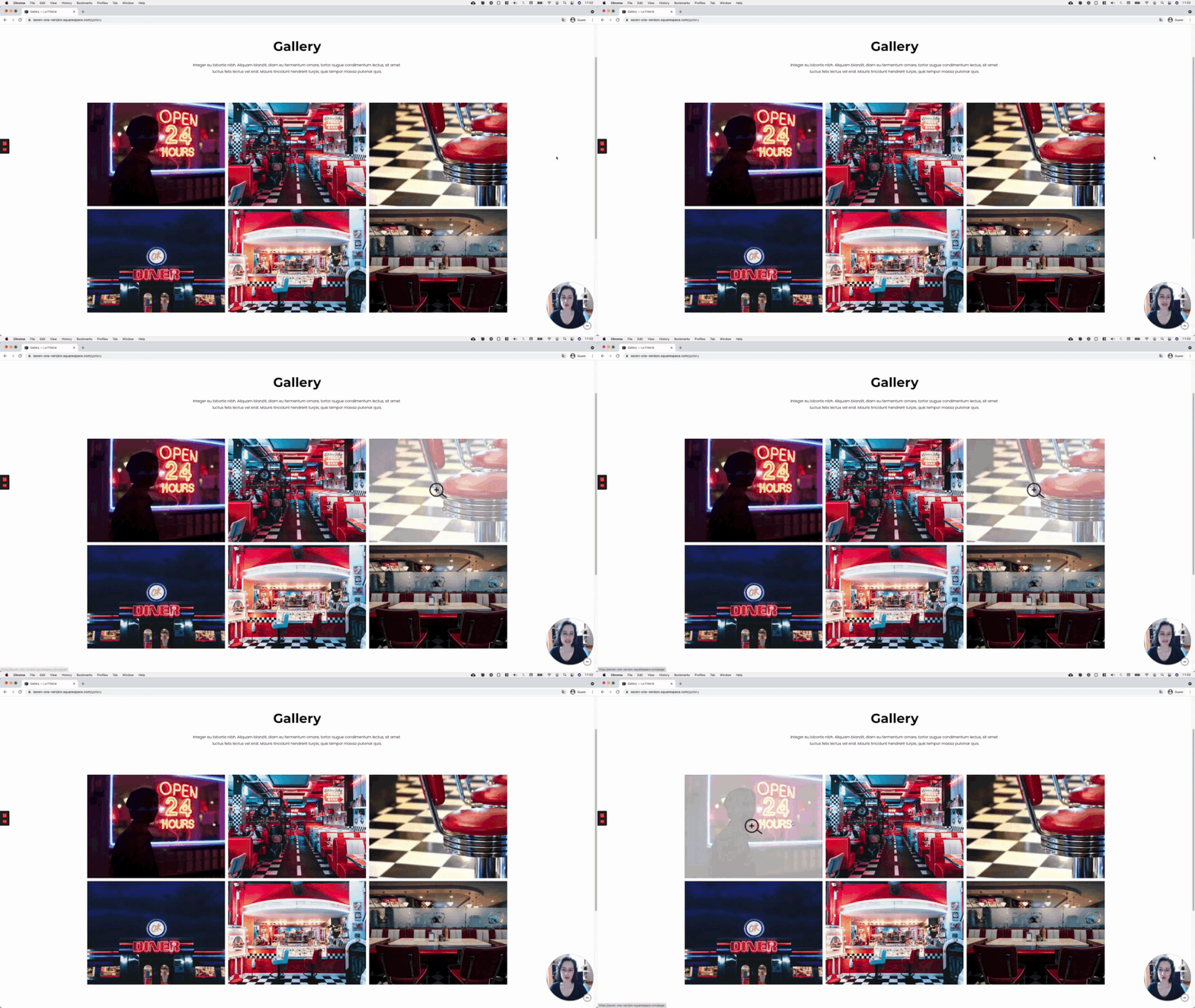
We’ll be creating an overlay that only shows up over clickable images inside the gallery, and nowhere else.
This can create an additional visual aid for those client projects where you want their audience to know if there’s more to see behind a portfolio project, service, package option, etc.
So, without further ado, let’s get to it!
Tutorial
Overview & timestamps
The process to set up the overlay is not too complicated, and it’s flexible enough that you can use any image you like! It doesn’t have to be a magnifying glass.
Although, if you like the icon, you can grab it here.
The key in this type of customization is to find the thing that will help us automatically differentiate between images that HAVE a link, and those that DON’T.
Fortunately, in this case, there’s a class for that.
(00:43) - Selecting the target container
First, we’ll need to go through a couple of the possible target container options we have, to pick the one that’ll suit our needs the best.(03:37) - Testing selector
With our choice made, we’ll test out the selector to see if it’s something we can work with to achieve the result we want.(04:44) - Creating the overlay
Next, it’s time to create our gallery thumbnail overlay! We’ll be using a simple pseudo-element here to add the color first.(08:35) - Adding the icon
Once the overlay is set, we’ll bring in our icon, and style it to our liking.(11:00) - Creating the hover mode
Last but not least, it’s time to create the hover mode! We’ll be applying a simple fade-in fade-out effect with the help of the opacity property and a subtle transition.
Until next time,
B.
Full code
Gallery Section Grid: Simple
/*SELECTIVE OVERLAY FOR GALLERY THUMBNAILS - GALLERY SECTION GRID SIMPLE (7.1)*/
.gallery-grid-item.has-clickthrough {
  position: relative;
}

.gallery-grid-item.has-clickthrough::after {
  background-color: rgba(255,255,255,0.7);
  background-image: url(YOUR-ICON-GOES-HERE.PNG);
  background-position: center;
  background-repeat: no-repeat;
  background-size: 80px;
  content: '';
  height: 100%;
  opacity: 0;
  pointer-events: none;
  position: absolute;
  left: 0;
  top: 0;
  transition: all .5s;
  width: 100%;
}

.gallery-grid-item.has-clickthrough:hover::after {
  opacity: 1;
}
Gallery Section Grid: Strips
/*SELECTIVE OVERLAY FOR GALLERY THUMBNAILS - GALLERY SECTION GRID STRIPS (7.1)*/
.gallery-strips-item.has-clickthrough {
  position: relative;
}

.gallery-strips-item.has-clickthrough::after {
  background-color: rgba(255,255,255,0.7);
  background-image: url(YOUR-ICON-GOES-HERE.PNG);
  background-position: center;
  background-repeat: no-repeat;
  background-size: 80px;
  content: '';
  height: 100%;
  opacity: 0;
  pointer-events: none;
  position: absolute;
  left: 0;
  top: 0;
  transition: all .5s;
  width: 100%;
}

.gallery-strips-item.has-clickthrough:hover::after {
  opacity: 1;
}
Gallery Section Grid: Masonry
/*SELECTIVE OVERLAY FOR GALLERY THUMBNAILS - GALLERY SECTION GRID MASONRY (7.1)*/
.gallery-masonry-item.has-clickthrough {
  position: relative;
}

.gallery-masonry-item.has-clickthrough::after {
  background-color: rgba(255,255,255,0.7);
  background-image: url(YOUR-ICON-GOES-HERE.PNG);
  background-position: center;
  background-repeat: no-repeat;
  background-size: 80px;
  content: '';
  height: 100%;
  opacity: 0;
  pointer-events: none;
  position: absolute;
  left: 0;
  top: 0;
  transition: all .5s;
  width: 100%;
}

.gallery-masonry-item.has-clickthrough:hover::after {
  opacity: 1;
}


