Change the color of your loading screen background (Brine 7.0)
You know when you’re loading your site and you see a flashing or fade-in background color before the content on your page fully loads?
This may not be happening on all of your pages – or even if you’re using a template outside the Brine family – but just where you have a banner image set as background.
Still, it’s annoying AF. Especially if the color doesn’t match your brand AT ALL!
Some time ago, after some trial and error, I found a way to change that background color via CSS.
However, recently, while redesigning this site, I discovered THE WAY to do it through the Style Editor… and of course, I had to share it with you.
How to change the background "fade-in" color on page load
It’s so stupidly simple, it kinda made me want to cry.
And if you already knew where to change this, I salute you because it was very well hidden!
First, I’ll show you how to change it and then I’ll dive into why it works (in case you’re curious).
Once you know though, you’ll probably go "ooooooooooooh, that makes sense". I know I did.
Alright, go ahead and open a page on your site where you have a banner image and then go to your Style Editor or Site Styles. Otherwise the option won’t show up on your panel.
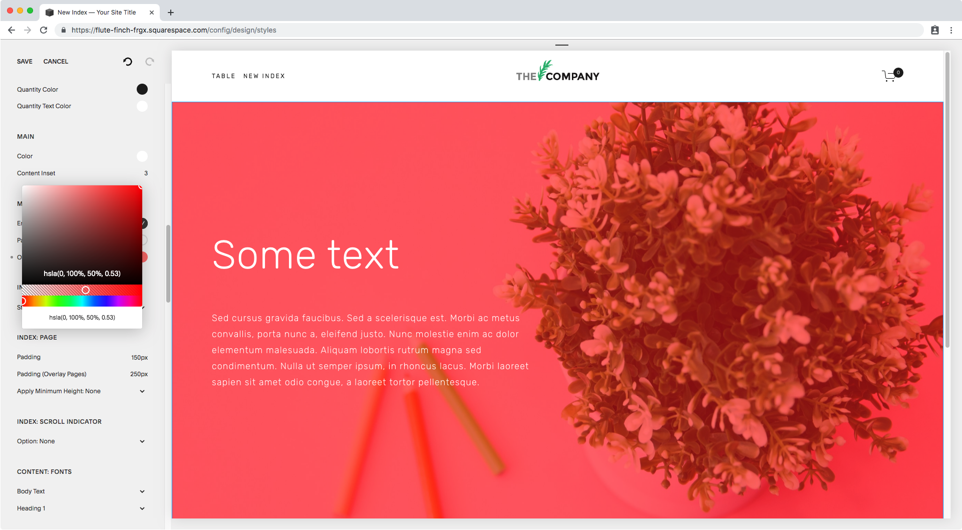
I have an index here on a test site that has a pink background image set as the first section banner.
If I load it, I see there’s a black background flashing a few seconds before the image shows up:
Not pretty. Let’s change it.
If we go into our Style Editor and scroll down a bit until the Main section options, we won’t see anything special right off the bat. In fact, there’s no black color set anywhere nearby except for the quantity color for the cart up top… or is there?
Taking a look inside the Overlay Color option under Main: Overlay we can see the black color is selected, albeit it’s set as transparent.
Let’s see what happens if I leave it transparent but change the color to red…
What kind of sorcery is this?!
The background now loads red!
So does that mean… if we set it to white?
Yes!! It now loads white as the rest of the page before displaying the content.
Perfect!
What's happening?
The thing is, there is – usually – more than one way to make something happen through code.
In this case, to create an overlay for an image, you can either add an element as the overlay on top of the thing you want to add it to OR turn down the opacity of the element itself (aka, the banner image) so the background shows up.
The latter, is the method Squarespace is using to set that overlay.
Side note: this is not the only place Squarespace uses this method, I’ve found the same thing applies to Index Galleries.
What this means is that if we set the overlay opacity to ~50%, what the code is really doing is setting the opacity of the image to .5, and since the background is set to red, that’s the color that shows up!
Therefore, even if you’ve set the overlay to transparent – i.e. the banner image to full opacity – the background color will still be there, and it will show up during those seconds the image takes to load.
So, there you have it!
Now you know how to switch that fade-in or loading background color in Brine templates, when you’re using banner images.
Until next time,
B.


