
How to create a hover mode for anything in Squarespace

This week, we’ll be looking at the nitty-gritty of hover modes.
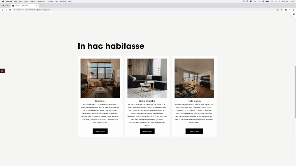
Through 3 different examples using the Auto List section in Squarespace 7.1, I’ll be showing you the logic required to build one, so you can head off and animate everything on your client’s site!
Just kidding… well, kinda.
I always get questions about this kind of customization and, personally, it’s my favorite way to add some dynamic elements to a website so, I just had to make a video on them.
So, if you want to learn how they work and how to set them up, jump right into the video!
Tutorial
Overview & timestamps
00:00 - Intro
00:45 - Editor settings for the example Auto List section
First up, I’ll share with you the settings I’m using for the Auto List section, in case you want to replicate one of the examples or just follow along with the video!
01:47 - Basic parts of a hover mode
Next, we’ll talk about the two main parts that are required to create a hover mode and the role that each of them plays in the effect.
02:20 - First example, changing the shape of the images on hover
For the first example, we’ll be looking at how we can change the shape of the Auto List layout images when we hover over the whole item.
03:59 - Quick tip about modifying images with CSS
But before we jump into picking the first part of the hover mode, I’ll share with you a quick little tip regarding working with image elements with CSS, especially when what you’re trying to do is modify things on the “edges” of the image.
05:13 - Picking the target container
Alright, with that out of the way it’s time to pick the container that’s going to change shape on hover.
06:29 - Testing the result we're looking for
Then, we’ll be testing out the properties we want to use to make sure we get the final result we’re after before looking for the other part of the hover mode.
07:57 - Finding the trigger for the hover mode
Now that everyhting’s looking good, it’s time to look for that trigger container.
11:45 - Creating the hover mode
And finally, we can create our hover mode for the images!
12:38 - Adding a smoother transition
Last but not least here, we’ll see what we can do to create a smoother transition for the shapeshifting image.
14:14 - Tackling the delay issue
And of course, we’ll run into an unexpected issue. But, I’ll show you why it’s happening and what we can do to get rid of it if necessary.
16:50 - Second example, making the list items slide-up
Up next, we’ll make the whole Auto List items levitate!
17:12 - Picking the target container
First, we need to look for that target container for the hover mode, depending on which part of the section we want to alter.
17:54 - Testing the result we're looking for
Then, it’ll be time to test the final result we’re going for, to make sure our code works right off the bat.
18:42 - Looking for the trigger of the hover mode
Knowing that everything should work correctly, we’ll move on to selecting the trigger container for the hover mode. But, we’ll run into a tricky situation…
18:50 - Quick tip on additional trigger options
To tackle these scenarios, I’ll give you a quick tip on what else you can use as your trigger if you can’t really count on the “main” choices.
19:50 - Creating the hover mode
With our trigger in place, we can go ahead and create our hover mode for the items!
20:17 - Adding a smoother transition
And here too, we’ll add a smooth transition to avoid the harshness of the movement.
21:34 - Third example, stretching and recoloring the button
Alrighty, two down, one to go! For this third example, we’ll be focusing our attention on the buttons of the Auto List items. We’ll be making them stretch out and change color, just because.
21:57 - Picking the target container
As for the target container, we’ll need to base our decision not only on the location/size of the element but also on where the original values were applied, to avoid some serious headaches.
23:11 - Testing the result we're looking for
Next up, we’ll test out things again to make sure everything looks like it should.
25:20 - Looking for the trigger of the hover mode
For the trigger here, we’ll go with a familiar container once more, to make sure the button changes regardless of which area of the item gets the cursor on.
25:53 - Creating the hover mode
With that out of the way, we can create and test out our hover mode!
26:24 - Adding a smoother transition
But here too, a transition will be required to make things a lot softer.
26:48 - Addressing the transition issue
To add the transition, we’ll have to address an issue with the color that’ll pop up thanks to the difference in code being used.
27:54 - Addressing the button's stretching issue
And then, specifically for the stretching transition, I’ll walk you through how the problem that arises can be fixed and what you need to keep in mind when you’re trying to animate different properties.
30:37 - Making the button stretch out from the middle
Last but not least, I’ll give you a quick tip on what we can change in the editor to make the button expand from the middle of the screen.
I know that was a lot but I hope you found it helpful for your next project!
Until next time,
B.
Full code
Example #1 - List images shape-shifting effect
Custom CSS Window
/*HOW TO CREATE A HOVER MODE FOR ANYTHING IN SQUARESPACE (7.1)*/
.list-item-media-inner {
  transition: all .5s;
  transition-delay: 0s !important;
}
.list-item:hover .list-item-media-inner {
  border-bottom-left-radius: 50%;
  border-top-right-radius: 50%;
}
Example #2 - List items slide up and shadow effect
Custom CSS Window
/*HOW TO CREATE A HOVER MODE FOR ANYTHING IN SQUARESPACE (7.1)*/
.list-item {
  transition: all .5s;
}
.list-item:hover {
  box-shadow: 8px 8px 20px rgba(0,0,0,0.1);
  transform: translateY(-50px);
}
Example #3 - List items button stretch and color-shift effect
Custom CSS Window
/*HOW TO CREATE A HOVER MODE FOR ANYTHING IN SQUARESPACE (7.1)*/
.list-item-content__button {
  text-align: center;
  transition: all 1s !important;
  width: 150px;
}
.list-item:hover .list-item-content__button {
  background-color: blue !important;
  width: 100%;
}