
How to add a custom Pin It button in Squarespace (7.0 & 7.1)

March 2018: a new and improved version of the code, allowing you to adjust the size of your custom pin image, is available now available.
Squarespace makes it really easy for you to add pin it buttons to your website, you only need to make a couple of clicks to activate them!
However when it comes to styling those buttons, it’s another story.
If you’re like me, you probably a) enjoy tweaking Squarespace templates and/or b) want to have as many things as possible on your site on-brand... including something simple like pin it buttons.
So, whether you can’t stop thinking that red or white button doesn’t match your branding, or you want to prove yourself you can make the change, today you’ll find out how to add a personalized pin it button to your pinnable images.
Let’s do this!

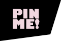
Download your custom "Pin It" button
Grab one – or all! – of the images below and follow along this tutorial. Simply click on them to open in a new tab and save, or right-click and "save-as".


Enabling pin it buttons in Squarespace
First, you need to have your pin buttons activated on Squarespace by going to Settings > Marketing > Pin it Buttons and enabling them.
For the sake of this tutorial, we’ll be setting it to large and circular.

Finding a way to target all pin it buttons
Now, if you use inspect element over the pin button image that pops up when you hover, you’ll see that the button has a particular class and the image set as background-image is the one you see. So logically, my first thought was to substitute that and call it a day... but – and I bet you knew this was coming – that didn’t work.

If you look closely at the pin’s class (the highlighted portion above), you’ll see a large number string in the middle. That number is different not only for each website but for each blog post, so as you can imagine it isn’t practical to grab each of your post’s pin class to change the image. I mean come on, nobody has time for that.
So, our first problem is to figure out what ALL pin buttons have in common and target that.
To see all the attributes of your pin button, you’ll need to either log out of your site and open the blog post as a visitor or open a second window in Chrome under Incognito mode (File > New Incognito Window). Now, let’s inspect the pin button again:
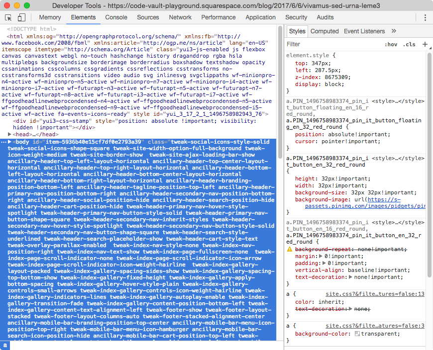
This time, you’ll see the entire tag highlighted and closed, but if you open it and scroll to the bottom, you’ll find an tag with the same class you saw before.
That’s your pin button.
Note: you have to make sure you see the pin button over your post image for the tag to show up in your inspect element window.
My a tag looks like this, and you can see the classes from before with the numeric strings, the default “Pin it!” title, an attribute called data-pin-log, another called data-pin-href with the link of the post, and some styles at the end:
<a class="PIN_1496758983374_pin_it_button_en_32_red_round PIN_1496758983374_pin_it_button_floating_en_32_red_round" title="Pin it!" data-pin-log="button_pinit_floating" data-pin-href="//www.pinterest.com/pin/create/button/?guid=NrjiUZM9FZ4x&url=https%3A%2F%2Fcode-vault-playground.squarespace.com%2Fblog%2F2017%2F6%2F6%2Fvivamus-sed-urna-leme3&media=https%3A%2F%2Fstatic1.squarespace.com%2Fstatic%2F58fe08c63a041197bb9d24b3%2Ft%2F5936b436893fc01158780021%2F1496757319653%2F%3Fformat%3D1500w&description=Sed%20finibus%20nunc%20ac%20mattis%20viverra%20%E2%80%94%20TCVP" style="top: 347px; left: 287.5px; z-index: 8675309; display: block;"></a>
By examining another blog post we can see which values of those attributes remain constant:
<a class="PIN_1496761559959_pin_it_button_en_32_red_round PIN_1496761559959_pin_it_button_floating_en_32_red_round" title="Pin it!" data-pin-log="button_pinit_floating" data-pin-href="//www.pinterest.com/pin/create/button/?guid=bh9goezXx9rE&url=https%3A%2F%2Fcode-vault-playground.squarespace.com%2Fblog%2F2017%2F6%2F6%2Fvivamus-sed-urna&media=https%3A%2F%2Fstatic1.squarespace.com%2Fstatic%2F58fe08c63a041197bb9d24b3%2Ft%2F5936b3571b10e360e30a6d28%2F1496757262923%2F%3Fformat%3D1500w&description=Vivamus%20sed%20urna%20%E2%80%94%20TCVP" style="top: 347px; left: 287.5px; z-index: 8675309; display: block;"></a>
The title value (Pin it!), the data-pin-log value (button_pinit_floating) and the style values (top: 347px; left: 287.5px; z-index: 8675309; display: block;) are the same, so why not use one of those as our target?
And in case you're wondering, you don't always have to target your element's classes or ids, attributes and their values can be used as selectors in cases like these!
All we need to do is use the selector corresponding to one of those attributes, and since we never know if Pinterest will alter the default title of their pin buttons or their styles, it’s safer to go for the data-pin-log attribute.
To use an attribute as part of your selector, you also need to address the type of element it belongs to, in this case an a tag, so we’ll end up with something like this:
a[data-pin-log="button_pinit_floating”] { }
That translates to: any a tag with an attribute of data-pin-log that has a value of button_pinit_floating. VERY specific!
By the way you’re doing great so far, keep going!.
Finding a way to replace the original pin it button
We know the pin button is basically a background image as we saw at beginning, so our goal so far has been to replace that with an image of our own. But let’s take a moment and see what happens if we try to alter the background color of that selector – since it’s the same thing as changing the background image but much quicker.
a[data-pin-log="button_pinit_floating"] {
  background-color: blue;
}

The color is behind the button image. So that’s yet another problem.
Let’s make it a bit wider so we can see it better.
a[data-pin-log="button_pinit_floating"] {
  background-color: blue;
  width: 100px!important;
}

Yep, that’s behind the image. The button looks multiplied right now because it hasn’t been set to no-repeat, but that’s not part of the problem.
What we need to do is add the background-color/background-image in front of the original one, since right now it’s located behind it. In this case, behind is before and in front is after, which might not make sense until you visually see it in the structure of your HTML site:
<a>
  <!--This is before/behind the button-->
  Here’s the pin button
  <!--This is after/in front of the button-->
</a>
Note: in other cases, and depending on positioning, before can be left and after can be right.
So this is how we're going to solve that second problem...
The pseudo-element we’ll be using is ::after. You might have seen it, you might have seen its counterpart ::before, but briefly what it does is help style a specific part of an element, what comes before or after its content.
To use it, it’s important to know a couple of things:
It can be added to any HTML element of your site.
It has to include the content property, even if it’s blank (you’ll see what I mean in a bit).
It can be used with double (::after) or single colons (:after), but this time we’ll be using single colons (read more about the difference here).
Ok, let’s see this in action.
We’ll add the ::after to our previous pin button selector and include some text in the content property as well as the same background-color we used before. This will help us see things better.
a[data-pin-log="button_pinit_floating"]:after {
  content: "TEST";
  background-color: blue;
}

Awesome! It works.
Adding a custom pin it button
Now let’s add our customized pin button. You can create one in PS, AI, Canva or on your favorite design software. If you want to make it the same size as the default pin button we chose in this tutorial (red, circular), go for 32px by 32px – that’s the size the original background image has.
Once you’re done, upload it to your Custom Files in your CSS window.

Change the content property in your snippet to read url() and then click on your uploaded file to paste the link between the parenthesis:
a[data-pin-log="button_pinit_floating"]:after {
  content: url(https://static1.squarespace.com/static/58fe08c63a041197bb9d24b3/t/5936d01e8419c2a3645bc4d3/1496764446241/Pin+button+3232.png);
}

How about that? It looks great!
If you’re happy with the size then you can leave it like that, but if you want to learn how to change the size and how to solve the problem that comes with it keep reading.
Adding a larger custom pin it button
Once you achieve all the steps above, there’s pretty much nothing that can stop you. So let’s see what happens if you add a larger pin button.
First of all, you have to create one in any size you like. I’ll go with an 80px by 80px image.
Upload it again, and add it the same way as before to your snippet:
a[data-pin-log="button_pinit_floating"]:after {
  content: url(https://static1.squarespace.com/static/58fe08c63a041197bb9d24b3/t/5936d01e8419c2a3645bc4d3/1496764446241/Pin+button+8080.png);
}

See the problem? The old pin image shows...
However, to make that image invisible we can’t use the display property, since even if it’s applied to the button selector without the :after, the pseudo-element it’s still linked to it, and will disappear as well.
The solution to this problem is probably not the best one, but it works. What we can do is move the old image as far from the screen as possible so it doesn’t show.
To do that, we’re going to use the transform property on both the original selector AND the selector with the :after pseudo-element. This will allow us to move the old button a determined amount of pixels to the left, and then add the same amount to the new button to move it back in place.
Starting small, our entire code will look as follows when adding the transform property:
/**This is the OLD pin button**/
a[data-pin-log="button_pinit_floating"] {
  transform: translatex(-100px);
}

/**This is the NEW pin button**/
a[data-pin-log="button_pinit_floating"]:after {
  content: url(https://static1.squarespace.com/static/58fe08c63a041197bb9d24b3/t/5936d2c38419c20d72d5cc75/1496765123298/Pin+button+8080.png);
  transform: translatex(100px);
}

To avoid the new button moving with the old one, we have to set its positioning to absolute:
/**This is the OLD pin button**/
a[data-pin-log="button_pinit_floating"] {
  transform: translatex(-100px);
}

/**This is the NEW pin button**/
a[data-pin-log="button_pinit_floating"]:after {
  content: url(https://static1.squarespace.com/static/58fe08c63a041197bb9d24b3/t/5936d2c38419c20d72d5cc75/1496765123298/Pin+button+8080.png);
  transform: translatex(100px);
  position: absolute;
}

And lastly, to move the old pin it button outside of the screen, we have to be a bit more savage with the transform value:
/**This is the OLD pin button**/
a[data-pin-log="button_pinit_floating"] {
  transform: translatex(-9999px);
}

/**This is the NEW pin button**/
a[data-pin-log="button_pinit_floating"]:after {
  content: url(https://static1.squarespace.com/static/58fe08c63a041197bb9d24b3/t/5936d2c38419c20d72d5cc75/1496765123298/Pin+button+8080.png);
  transform: translatex(9999px);
  position: absolute;
}

And there you go!
I don't know about you, but I got pretty excited when I found out I could have my own custom pin it button. Don't be afraid to experiment with even larger buttons, or even full cover images!
Until next time,
B.
Full code
UPDATED VERSION
This new version includes browser compatibility prefixes and an easier way to adjust the size of your new pin image through the height and width values!
/*This is the OLD pin button*/
a[data-pin-log="button_pinit_floating"] {
  -ms-transform: translatex(-9999px);
  -webkit-transform: translatex(-9999px);
  transform: translatex(-9999px);
}

/*This is the NEW pin button*/
a[data-pin-log="button_pinit_floating"]::after {
  background: url("PIN-BUTTON-IMAGE.png");
  background-size: contain;
  content: "";
  height: 80px;
  position: absolute;
  left: 0;
  top: 0;
  -ms-transform: translatex(9999px);
  -webkit-transform: translatex(9999px);
  transform: translatex(9999px);
  width: 80px;
}
OLD VERSION
/*This is the OLD pin button*/
a[data-pin-log="button_pinit_floating"] {
  transform: translatex(-9999px);
}

/*This is the NEW pin button*/
a[data-pin-log="button_pinit_floating"]:after {
  content: url(https://static1.squarespace.com/static/58fe08c63a041197bb9d24b3/t/5936d2c38419c20d72d5cc75/1496765123298/Pin+button+8080.png);
  position: absolute;
  transform: translatex(9999px);
}