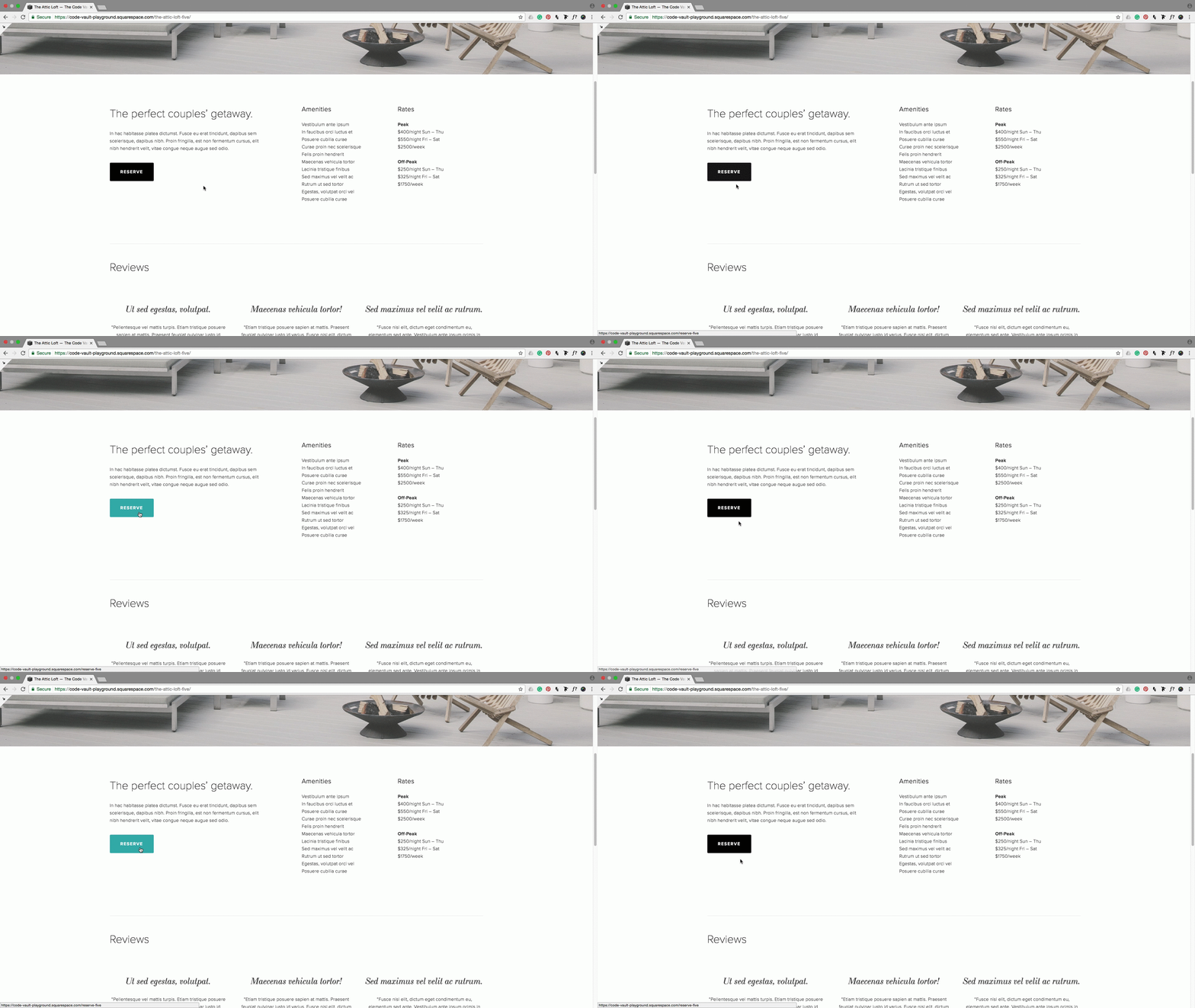
Changing your button's color on hover mode
One way to make your template buttons look not only unique and on-brand but also invite your audience to click is to add an eye-catching hover mode.
Squarespace’s buttons already offer two styles:
From solid background color to slightly faded.
From outline to a solid background color.
But what if you want to have the change go the other way around? From solid to outline or from one color to a different one?
In this post, you’ll learn how you can achieve those two effects with a couple of lines of CSS!
Finding your button’s class
First, you’ll need to find the classes of your button through inspect element (I recommend using Chrome) by right-clicking on the button you want to alter and selecting Inspect.
Next, with the a element selected, go to the right-hand sidebar and from the top-most group of classes, highlight and copy the part that’s in black.
The grayed out text refers to the classes of buttons that have the same style as the one you’re selecting (e.g rounded) but in different sizes. The section in black, are the classes for the button size you’re currently selecting. In this case, the entire group reads:
.small-button-shape-rounded .sqs-block-button .sqs-block-button-element--small,
.medium-button-shape-rounded .sqs-block-button .sqs-block-button-element--medium,
.large-button-shape-rounded .sqs-block-button .sqs-block-button-element—large {

}
But only the dark grey section will be used in this example to modify the medium size button.
Keep in mind that depending on the style of button you’re using, your classes will be different.
Changing a button’s color on hover
To change the background color of your solid button, you only need a second hex code to alter the background-color property. In this example, it will go from black to a green-blue color, #009999.
With your group of classes selected, go to your CSS injection window and paste the classes you got from the inspect element window:
.medium-button-shape-rounded .sqs-block-button .sqs-block-button-element--medium {

}
If you were to change the properties of that snippet as it is, you would be altering the button itself. Try it out! Add this to your snippet and see how the button changes its background color:
.medium-button-shape-rounded .sqs-block-button .sqs-block-button-element--medium {
  background-color: #009999;
}
However, since you want to edit the hover mode, you need to use the pseudo-class :hover after the last class like so:
.medium-button-shape-rounded .sqs-block-button .sqs-block-button-element--medium:hover {
}
Now, whichever changes you make will be applied to the button’s hover mode instead.
.medium-button-shape-rounded .sqs-block-button .sqs-block-button-element--medium:hover {
  background-color: #000999;
}
Changing a button from solid to outline
To create this effect, three things are needed: changing the current background color of the button, adding a border or outline to the hover mode, and changing the color of the text.
So if you have your black button and want to switch to a white button with black border, you’ll need to add:
.medium-button-shape-rounded .sqs-block-button .sqs-block-button-element--medium:hover {
  background-color: transparent;
  border: 2px solid #000000;
  color: #000000;
}
If you're wondering why transparent instead of white, it's in case you decide to add your button to a colored background.
Regarding the border, you can change 2px to any thickness you want (1px, 3px...) and add your corresponding color hex code where #000000 is.
The color of the font changes thanks to the color property, where #000000 can be substituted by your chosen color.
Now, you might notice there’s a slight misalignment when making this change on a solid color button. If you look closely you can see the text moves a bit and the button seems to extend in size, in turn making the content move down just a tad:
This is because you’re adding a border to the hover mode of a button that didn’t have any, hence affecting the original size by a couple of pixels. However, a quick way to solve this is to add a border to the normal button mode as well (without the :hover pseudo-class):
.medium-button-shape-rounded .sqs-block-button .sqs-block-button-element--medium {
  border: 2px solid #000000;
}
Note: for some Squarespace buttons the changes won’t work unless you use the !important rule like this border: 2px solid #000000 !important; Just make sure to use it ONLY if necessary.
Just make sure the pixel size matches the one you’ll be adding in the hover mode and making the color either transparent or match the button color (in this case, it would also be black).
How about that? Now you can add two different hover modes to your Squarespace buttons with just a few lines of CSS.
Until next time,
B.
Full code
Note: the code targets the medium sized Squarespace button. You'll need to swap the corresponding class for the one that matches the button you're using (i.e. .sqs-block-button-element--small or .sqs-block-button-element--large).
Solid to solid hover effect
Custom CSS Window
/*CHANGING YOUR BUTTON'S COLOR ON HOVER MODE - SOLID TO SOLID*/
.sqs-block-button .sqs-block-button-element--medium:hover {
  background-color: #009999;
}
Solid to outline hover effect
Custom CSS Window
/*CHANGING YOUR BUTTON'S COLOR ON HOVER MODE - SOLID TO OUTLINE*/
 .sqs-block-button .sqs-block-button-element--medium {
  border: 2px solid transparent !important;
}
 .sqs-block-button .sqs-block-button-element--medium:hover {
  background-color: transparent;
  border: 2px solid #000000 !important;
  color: #000000;
}


