Edit a specific banner in the Five template (7.0)
In a previous post, you saw how to make changes to one specific banner in any template from the Brine family and, in today's tutorial, we'll look at how to do the same thing on a Five template.
You'll see exactly how to target a specific banner in your Five template to:
Change the banner page title color
Create a background color behind the page title text to make it stand out from the image
Add a button to the banner with simple CSS
Change the overlay color or opacity on just one banner
Ready? Let's do this!
Select a specific banner
To edit just ONE banner in your Five template you can either add your code inside your chosen page's header or target the corresponding page's ID in your Custom CSS window.
In this tutorial, we'll see how to do it with the page's ID.
We'll start by making a right-click anywhere on the page and selecting "View Page Source"
Now let's do a quick search by hitting CTRL+F or CMD+F and looking for the word body.
That will take us the opening body tag where we'll be able to locate the page's ID.
Once you copy that, close the window and head back to your page so we can start editing our banner!
Edit the page title
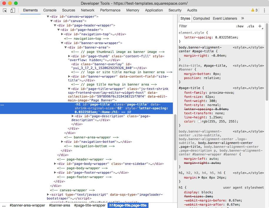
Let's take a look at what our banner page title is called so we can target it in our CSS window
Alright, it has a class of .page-title so we can use that (you could also use the id!).
In our Custom CSS window (Design > Custom CSS) we can then paste our page's id along with the class of our title:
#collection-59f8996f6c319430315f70f4 .page-title { }
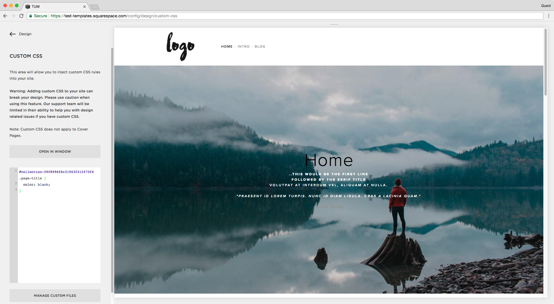
And now let's start by changing the color, let's make it black:
#collection-59f8996f6c319430315f70f4 .page-title {
  color: black;
}
Ok, now how about we add a background color to the page title so it stands out from the banner image?
#collection-59f8996f6c319430315f70f4 .page-title {
  color: black;
  background: white;
}
If you want to shrink down the background, we can make the container hug the content inside it – instead of spanning along the width of its parent container – by making it inline-block like so:
#collection-59f8996f6c319430315f70f4 .page-title {
  color: black;
  background: white;
  display: inline-block;
}
Great! Now you can adjust the space between the edge of the background and the text with padding, and also the distance between the title and the paragraph below with a bit of margin:
#collection-59f8996f6c319430315f70f4 .page-title {
  color: black;
  background: white;
  display: inline-block;
  padding: 5px 20px;
  margin-bottom: 10px;
}
Perfect!
Add a button to the banner
To create a button in the banners of the Five template, you have to start by going into your page's settings and adding a link in your page description.
Once you have your link there, we can easily style it through CSS and turn it into a button!
First let's take a look at what the whole paragraph/description section is called:
It has both an ID and class of .page-description, so we can use either.
This is going to allow us to indicate the location of the specific link we want to turn into a button.
Since our link is an a element – like any other link in our page – as you can see here:
We can then target it in our CSS window like this:
#collection-59f8996f6c319430315f70f4 .page-description a { }
or this, if you want to use the ID selector of the paragraph instead of its class selector:
#collection-59f8996f6c319430315f70f4 #page-description a { }
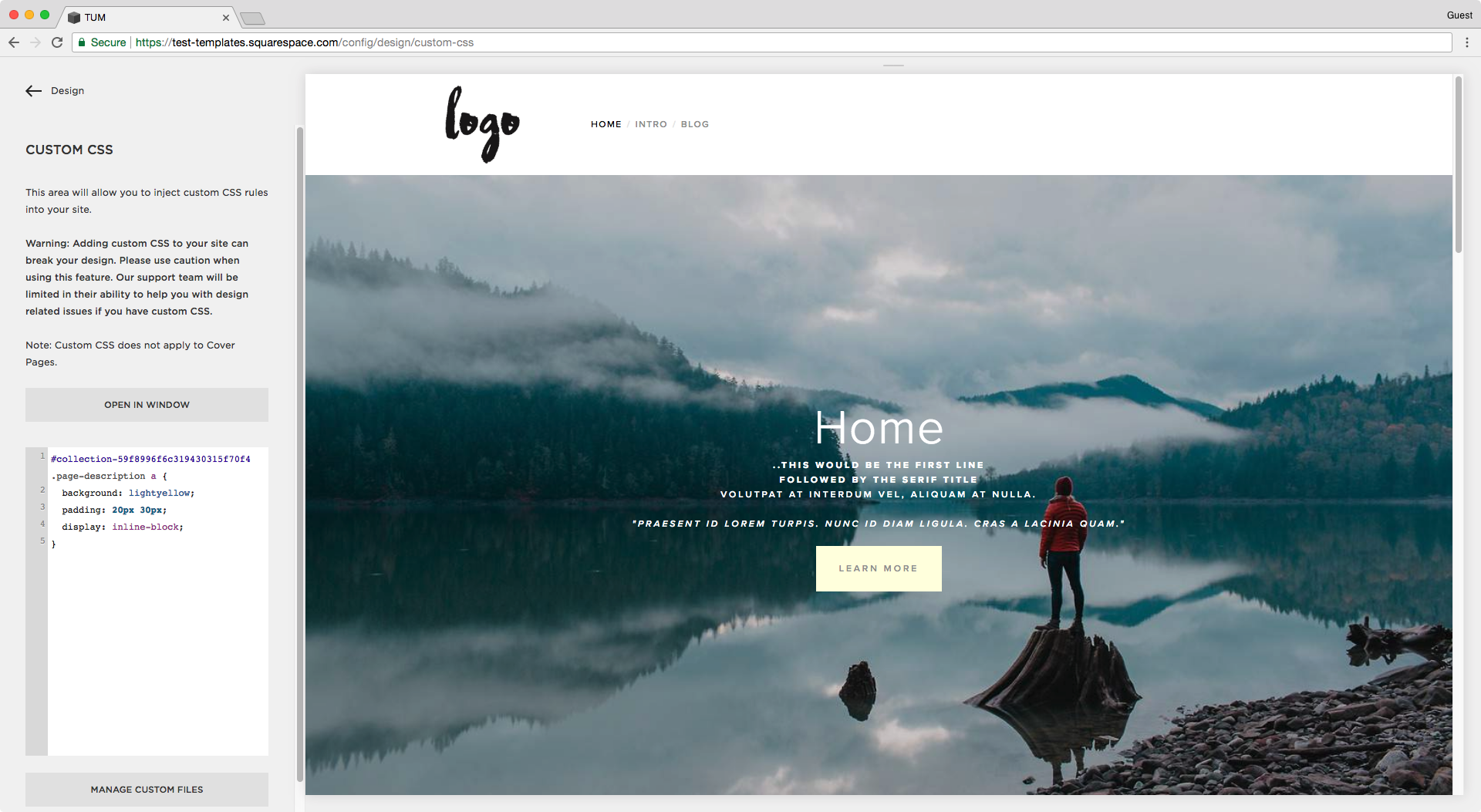
Alright, let's begin by giving it a background color:
#collection-59f8996f6c319430315f70f4 .page-description a {
  background: lightyellow;
}
And now add some padding to make it bigger:
#collection-59f8996f6c319430315f70f4 .page-description a {
  background: lightyellow;
  padding: 20px 30px;
}
I'm also going to set it as inline-block so the button stacks below the container of the rest of the text, creating a bit more separation between them:
#collection-59f8996f6c319430315f70f4 .page-description a {
  background: lightyellow;
  padding: 20px 30px;
  display: inline-block;
}
The text is a little too light, so I'll make it black:
#collection-59f8996f6c319430315f70f4 .page-description a {
  background: lightyellow;
  padding: 20px 30px;
  display: inline-block;
  color: black;
}
And what if you want to have a rounded button instead?
Then you'll need to set the border-radius property:
#collection-59f8996f6c319430315f70f4 .page-description a {
  background: lightyellow;
  padding: 20px 30px;
  display: inline-block;
  color: black;
  border-radius: 50px;
}
Change the overlay of one banner
If you feel the contrast is too low between the text and your banner image, then we can change the color or transparency level to make it easily readable.
Squarespace has at least two ways of setting the overlay for images, either by making the image itself more transparent so the background bleeds through, or by placing an element over the image which can be set to be more or less opaque.
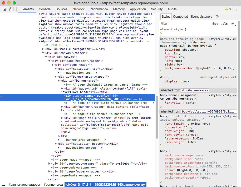
In the case of the Five template banners, the overlay is set as the latter:
Which makes our modification process pretty straightforward!
We just need to indicate our chosen page once again, along with the class of the overlay which in this case is .banner-overlay:
#collection-59f8996f6c319430315f70f4 .banner-overlay { }
And then simply use an rgba color value to change the background color. In this case, I'll stick to the pure black color and only play with the opacity level to make it more visible:
#collection-59f8996f6c319430315f70f4 .banner-overlay {
  background: rgba(0, 0, 0, 0.6);
}
Done!
Until next time,
B.


