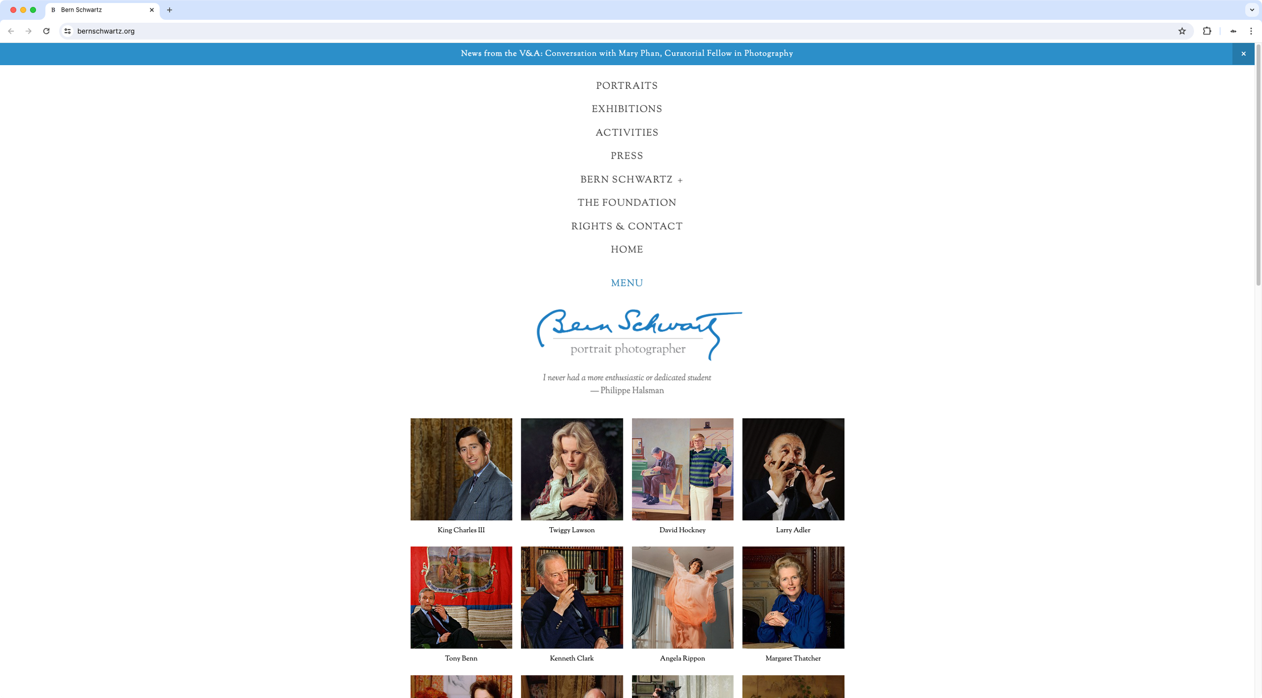
Seamless burger button navigation across devices
The designer wanted to modify the desktop navigation on her client's site to make it match the mobile nav users experienced on smaller devices. Some custom code had already been applied to make that happen but the functionality was slightly different, and her client wanted a seamless experience between screen sizes.
Using the existing custom code as a starting point, I made the necessary tweaks required to achieve the same kind of look, functionality and animations, usually displayed on mobile devices for that particular Squarespace template.
Additionally, I included a set of variables the designer could easily change based on any client requests concerning link size and colors.

