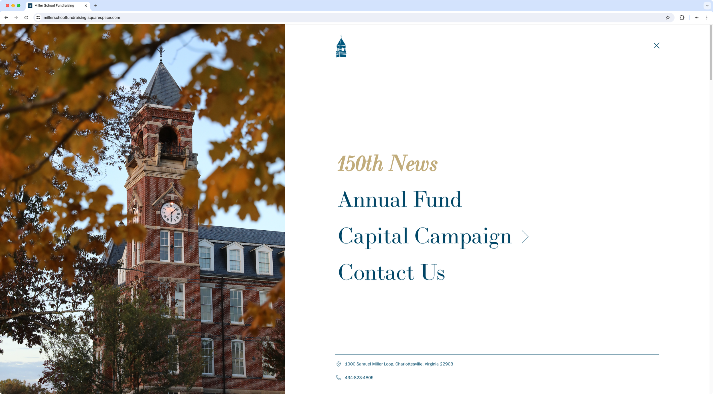
Bold split mobile navigation for desktop
The designer was creating a new website with a very bold and distinctive look, and wanted to bring to life some ideas he already had in terms of the desktop navigation, mainly: creating a split layout, having an entry animation when opening the menu, creating a specific burger button + logo look, and having the option to include additional info inside the links panel.
Starting with the native mobile menu as the base, I created a custom navigation with a split layout that included a small "footer" section with some important contact information about the school, implemented the desired entry animation on desktop, added an on-brand hover mode, and set up a set of easy-access variables for the designer to change at will to adjust different areas of the new navigation.

