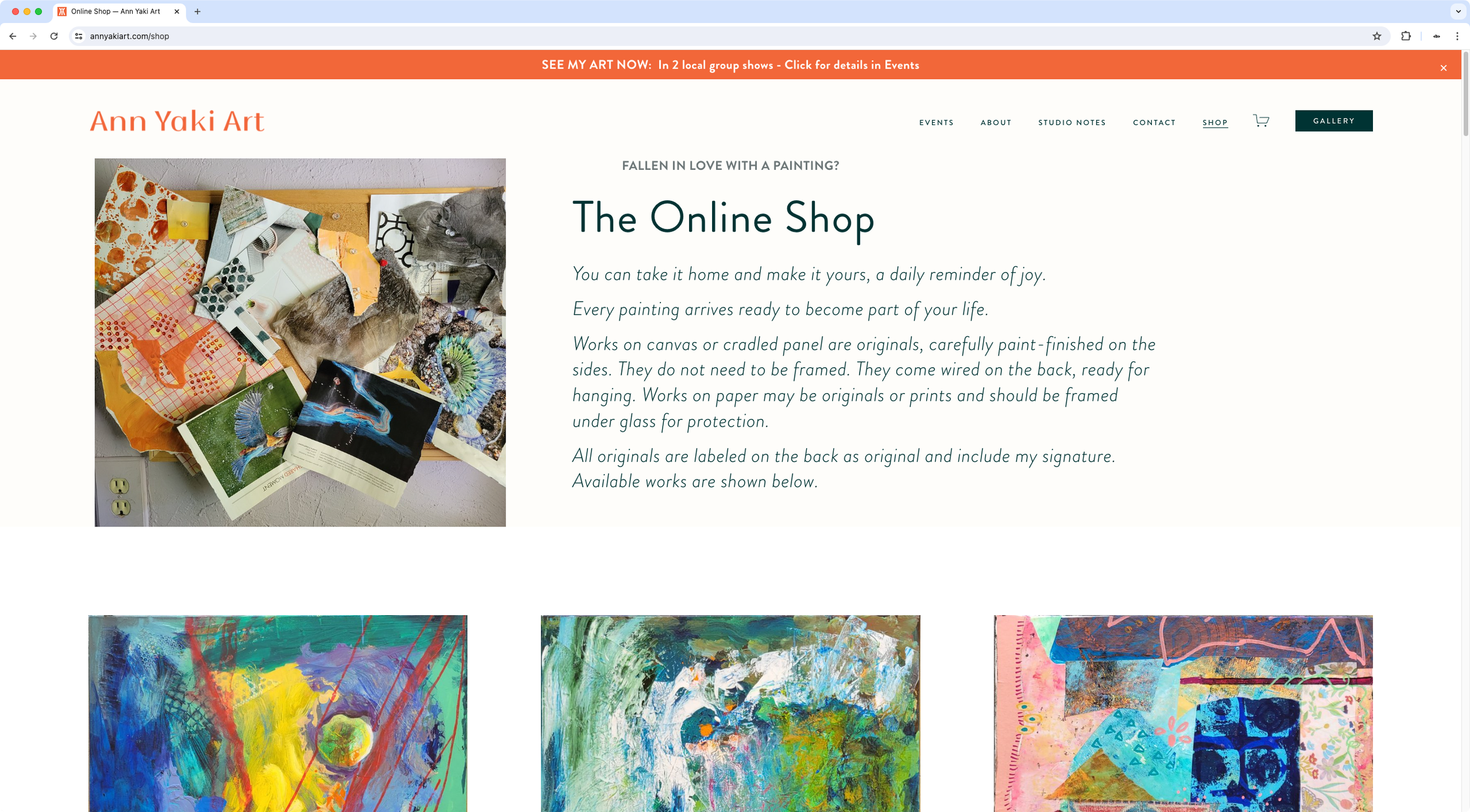
Masonry layout for shop page
The client was looking for a way to modify certain areas of her website, including a better way to display her art pieces without getting the dreaded crop or having to include unnecessary whitespace to the image files.
Apart from the specific tweaks made to different pages, I created a custom layout for her shop page so that her art thumbnails would display in their corresponding aspect ratio, in a Masonry style.
In the same line, I also set up a custom layout for her Gallery pages to display them in a Masonry style as well, while providing a user-friendly way to decide which pieces to display and link up to the Shop page, independently from the existing listings for sale.

