
Changing the number of slides per row for Squarespace Auto Layouts on smaller screens (7.1)
So, do you love the look of your multi-column Auto Layout on desktop and mobile phones, BUT feel pretty "meh" about it on tablets?
Does it look all squished-up?
Does it look too wide?
Regardless of the reason why you want to change the look, today's CSS trick is for you!
We'll be looking at how we can control the number of items displayed at any point when working with the Auto Layout List in Squarespace 7.1.
Ready? Let’s do this!
Tutorial
Overview & timestamps
Apart from the actual slide-per-row modification we’ll be tackling, I’ll also be sharing with you a couple of golden nuggets in terms of how to adapt the code to YOUR number of Auto Layout columns and how to fix a super annoying bug/issue that comes up when using the repeat( ) and calc( ) functions in Squarespace’s Custom CSS window:
00:00 - Intro
00:55 - Quick note about the initial column number
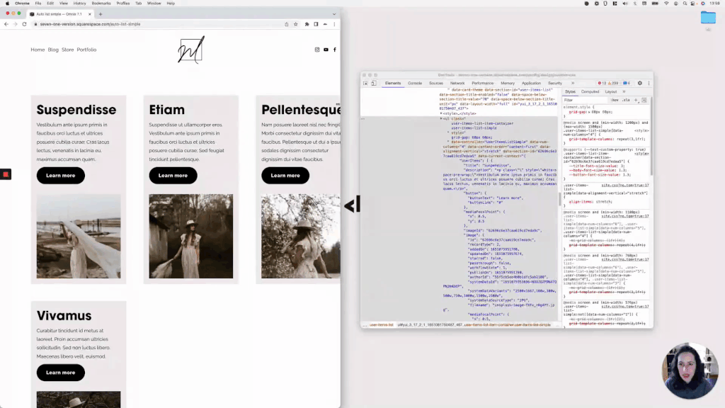
Before we get started with the code, I’ll show you the settings I’m working with (mainly the number of columns) to keep in mind your own settings when creating our snippet, just in case you need to modify it for your project.
01:13 - What Squarespace uses to create columns in the Auto Layout sections
Next, we’ll take a few minutes to do some detective work inside the Inspect Element tool and find out which container is actually making the items/slides sit in a row, and what needs to be modified to change it to our liking.
03:52 - Understanding the current value that Squarespace is using to create the columns
Once we find the corresponding property + value combo, I’ll walk you through what it means and how it can be altered to achieve our goal.
04:33 - Reusing the selector and quick note on adjusting it if necessary
Moving onto the Custom CSS window, I’ll share with you what selector I’ll be reusing, what it’s targeting, and how you can adjust it based on the number of Auto Layout columns YOU’RE working with.
05:44 - Overriding the value in the Custom CSS window
With our selector in place, we’ll be able to add in a quick initial value to test things out, especially because we first need to overcome an issue that’ll no doubt pop up…
06:21 - Quick note about issues with the repeat( ) and calc( ) functions in Squarespace
Even when the code we’re using will still work on the live site, assuming you’d prefer to check the change while inside the editor as well, I’ll give you a super useful tip that you can use to fix the repeat( ) function invalid value issue.
08:18 - Checking the original breakpoints being used
With that out of the way, we’ll proceed to check out the media queries that Squarespace is already using, to see where we need to adjust them or create our own.
10:01 - Selecting the first breakpoint for the new number of slides per row in the Auto Layout
Considering the original number of columns in the example, we’ll create a first media query that’ll make sure the Auto Layout is split into 3 items per row vs. 4, much sooner than it natively does.
11:55 - Selecting a second breakpoint to change the Auto Layout's number of items per row
However, to make things look a little bit better, we’ll adjust the code and create a second breakpoint to make sure the content expands nicely on laptop and tablet sizes before hitting the original layout for smaller screens.
And that’s all for now! I hope you find this little trick helpful for your next project.
Until next time,
B.
Full code
Custom CSS Window
/*CHANGING THE NUMBER OF SLIDES PER ROW FOR SQUARESPACE AUTO LAYOUTS ON SMALLER SCREENS (7.1)*/
@media screen and (min-width: 1200px) and (max-width: 1500px) {
.user-items-list-simple[data-num-columns="4"] {
  grid-template-columns: repeat(~"3,1fr");
  }
}

@media screen and (min-width: 768px) and (max-width: 1200px) {
.user-items-list-simple[data-num-columns="4"] {
  grid-template-columns: repeat(~"2,1fr");
  }
}