
Creating an off-center animated background for collage blocks (7.0 & 7.1 CE)

In a previous post, we saw how we could tweak the collage block with veeeery little code to give the content side a nice border.
The final result of that customization looks pretty nice, but today I want to show you how we can take that tweak to the next level with the help of our friend: the pseudo-element.
Ready? Let’s go!
Adding a border to the content side of the collage block
Let’s quickly jump to the final result of that previous tutorial, so we have our starting point for this one.
We’re just targeting the content container of our collage block, and giving it a nice black border. And same as last time, we’re removing the background color via the Style Editor options.
Here’s the code we used before, just in case:
.sqs-block-image .design-layout-collage .image-card {
  border: 1px solid black;
}

Creating an off-center background
To be able to add our animatable background to our collage, we can create a simple pseudo-element that “attaches” to the container holding our content.
That way, we’ll be able to size it accordingly and easily put it in place.
We already have the selector that targets our content container; it’s the one we used to add the border!
Let’s create an empty pseudo-element for it that has 100% of its width and height, plus a nice light blue background color:
.sqs-block-image .design-layout-collage .image-card::before {
  background-color: #d5dade;
  content: '';
  height: 100%;
  width: 100%;
}

We can’t see anything yet, but we will in a second once we give it a position of absolute to be able to move it around as we please:
.sqs-block-image .design-layout-collage .image-card::before {
  background-color: #d5dade;
  content: '';
  height: 100%;
  position: absolute;
  width: 100%;
}
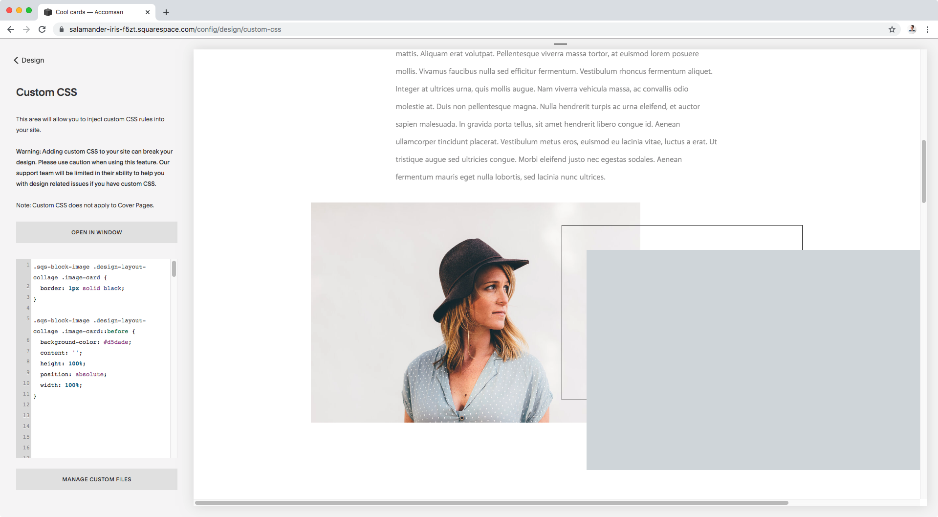
Alright, our blue background seems to be larger than the content area we’re adding it to.
Let’s set the left and top offsets to put it into place and get a better picture of what’s going on.
.sqs-block-image .design-layout-collage .image-card::before {
  background-color: #d5dade;
  content: '';
  height: 100%;
  position: absolute;
  left: 0;
  top: 0;
  width: 100%;
}

Ok, it seems our background pseudo-element is using our entire image block collage thing as the reference point for its size and position.
No biggie!
Let’s change that by giving the content area (aka, the container that’s acting as a parent of our pseudo-element) a position of relative!
.sqs-block-image .design-layout-collage .image-card {
  border: 1px solid black;
  position: relative;
}

Bam! Just like magic.
Now our background pseudo-element knows who it should use as a guideline for its position and size.
We can’t see the text tho, so let’s set a z-index of -1 to set the background to the back.
.sqs-block-image .design-layout-collage .image-card::before {
  background-color: #d5dade;
  content: '';
  height: 100%;
  position: absolute;
  left: 0;
  top: 0;
  width: 100%;
  z-index: -1;
}

Cool! Our background is in place.
How about we offset it now?
You can play around with the position as much as you like!
I’ll be giving mine a top and left offset of -15px so the blue portion comes out behind the content from the top left corner.
.sqs-block-image .design-layout-collage .image-card::before {
  background-color: #d5dade;
  content: '';
  height: 100%;
  position: absolute;
  left: -15px;
  top: -15px;
  width: 100%;
  z-index: -1;
}


Animating the new background
Things are looking great so far, but it’s time for the last piece of the puzzle, the animation!
We’re going to use a simple hover mode to make this collage block look more dynamic.
Basically, we’ll tell our browser that when someone places the mouse ANYWHERE over the collage block, we want the background to shift position.
To do that, we need to target the hover mode of our ENTIRE collage block container (either .sqs-block-image or .design-layout-collage), and set new offset values under our background pseudo-element.
Translated into code, that means:
.sqs-block-image .design-layout-collage:hover .image-card::before {
  left: -5px;
  top: -5px;
}

Awesome!
As you can see above, when the mouse enters the image block zone the background shifts to its new position.
However, that change is happening way too suddenly.
Let’s make sure we add the transition property where the original background offset is located, in order to make things run more smoothly.
.sqs-block-image .design-layout-collage .image-card::before {
  background-color: #d5dade;
  content: '';
  height: 100%;
  position: absolute;
  left: -15px;
  top: -15px;
  transition: all .5s;
  width: 100%;
  z-index: -1;
}

Much much better!
Now, what happens if you DON’T want the hover to happen when any part of the image block is touched but only when the actual content is hovered upon?
Then we just need to change one little bit in our code!
Instead of targeting the hover mode of the ENTIRE block, we’ll target the hover mode of the CONTENT AREA where we attached the pseudo-element!
.sqs-block-image .design-layout-collage .image-card:hover::before {
  left: -5px;
  top: -5px;
}

Can you see the difference?
Now the background shift only happens when the content area is hovered over!
So there you have it my friend, that’s how you can create a simple yet pretty cool look for your collage blocks.
Until next time,
B.
Full code
/*OFF-CENTER ANIMATED BACKGROUND FOR COLLAGE BLOCKS*/
.sqs-block-image .design-layout-collage .image-card {
  border: 1px solid black;
  position: relative;
}

.sqs-block-image .design-layout-collage .image-card::before {
  background-color: #d5dade;
  content: '';
  height: 100%;
  position: absolute;
  left: -15px;
  top: -15px;
  transition: all .5s;
  width: 100%;
  z-index: -1;
}

 //Option 1 - Making the background shift happen when hovering ANYWHERE on the image block
.sqs-block-image .design-layout-collage:hover .image-card::before {
  left: -5px;
  top: -5px;
}

 //Option 2 - Making the background shift happen when hovering ONLY over the content area
.sqs-block-image .design-layout-collage .image-card:hover::before {
  left: -5px;
  top: -5px;
}