Adding an image to buttons in Squarespace
Have you ever wanted to add something extra to Squarespace buttons to make them look a bit more custom with very little effort?
If so, today’s CSS trick is for you!
We’re going to be looking at the EASIEST way to add an on-brand detail to our client’s buttons, to make the whole site look even more personalized in a ridiculously short amount of time.
Let’s get to it!
Targeting the button
We’ll be starting out with a Medium button in Squarespace 7.0.
Note: the exact same code can be used for Medium buttons in 7.1, and adapting it to the Small and Large size requires minimal changes!
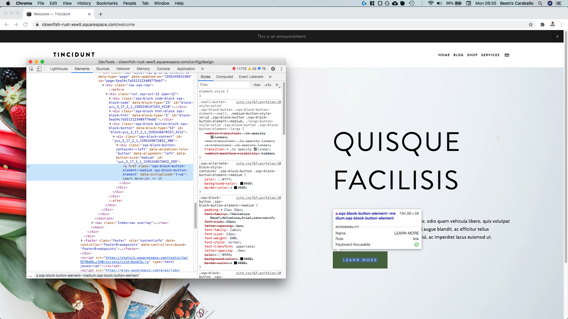
Here’s what I’m working with:
I just have some text over a banner image, accompanied by the button I’m looking to customize.
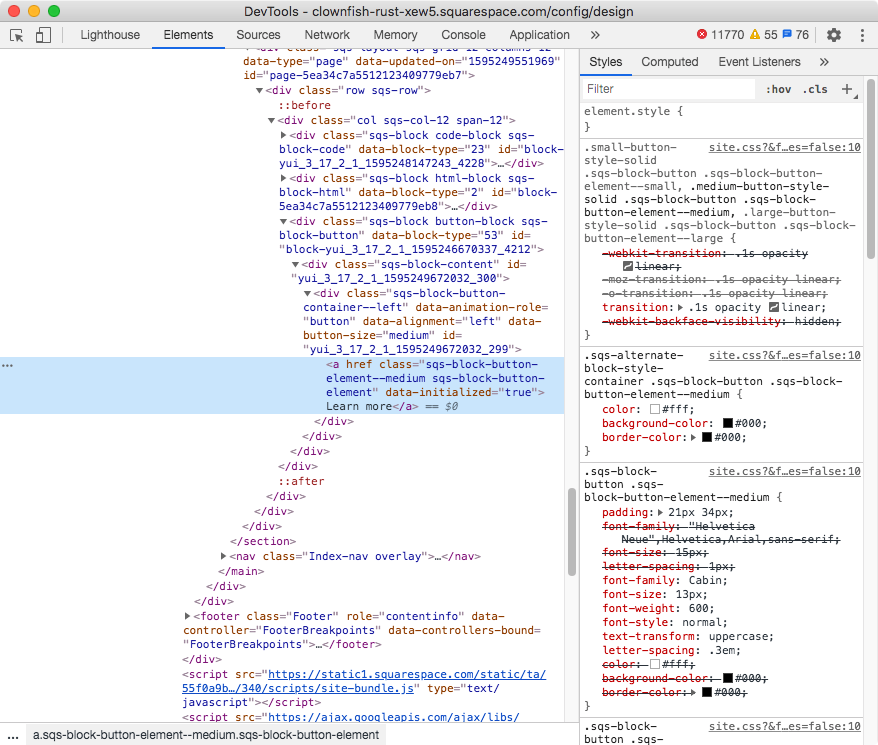
Let’s take a look through our Inspect Element tool to see what our Medium button is called and how we can target it:
Ok, so as we can see above our button is an a element with two classes: .sqs-block-button-element--medium and .sqs-block-button-element.
We could use both to target it, but it doesn’t seem necessary since the first one is specific enough for what we’re doing here. Plus, we’re not overriding any existing background-image value, so we don’t have to get that specific with our selector.
Bottom-line, let’s go with the first class only:
.sqs-block-button-element--medium {

}
Adding the image
Alright, let’s go ahead and add in our background-image:
.sqs-block-button-element--medium {
  background-image: url(https://static1.squarespace.com/static/5e396e0cd589db5a1b0afc56/t/5f159136cd0e0c7efbf24bcd/1595248950992/Circle.png);
}
Ok!
I don’t know if you can tell but right now the image is peeking through the bottom right corner of the button.
Let’s make it more visible by changing its position to center:
.sqs-block-button-element--medium {
  background-image: url(https://static1.squarespace.com/static/5e396e0cd589db5a1b0afc56/t/5f159136cd0e0c7efbf24bcd/1595248950992/Circle.png);
  background-position: center;
}
Alright, and now let’s shrink it down.
Depending on the design you’re going for, you may want to use a percentage or pixel size here.
Personally, I want it to fit nicely within the boundaries of the button, without getting all stretched out, so I’ll use contain to set the size:
.sqs-block-button-element--medium {
  background-image: url(https://static1.squarespace.com/static/5e396e0cd589db5a1b0afc56/t/5f159136cd0e0c7efbf24bcd/1595248950992/Circle.png);
  background-position: center;
  background-size: contain;
}
Awesome!
But we don’t want a repeating pattern, so let’s set the background to no-repeat as well:
.sqs-block-button-element--medium {
  background-image: url(https://static1.squarespace.com/static/5e396e0cd589db5a1b0afc56/t/5f159136cd0e0c7efbf24bcd/1595248950992/Circle.png);
  background-position: center;
  background-repeat: no-repeat;
  background-size: contain;
}
Awesome!
And now, let’s move this to the left side of the button by changing its background-position:
.sqs-block-button-element--medium {
  background-image: url(https://static1.squarespace.com/static/5e396e0cd589db5a1b0afc56/t/5f159136cd0e0c7efbf24bcd/1595248950992/Circle.png);
  background-position: top left;
  background-repeat: no-repeat;
  background-size: contain;
}
Nice!
Let’s move onto the last part.
Making style adjustments
To finish things off, let’s hop onto our Style Editor and change up the opacity of the background and the color of the button’s text.
And just like that, we’re done!
Neat, right?
Full code
Note: you can play around with the different background properties to resize and reposition your image however you like! And if you want to add this customization to a different size button, you can use .sqs-block-button-element--large or .sqs-block-button-element--small as your selector, for the large and small buttons respectively.
Custom CSS Window
/*ADDING AN IMAGE TO BUTTONS IN SQUARESPACE*/
//Medium buttons
.sqs-block-button-element--medium {
  background-image: url(IMAGE.png);
  background-position: top left;
  background-repeat: no-repeat;
  background-size: contain;
}


