What have I done?, i.e…
My coding portfolio
From small customizations, to custom page layouts, to full site developments, I’ve worked with both DIYers and designers to solve stubborn issues, offer the most user-friendly solutions to not-quite-there yet ideas, and make their specific visions a reality!
Custom page layouts • Specific customizations & fixes • Full site development • Custom page layouts • Specific customizations & fixes • Full site development • Custom page layouts • Specific customizations & fixes • Full site development • Custom page layouts • Specific customizations & fixes • Full site development •
Custom page layouts • Specific customizations & fixes • Full site development • Custom page layouts • Specific customizations & fixes • Full site development • Custom page layouts • Specific customizations & fixes • Full site development • Custom page layouts • Specific customizations & fixes • Full site development •
Featured projects
slideUpCards
-
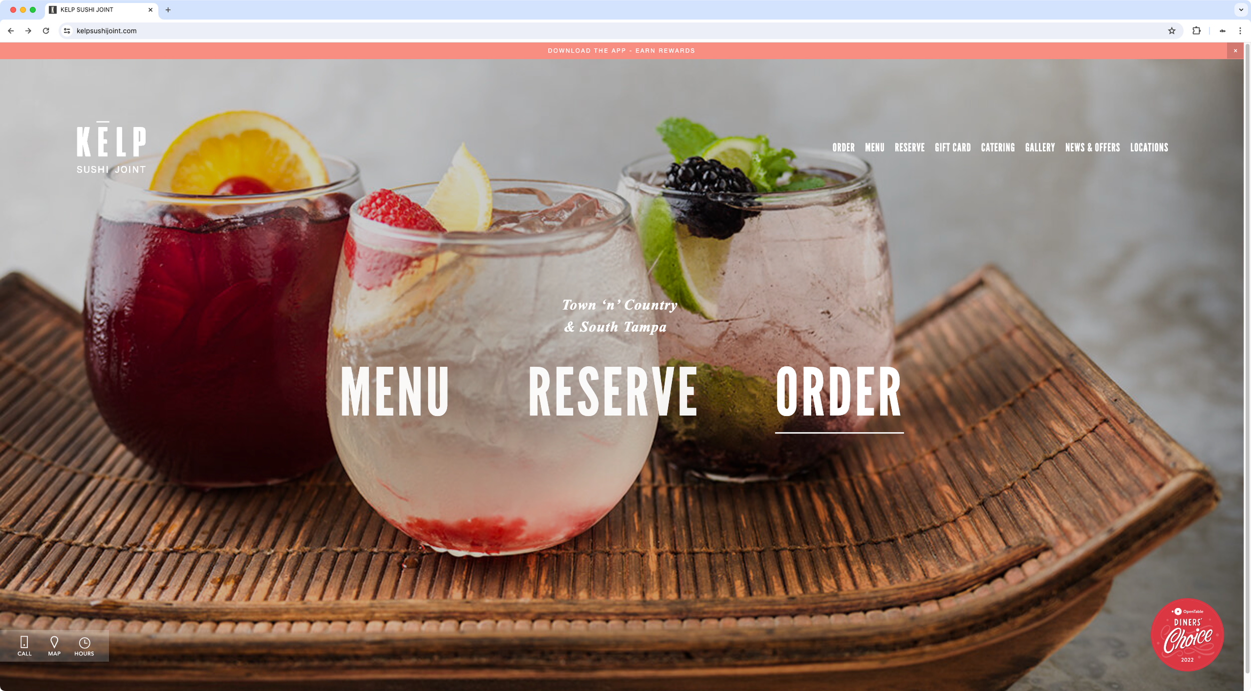
Custom floating elements
Specific customization
The designer wanted a small non-intrusive floating bar where their client's customers could easily have access to the hours/location info of the restaurant. She also wanted a way to display an OpenTable badge on the Homepage to proudly present their award.
Read More
I set up and customized these two floating elements for her, in the most user-friendly way possible, so she could quickly modify icons and links at any time, in case their clients made the request.
-

Interactive bios page layout
Custom page layout
The designer was looking for a way to have an easily update-able bio section for her client's site, that included an alternate image on hover for each trainer, information about the person, and a way to "mark" those who were available to take on new clients.
READ MORE
I set up and customized a user-friendly layout for their page where she and her client could easily add in new people, create Read More dropdowns to hide part of the information if needed, and add custom announcements with text of their choice, without having to touch code.
I also turned the entire customization into a copy/paste plugin, so she could use it in future projects and quickly adapt colors and fonts to that specific client's brand.
-

Filterable resource hub
Specific customization
The designers wanted to create a filterable database of resources for their clients' audience, where all the information was available directly on the cards themselves, while avoiding a cluttered look and page redirects.
READ MORE
Using a Blog page and the Universal Filter plugin as the starting point, I customized the blog items in a way that would allow anyone updating the information to do so quickly – without having to touch code – while still getting the pre-defined look for the corresponding organization's main info, and providing the ability to include additional content inside a dropdown section.
I also set up a specific set of variables for the designers to change up colors and other styles for the cards quickly, in case their clients requested it.
-
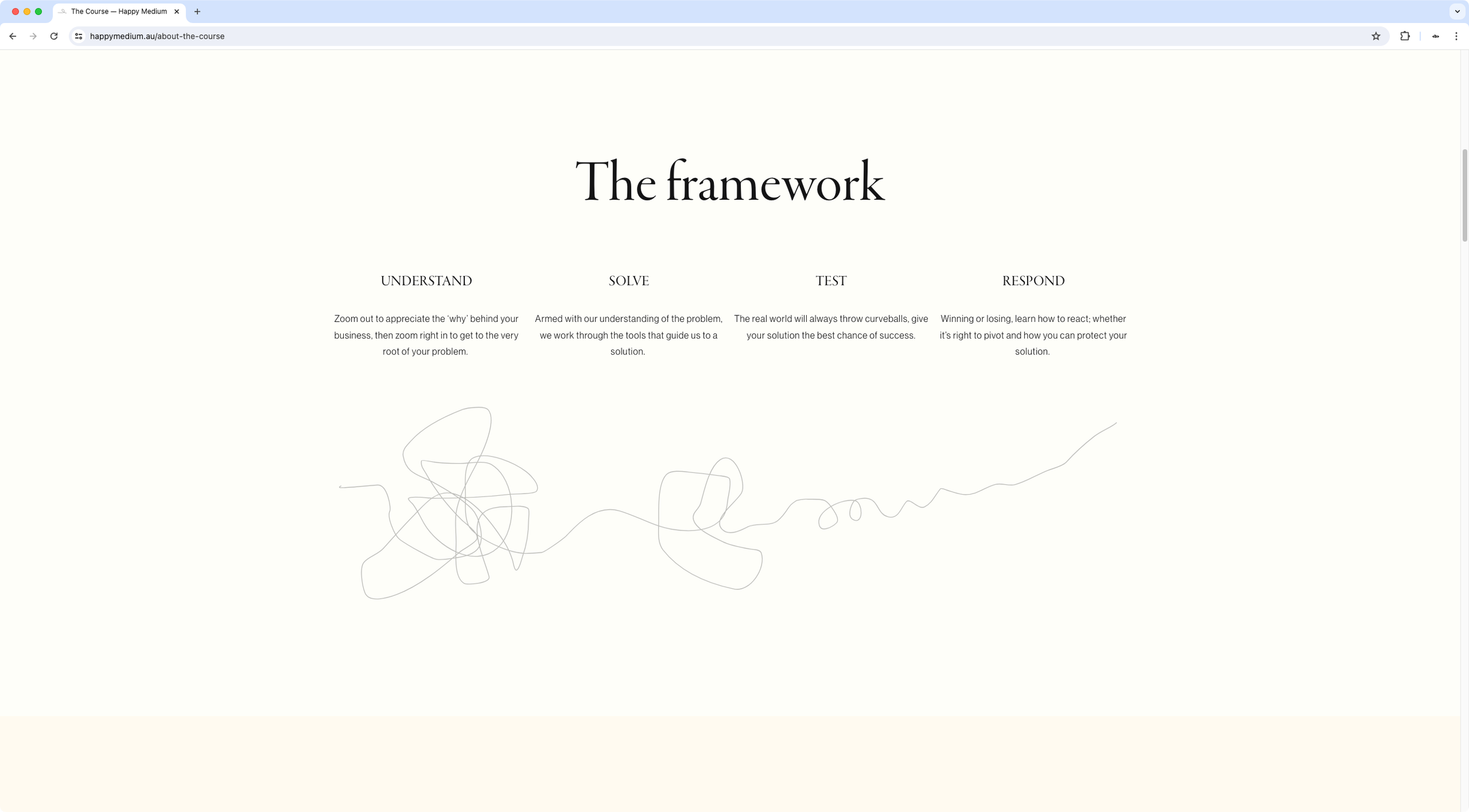
Animated SVGs on scroll
Specific customization
The client was looking for a way to add some animations to her site to make it more interactive and emphasize specific areas of her copy.
READ MORE
Based on some amazing inspirational sites she sent over, and considering Squarespace's limitations, I was able to turn her hand drawn SVGs into animated elements that would come to life on scroll, or get drawn on the screen as her audience moved the cursor around.
I also included some easy-to-tweak settings/variables so she could have more control over the look of her animations, in terms of color and style.
-
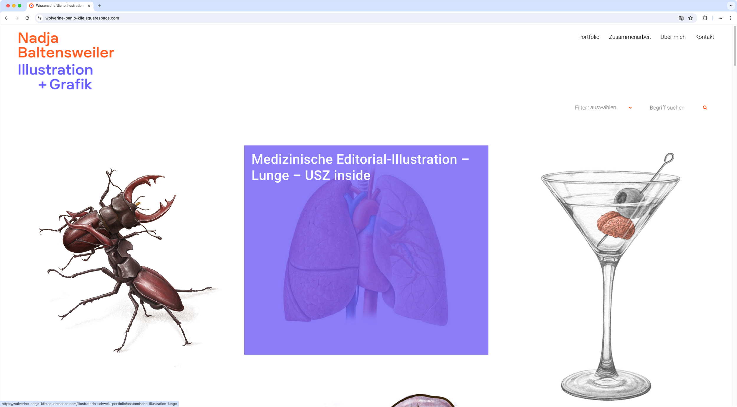
Custom portfolio hover mode and filter
Specific customization
The client had already implemented customizations on her site and was looking to both adapt some of them to better suit her needs, and set up additional functionality – such as a portfolio filter – that couldn't be done with Squarespace's native options.
READ MORE
Amongst the different modifications made to her site, I implemented and customized the Universal Filter plugin for her Portfolio/Blog page, fixed an overlay issue where external links weren't accessible, and created a "selective display" cart button customization that would allow her to hide or show the cart icon on a page-by-page basis, without having to use Page IDs.
-
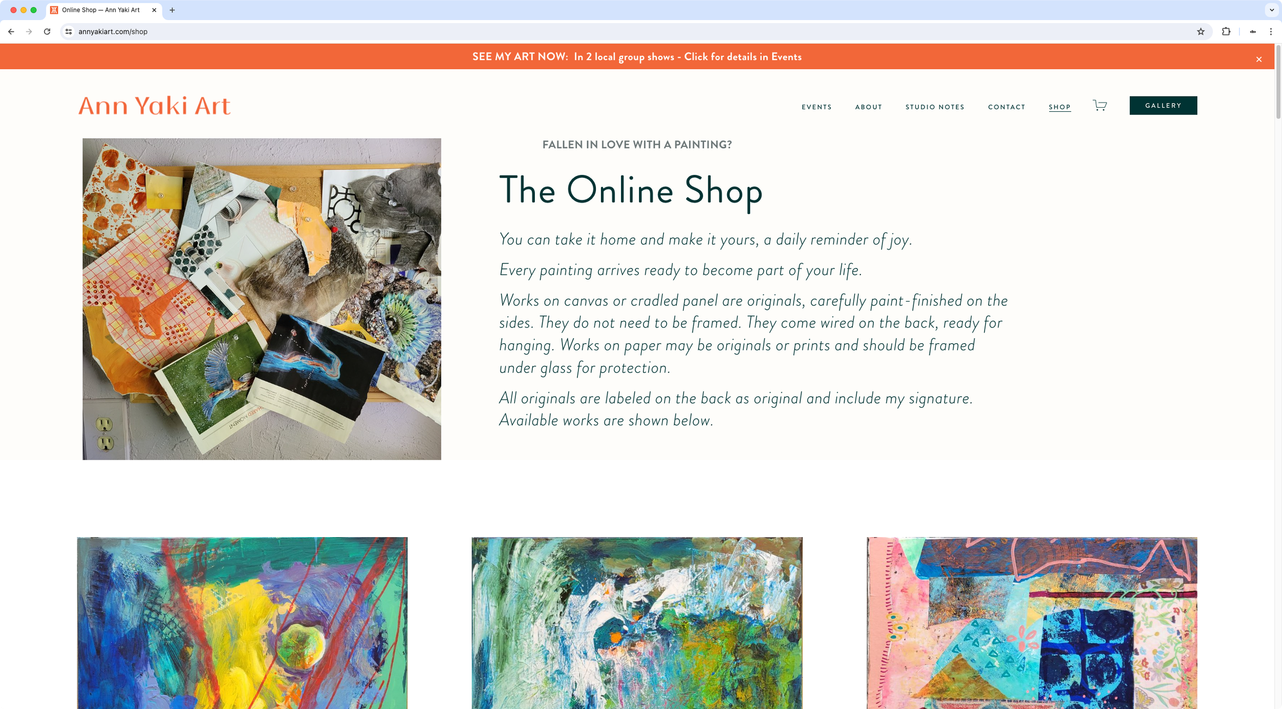
Masonry shop page layout
Custom page layout
The client was looking for a way to modify certain areas of her website, including a better way to display her art pieces without getting the dreaded crop or having to include unnecessary whitespace to the image files.
READ MORE
Apart from the specific tweaks made to different pages, I created a custom layout for her shop page so that her art thumbnails would display in their corresponding aspect ratio, in a Masonry style.
In the same line, I also set up a custom layout for her Gallery pages to display them in a Masonry style as well, while providing a user-friendly way to decide which pieces to display and link up to the Shop page, independently from the existing listings for sale.
-
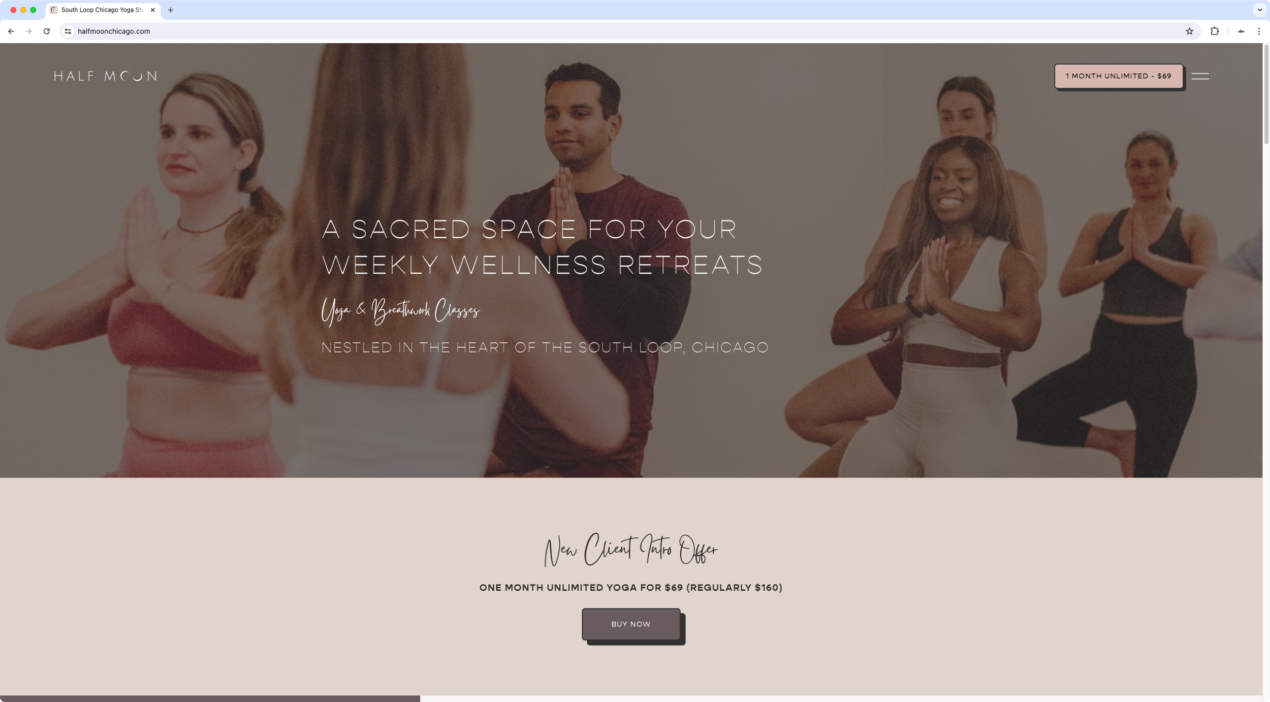
Custom desktop nav and button
Specific customization
The designer was looking for a way to create a sidebar-style navigation on desktop for her client that didn't cover the entire screen, while retaining the option of displaying the header CTA at all times, keeping it responsive on smaller devices.
READ MORE
Using the native mobile nav as a starting point, I customized the elements to create a bold menu with big links, included a subtle hover mode on desktop, and set up an alternate CTA to display shorter text on smaller screens, to ensure responsiveness.
I also set up a set of easy-access variables for her to modify sizes, colors, and other style-related details quickly, based on future changes her client may want to see.
-

Custom Lightbox for artist statement
Specific customization
The designer had a very specific vision for different custom elements on her client's site, including an "Artist Statement" lightbox that could display different content for each of her client's photo collections, with specific dimensions and a minimal look.
READ MORE
With the help of a third-party lightbox plugin, I was able to build the element on the site based on her specifications, while providing the most user-friendly way for both her and her client to update and set up the content for future galleries as needed.
I included a mobile-friendly version as well, to ensure the "Artist Statement" CTA could be accessible on smaller screens without disrupting the content on the page.
-
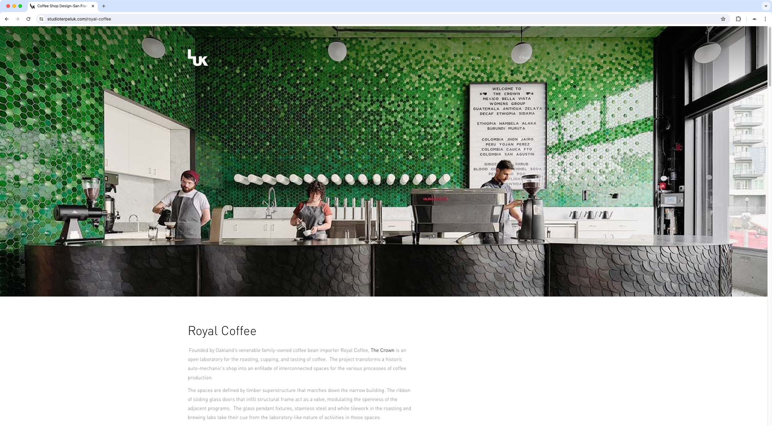
Alternate nav style on scroll
Specific customization
The client was looking to customize certain areas of their site, including the navigation bar within project pages. To maintain the minimal look they had across the entire website, they needed the header to keep a transparent background while on top of the hero banner, and then showcase a solid color once the content area of the page was reached, on scroll.
READ MORE
Using the native header as a starting point, I set up their alternate navigation styles on scroll based on the boundaries of the hero background.
Additionally, considering the fact that some project pages had a lighter-colored image than others, I included a user-friendly dark/light option for the alternate nav colors that could be selected through the native Color Themes for the section.
-
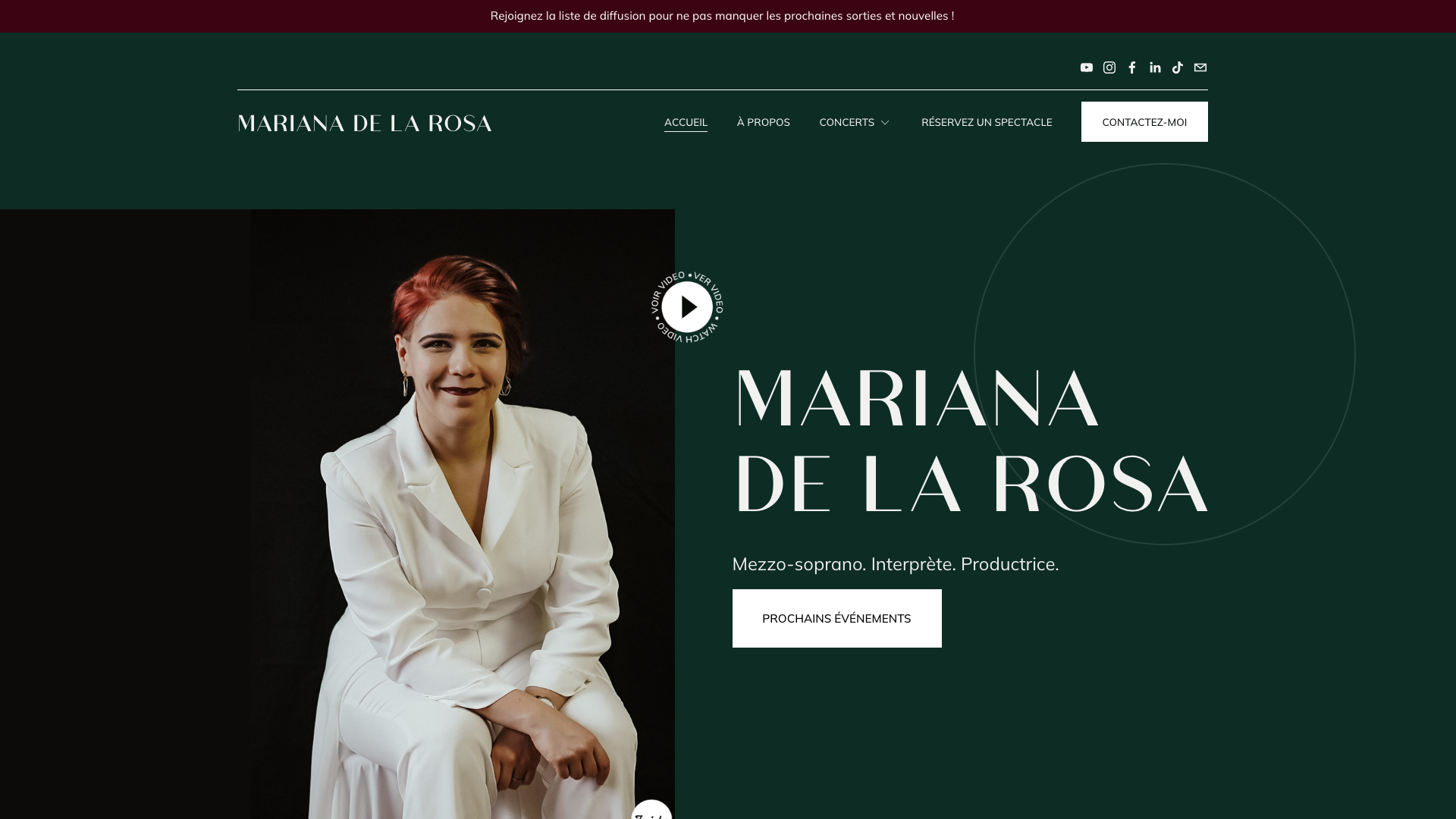
Multilingual singer site development
Full site development
The client wanted a website for her personal brand to consolidate all the information she usually shared through social media and Youtube. She had gotten to a point in her artist career where she was ready to display her professionalism and merits more openly to prospective clients and her international audience.
READ MORE
Considering the different kinds of content she wanted to display, the different ways potential clients can work with her, and the fact that she was reaching audiences that spoke English, French and Spanish, I built her a multilingual site with a clean look and lots of interactive elements.
We decided to focus on displaying videos, upcoming events, and past event galleries vs. heavy text to highlight her amazing talent.
All the customizations implemented were done in the most responsive and user-friendly way possible, and I included an in-depth instructional video at the end of our project to allow her to manage the content and site on her own.
-
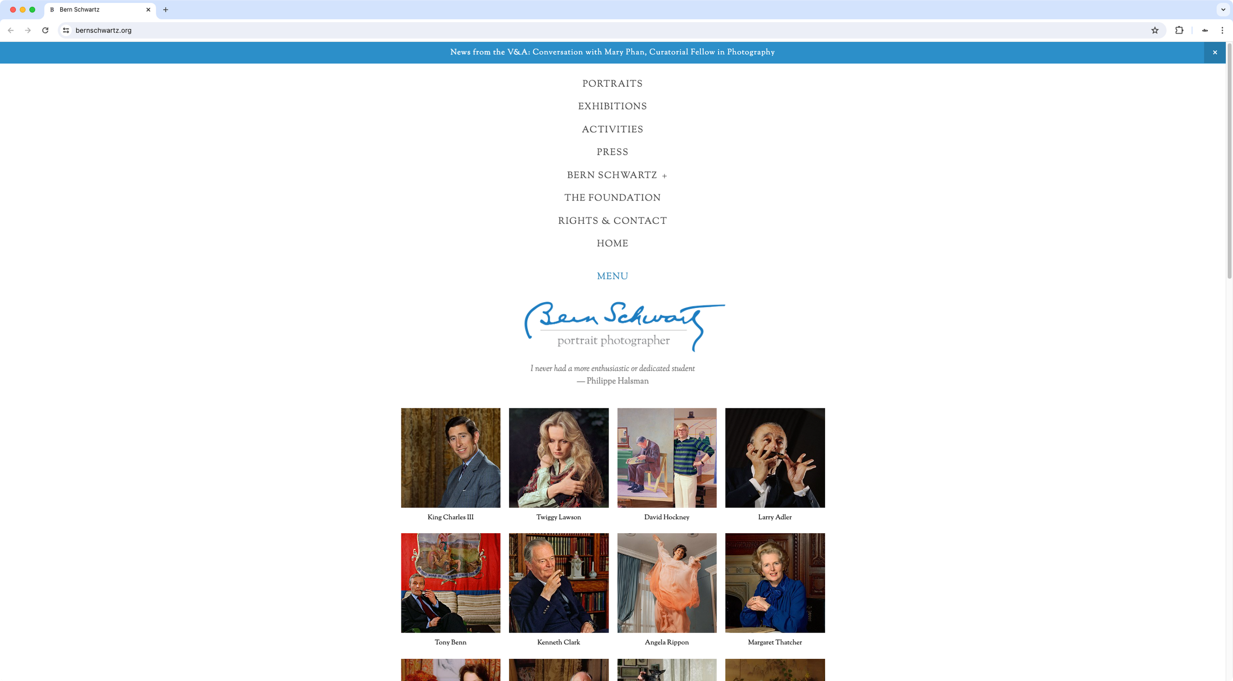
Seamless navigation across devices
Specific customization
The designer wanted to modify the desktop navigation on her client's site to make it match the mobile nav users experienced on smaller devices. Some custom code had already been applied to make that happen but the functionality was slightly different, and her client wanted a seamless experience between screen sizes.
READ MORE
Using the existing custom code as a starting point, I made the necessary tweaks required to achieve the same kind of look, functionality and animations, usually displayed on mobile devices for that particular Squarespace template.
Additionally, I included a set of variables the designer could easily change based on any client requests concerning link size and colors.
-
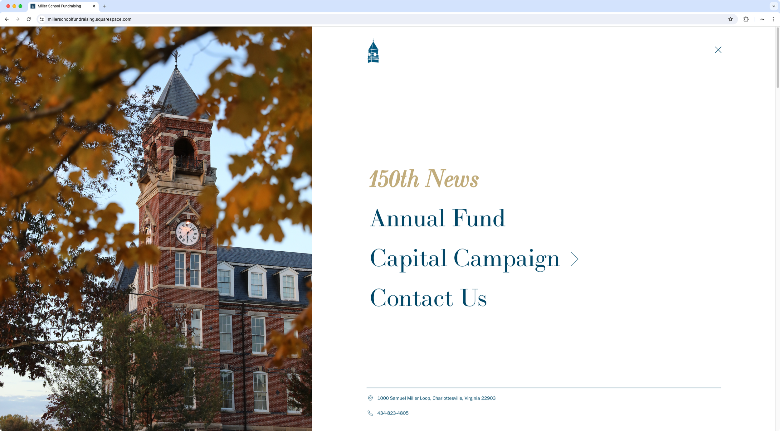
Bold desktop split layout navigation
Specific customization
The designer was creating a new website with a very bold and distinctive look, and wanted to bring to life some ideas he already had in terms of the desktop navigation, mainly: creating a split layout, having an entry animation when opening the menu, creating a specific burger button + logo look, and having the option to include additional info inside the links panel.
READ MORE
Starting with the native mobile menu as the base, I created a custom navigation with a split layout that included a small "footer" section with some important contact information about the school, implemented the desired entry animation on desktop, added an on-brand hover mode, and set up a set of easy-access variables for the designer to change at will to adjust different areas of the new navigation.
-
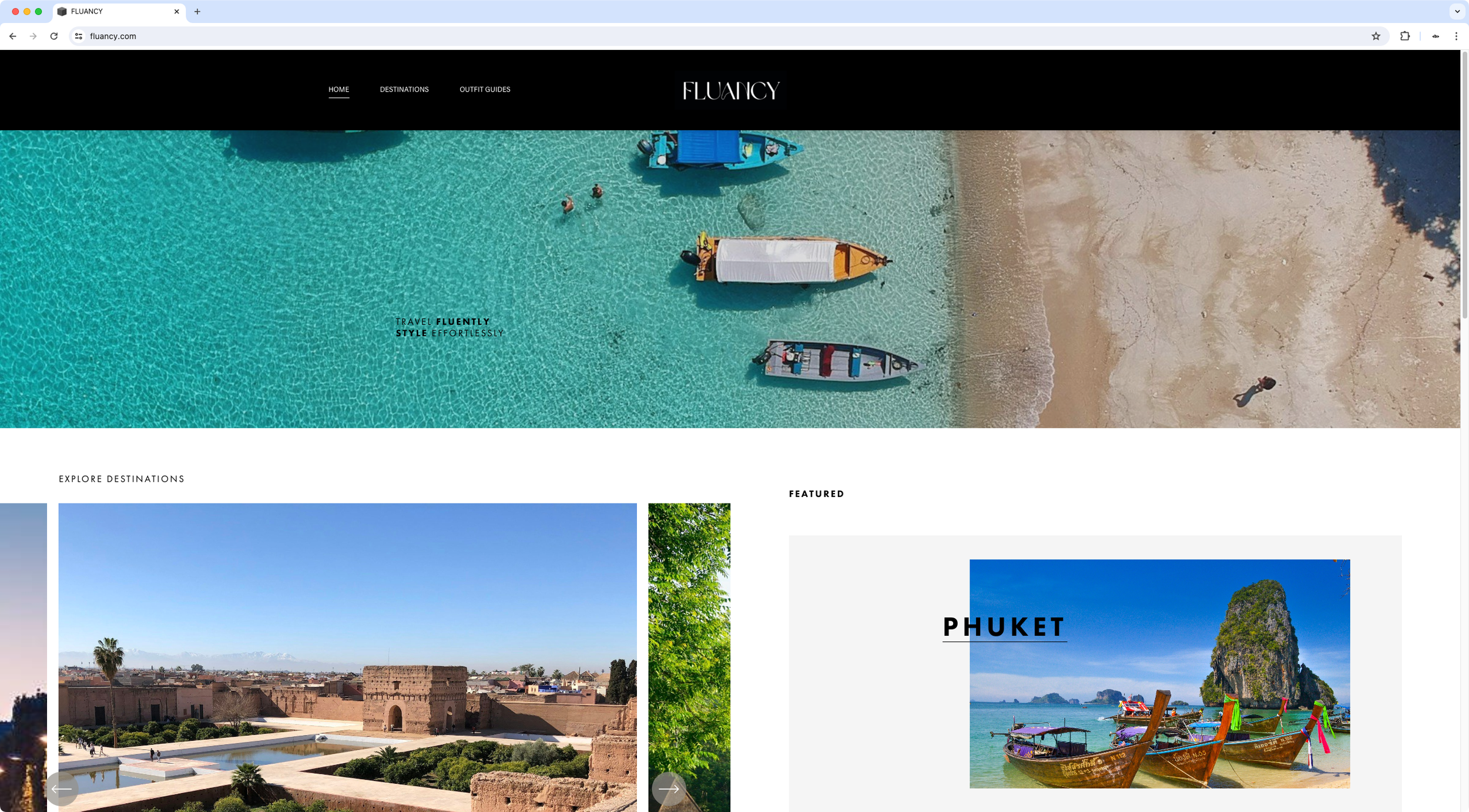
One-time loading screen
Specific customization
The client had a loading screen customization on her site that allowed her to showcase a welcome message when a user landed on the homepage. However, she was looking for a way to make sure that that only happened the first time the visitor opened up her site, instead of every time the homepage was visited.
READ MORE
Using the existing code as a base, I made the necessary HTML and CSS adjustments required for the screen to work with the one-time customization, and implemented the timing limitation that would effectively hide the loading screen once a user had already seen it the first time during their entire visit.
-

Accordion services page layout
Custom page layout
The designer had a very clear vision for her client's site completely laid out in her prototype, but was looking for a way to implement certain customizations that required code. Amongst them, was a super custom accordion-style page layout for the Services page.
READ MORE
Considering all the precise design aspects of her layout and the content involved, I built a custom page for her client that gathered all her requirements and ideas – including a floating image hover mode – while keeping the design responsive and the content-update process very easy to manage for anyone needing to make changes in the future.
Additionally, I included a set of variables in the code that would allow her to quickly change styles when needed, after rounds of revision.
-

Custom fixtures page layout
Specific customization
The client was looking for a responsive way to display the team's fixtures on his site, without the struggle of having to manually align separate blocks to get the look he wanted.
READ MORE
Based on his inspirational site, I customized a Gallery Block for him so that he could easily add, modify and remove information inside it – without touching code – while maintaining that horizontal layout he needed. I included some small mobile modifications as well to keep the information organized neatly at all times.
-

Slide-up title hover animation
Specific customization
The client was migrating his site from 7.0 to 7.1 and was looking to adapt some customizations he already had in place to the new version. Amongst the different tweaks, he was looking for a way to display a custom filter and a slide-up animation for his post titles, to keep a minimal look while including some interactive elements.
READ MORE
Using the Universal Filter plugin as a base for the filtering functionality, I customized its look to make it match the old site in terms of colors and overall style. Additionally, I modified his Summary Block to turn the title into a slide-in element that would show up only on hover, enticing users to click through to see the gallery behind it.
-

Custom event page layout
Custom page layout
The client was looking to make several tweaks to his 7.0 site, to better showcase his business and offers to potential clients and customers.
One of the customizations he was going for was a restructure of his Event pages, to have a 3-column layout that would better work with the information he wanted to make clearly visible from the start.
READ MORE
I created a fully custom page layout for his events by reorganizing the way the content was being presented into 3 distinct sections: the general event info, the product block to purchase access to the event/workshop, and an FAQs accordion block with key information about the offer and his teaching style.
All the information was set to be easily editable on his end, so he would have no additional work replicating the layout over and over again for future workshops.
-

Custom floating navigation
Specific customization
The designers were looking to bring to life a floating navigation idea they had already established in their mockup. They needed it to be user-friendly, responsive and include a specific hover and active mode style that had been pre-approved by their client.
READ MORE
To keep things as easy to edit as possible, I used a Gallery Block as the base to create this floating element.
Using the icons and text provided, I customized the slides in order to turn them into big buttons that would change colors on hover, and once again when the user was on the corresponding page clicked.
Additionally, I created a "stacked" look for mobile that would work well on smaller devices, made the navigation setup easy to control on their end – in case they needed to add it to a different page in the future – and included a set of variables they could use to control the colors/styles of the design at any time.
Got an idea?
Whether rare, medium-rare or fully cooked, let’s chat about your customization ideas and goals to see what we can do to make them a reality!


